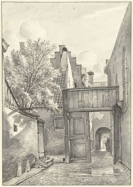
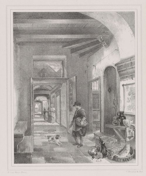
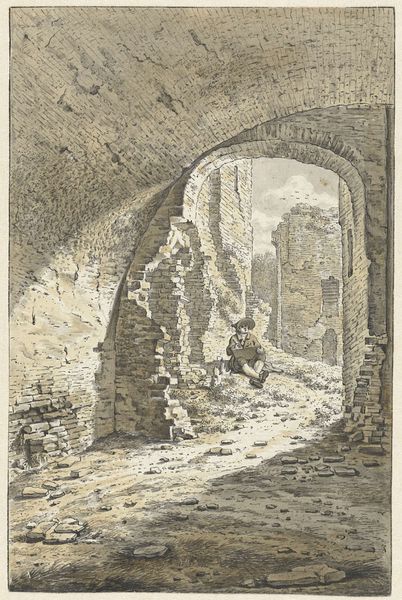
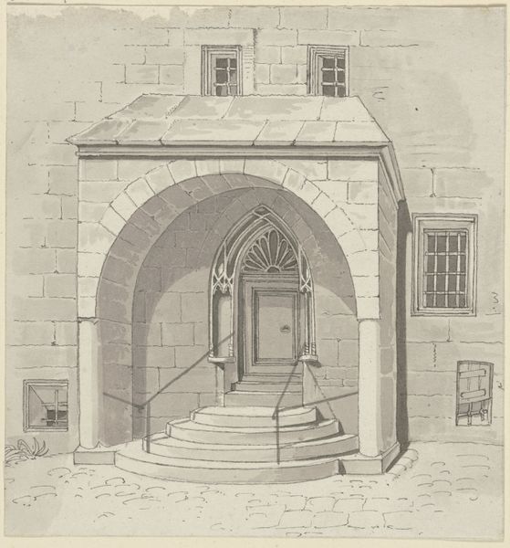
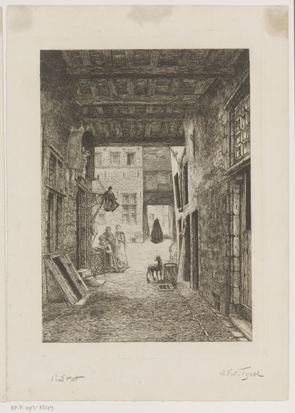
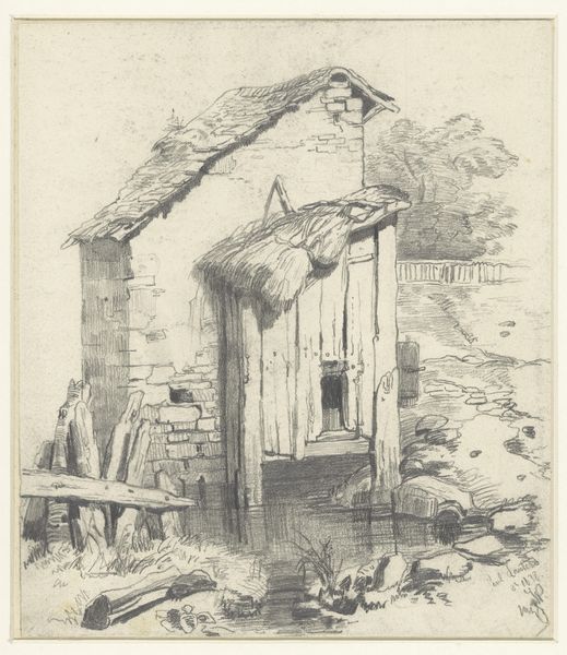
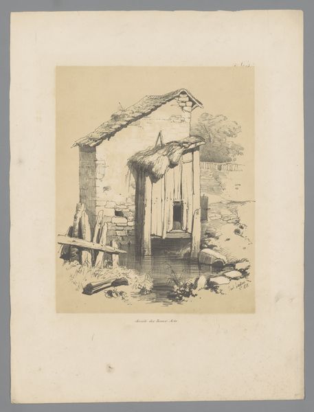
drawing, print, ink, pencil, architecture
#
drawing
#
medieval
# print
#
landscape
#
form
#
ink
#
pencil
#
line
#
genre-painting
#
architecture
#
realism
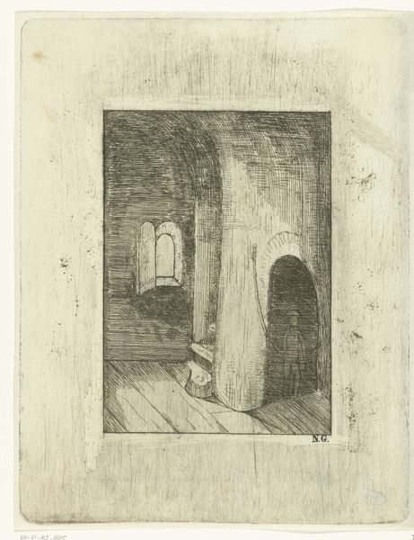
Dimensions: sheet: 10 x 8 7/8 in. (25.4 x 22.5 cm)
Copyright: Public Domain
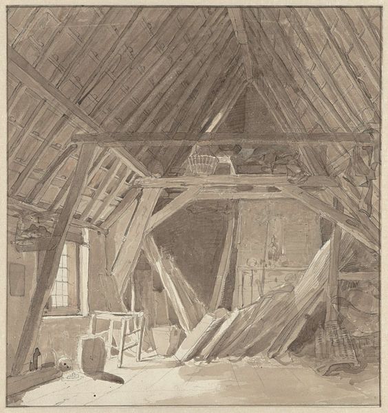
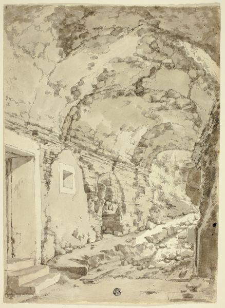
Editor: Here we have an anonymous artwork, "Convent of St. Cloud," created sometime between 1820 and 1860, using pencil, ink, and print. It's a stark image, almost ghostly in its depiction of the interior. What catches your eye about the composition? Curator: Immediately, the artist’s strategic employment of line and tone constructs a compelling spatial dialogue. Notice the calculated variation in line weight; thicker lines define the structural framework – the ceiling beams, door frames – thereby asserting their permanence, while thinner, more delicate lines articulate the surface textures and nuances of light. Editor: So it's about the balance between form and the way light interacts with it? Curator: Precisely. Observe how the light source, presumably from the unseen left, models the forms, creating subtle gradations that animate the architectural plane. Consider the way the artist orchestrates our visual journey. The stark foreground contrasts with the midground that presents an interior that seems to have been obstructed; the perspective, then, forces the viewer's eye to grapple with planes of depth, all orchestrated with remarkable technical skill. Do you find the orthogonal lines add or detract from the reading? Editor: They definitely reinforce the sense of receding space. I hadn't considered how active the foreground is, almost like a stage setting. I was focused on the doorways in the background. Curator: And rightly so! How do you respond to the fact that those openings offer nothing more than another flat, white space? How does the formal quality of those lines offer depth when it merely provides no through way. It may signal not only what the interior _is_, but is now no longer, or even could have been. Editor: It's fascinating to see how the interplay of light and shadow and line defines and ultimately obscures so much in this space. Thank you, I see the drawing differently now. Curator: Indeed. The strength here lies in its manipulation of visual codes, challenging us to perceive the artwork, rather than simply recognize a location.
Comments
No comments
Be the first to comment and join the conversation on the ultimate creative platform.
More like this