#
pencil drawn
#
aged paper
#
toned paper
#
light pencil work
#
pencil sketch
#
old engraving style
#
sketch book
#
personal sketchbook
#
pencil work
#
columned text
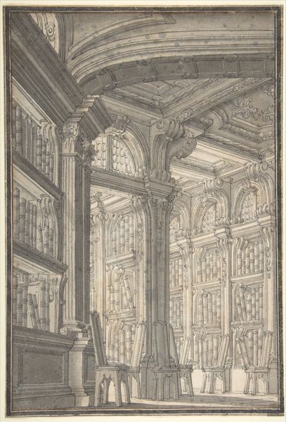
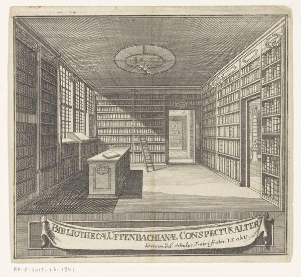
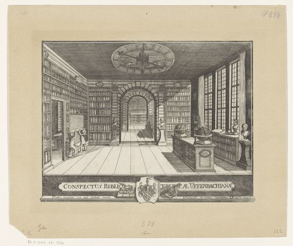
Dimensions: height 575 mm, width 430 mm
Copyright: Rijks Museum: Open Domain
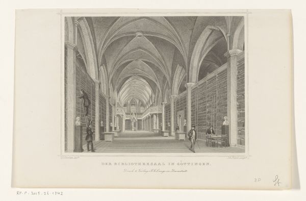
Editor: So this is "Interieur van een bibliotheek" by E.W. Evans, created sometime between 1866 and 1924. It looks like a pencil sketch. I'm struck by how detailed it is, especially the ceiling and the display case. What do you see in this piece, focusing on the art itself? Curator: The immediately striking element is the meticulous rendering of texture and form through purely linear means. Notice how the artist employs hatching and cross-hatching to build up tonal values, simulating light and shadow within this architectural space. What do you make of the perspective employed? Editor: Well, it seems fairly accurate, creating a sense of depth as your eyes move toward the back of the library with its large arched window. Curator: Precisely. But consider how the artist manipulates that perspective. The foreground is dominated by this elaborate display case, drawing the viewer's eye in. Then, notice the repetition of vertical elements – the bookshelves, the window mullions – creating a rhythmic structure. Does this structural emphasis have a specific meaning? Editor: Hmm, perhaps the rhythm of those verticals, contrasted by the arching ceiling, provides balance, creating visual harmony. But how does the aged, toned paper play into our formal analysis? Curator: The sepia tone contributes significantly. It mutes the contrasts, fostering a unified field, allowing our perception to attend to formal relationships without strong color distractions. How would you say this affects our experience of the drawing as a whole? Editor: I think it makes the piece feel timeless, classical even. I focused on the representational, but seeing your analysis has made me appreciate the underlying structural complexity of this sketch! Curator: And recognizing those structural relationships illuminates the meticulous craftsmanship, thereby affecting how we read what is being represented. Form and content work hand in hand.
Comments
No comments
Be the first to comment and join the conversation on the ultimate creative platform.
More like this