Dimensions: height 363 mm, width 274 mm
Copyright: Rijks Museum: Open Domain
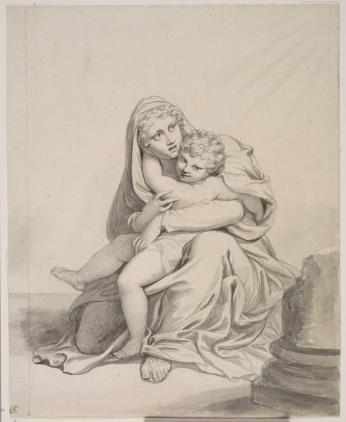
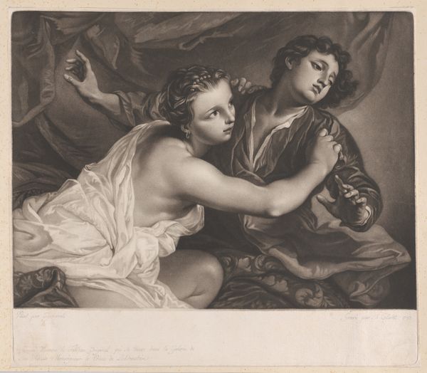
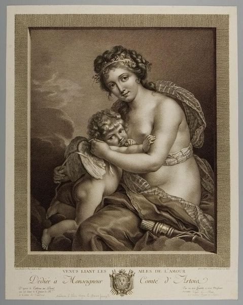
Curator: I’m struck by the stark simplicity of this engraving. A quiet, almost melancholic feel emanates from the image. Editor: This is "Venus en Amor," crafted in 1775 by Johann Friedrich Bause. It's a wonderful example of the classical-realism style rendered through engraving. Tell me, what cultural narratives do you see reflected? Curator: The visual dialogue between Venus and Amor is rich. Venus, typically seen as an embodiment of mature beauty and sensual power, looks almost pensive here, even guarded. Editor: Indeed, she does not radiate typical Baroque flamboyance. Observe Bause's use of line – it's meticulously controlled, creating delicate shading and subtle curves that emphasize the smoothness of Venus’ skin. Notice the textural contrast with Amor’s more cherubic features, achieved through tighter, denser lines. It's masterful. Curator: Amor, in contrast, seems to whisper a secret, his youthful face full of playful intrigue. The placement of his hand on Venus' shoulder carries the weight of familial connection, a poignant display of innocent intimacy in the engraving's grayscale world. This isn’t merely about physical beauty; it reflects ideals around affection. Editor: I concur. The limited tonal range is interesting; it feels like Bause is deliberately stripping away some of the Baroque artifice to expose the core, classical structure. Curator: And beyond that, consider the continuity in depictions of Venus and Amor. This specific rendition, using classical symbols like the dove, which carries associations of love and peace, echoes iconography dating back to antiquity. Bause connects to these historical emotional touchstones. Editor: Absolutely. Bause has clearly absorbed those lessons and reformulated them in this work. His technical precision and focus on clean lines make it less a celebration of overflowing abundance like we would expect from the Baroque. Curator: It speaks more to inner emotional truths, making Venus relatable across time and place. Editor: A thoughtful exploration then, balancing visual elegance with encoded meanings, bridging stylistic epochs with impressive precision.
Comments
No comments
Be the first to comment and join the conversation on the ultimate creative platform.
More like this