Curatorial notes
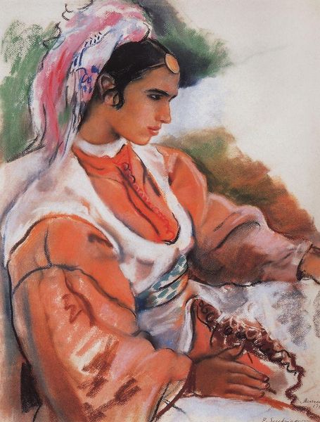
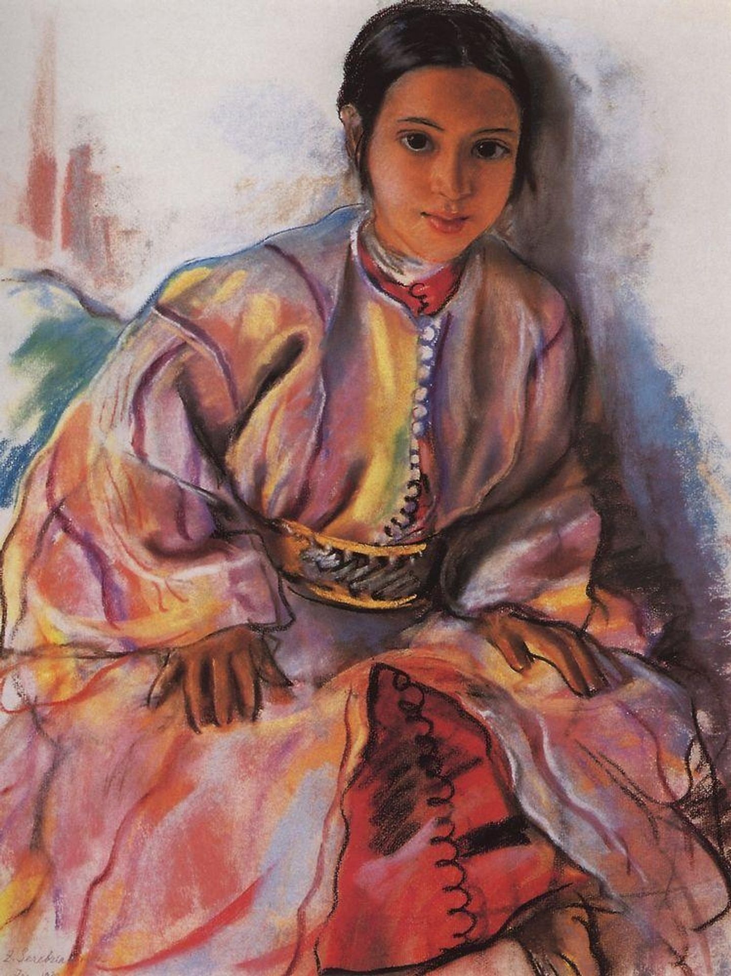
Curator: Let’s take a closer look at Zinaida Serebriakova's "Girl in Pink," created in 1932. I’m immediately struck by how gentle and almost dreamlike it feels. Editor: My eye is drawn to the textile rendering first—I wonder, is that pastel on paper? It’s incredible to think how Serebriakova layers such seemingly fragile material to conjure such robust fabric and detail. Look at how she renders the button details along the garment's neckline. Curator: You know, there's a certain wistful quality to her expression, a sense of quiet contemplation. I always get a glimpse into her inner world when I see this piece; she could be anyone reflecting on childhood dreams, hopes, and vulnerabilities. The pink is quite central to that idea, don’t you think? Almost naive, girlish even. Editor: Yes, that particular use of pink gives a rosy glow to everything, but I would resist a reading of mere girlishness. The choice of medium here seems intentional. The subtle blending is amazing, but what intrigues me more is that pastels are fundamentally pigment bound with just enough binder to hold them together. They offer a directness in applying colour, cutting out the fluid stage and that's very striking to observe. I think it is fascinating to examine the making of these pastel sticks, imagining what was available during Serebriakova's time and comparing that to our contemporary abundance of pigments today. Curator: Absolutely, a connection to art making, yes! I often muse if that sense of immediacy directly translates into how powerfully the subject’s gaze captures the viewers' attention. There is something so candid, don't you think, about that quiet intensity? As if time simply stops. Editor: Serebriakova must have been deliberate in choosing to use that candid quality—the very same pastel pigments come at a cost. The lack of binding agents that allows pastels their velvety softness and the ability to make delicate, soft lines is equally the material’s shortcoming: colours don’t strongly adhere to surfaces and risk being brushed off and smudged unless protected behind glass or fixatives. I want to think more about this impermanence that parallels our own short existence. Curator: Beautifully said! Thinking about that tender gaze along those lines brings so much weight! I do believe it is that fleeting moment she perfectly captures, so delicate like those pastel strokes. A pure expression of something heartfelt that you almost don't dare to touch... Editor: An image of quiet dignity conveyed by the fragile yet expressive quality of layered pigment... Thank you for illuminating my appreciation of materiality and technique.