Copyright: Public Domain: Artvee
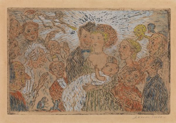
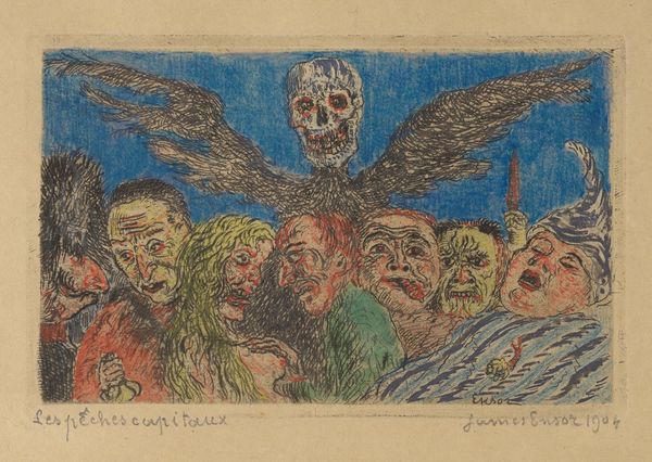
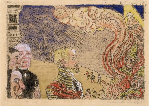
Editor: Here we have "The Coquette Death" by James Ensor, crafted in 1922 using ink. It has an eerie yet playful vibe. What structural elements catch your eye? Curator: Observe how Ensor masterfully utilizes line and form. Note the frenetic energy of the swirling pen strokes contrasted with the relative stillness of the skeletal figure at the center. How do these formal choices contribute to the overall impact? Editor: It feels unsettling but in a humorous way. I see the way the grotesque figures frame the scene; almost as if to suggest death enjoys putting on a show for onlookers. Curator: Precisely! And consider the composition; a delicate balance exists between the flatness of the picture plane and the illusion of depth achieved through overlapping figures. How does Ensor manage to create such visual tension using primarily linear means? Editor: So, rather than depicting a scene, he's actually more concerned with how we *see* it? Curator: To some extent, yes. Note how the vibrant use of colour isn't employed naturalistically, but for expressive, structural purposes. Does that shift your perception of the drawing? Editor: It does. Initially, I saw a bizarre parade of ghouls, but the formal techniques you point out really add an uncomfortable complexity to it. Curator: Indeed, Ensor compels us to consider the formal language through which mortality is represented, transforming morbidity into a strangely compelling spectacle. What lasting thoughts do you have now? Editor: The drawing moves beyond morbid humor, focusing on lines, colors, and shapes that show something significant about mortality and its performance. Thanks for your insight.
Comments
No comments
Be the first to comment and join the conversation on the ultimate creative platform.
More like this