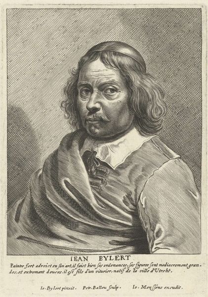
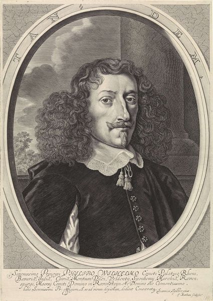
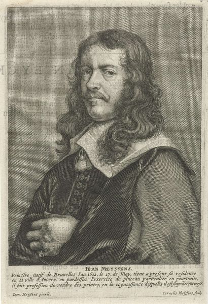
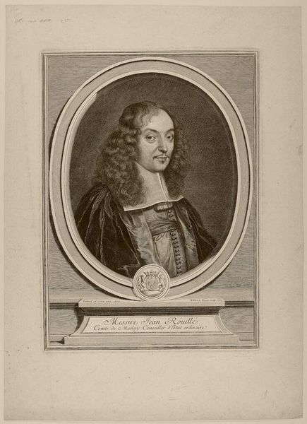
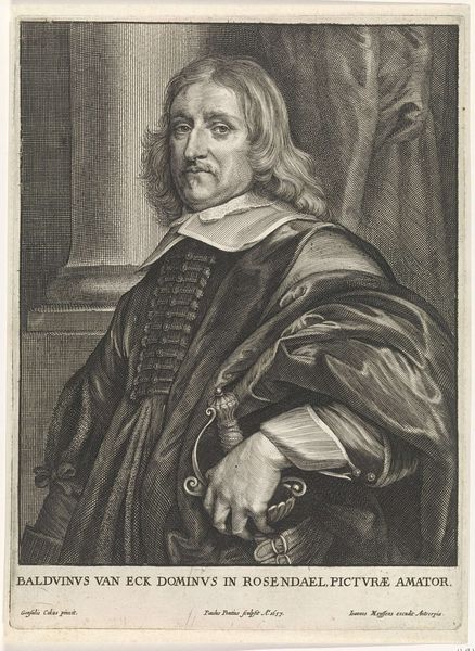
print, engraving
#
portrait
#
baroque
#
dutch-golden-age
# print
#
old engraving style
#
genre-painting
#
engraving
Dimensions: height 165 mm, width 114 mm
Copyright: Rijks Museum: Open Domain
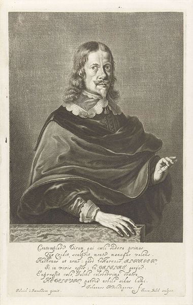
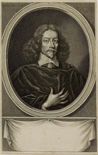
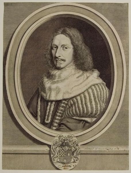
Curator: We're looking at a portrait of David Teniers II, created sometime between 1649 and 1662. It's an engraving, currently housed at the Rijksmuseum. The artist behind this likeness is Pieter de Jode II. What's your initial reaction? Editor: Oh, it’s like peering into a past meticulously etched! It feels very self-serious, that’s my first impression. Is that… meticulous melancholy? Curator: I see what you mean! The engraver’s marks do give it a certain air. He was known as an eminent figure painter and landscape artist, highly regarded by royal circles. Do you notice the detail in the ruff, contrasted against the hatching? Editor: The ruff is almost otherworldly! It looks like a captured snowflake—gossamer and grand. Yes, the contrast... it’s stark but inviting, as if he is coming forward, even if with caution. There’s almost a hyper-reality to his eyes, given the nature of the medium. Curator: Indeed, Jode really plays with texture and tone here, drawing heavily from Baroque conventions. We observe not just a depiction, but also, I suggest, a careful statement about Teniers' status—engravers were often translating existing painted works into a format for broader circulation. He was advertising Teniers! Editor: Right! Making art accessible before “accessible” was even a word. And genre scenes and portraits were of course very important back then. It's funny though. Knowing the context deepens my initial reading; now, he seems to project confidence instead. Clever propaganda! Curator: Exactly! So, this portrait becomes more than just a depiction; it's an artifact steeped in socio-economic meaning—commerce, craftsmanship, the artist's standing within it all. Editor: In seeing the texture itself, it adds a layer to what he made of this image! A different feeling to simply painting an image to last, doesn't it? What begins as melancholic becomes almost bold—interesting to consider the choices, what’s emphasized… how feelings get re-created over time and change us. Curator: That's wonderfully put, almost echoing how meaning itself is printed onto our own consciousness through art, don’t you agree?
Comments
No comments
Be the first to comment and join the conversation on the ultimate creative platform.
More like this