painting, oil-paint
#
painting
#
oil-paint
#
charcoal drawing
#
painted
#
pastel chalk drawing
#
cityscape
#
modernism
#
watercolor
#
realism
Copyright: Varlin,Fair Use
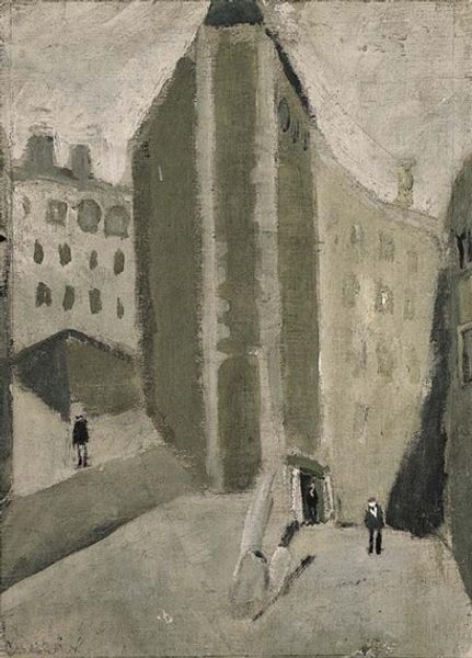
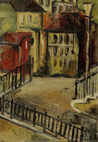
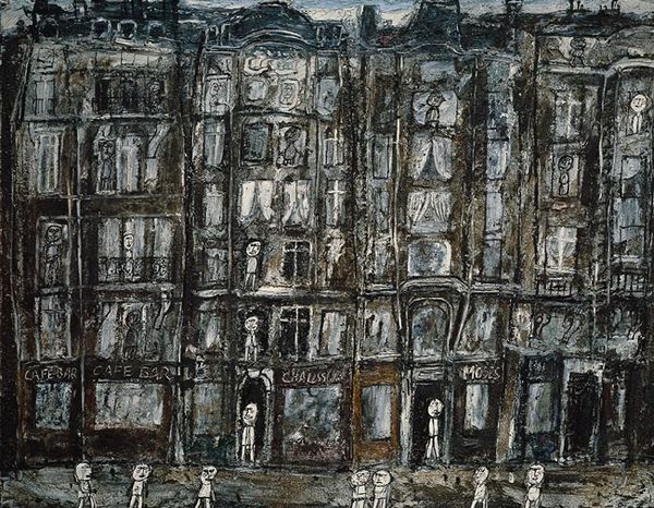
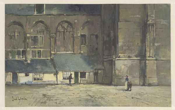
Editor: We're looking at "Poste de police in Paris," painted by Varlin in 1950, using oil paint. The subdued tones create quite a somber mood, don't you think? What do you see in this piece, from a formal perspective? Curator: The interest, for me, lies in the construction of space and form. Notice how Varlin employs a limited palette—primarily muted greens, grays, and browns. How does that strike you? Editor: Well, it certainly unifies the composition, creating a sense of harmony. Is that why he uses it? Curator: Indeed. It's a cohesive strategy that serves to flatten the pictorial space, pushing the building towards the picture plane. The lack of strong tonal contrast denies depth, emphasizing the two-dimensionality of the canvas. Consider, too, the heavy impasto in the sky— a stark contrast to the smoother application on the building itself. What effect does that textural variation create? Editor: It almost makes the sky feel heavier, more present, pushing down on the building. So the formal elements almost become representational through their materiality? Curator: Precisely! The diagonal lines of the streets converge, yet our eye is drawn upwards by the imposing verticality of the building. Varlin creates a dynamic tension, refusing a static, purely representational reading. He subverts realism through a manipulation of form and surface. Editor: I see what you mean. The tension between the flat picture plane and the implied depth creates a really interesting ambiguity. It’s made me rethink how I approach cityscape paintings. Curator: Formal analysis opens up possibilities beyond mere depiction. Now we both see.
Comments
No comments
Be the first to comment and join the conversation on the ultimate creative platform.
More like this