Dimensions: height 102 mm, width 155 mm
Copyright: Rijks Museum: Open Domain
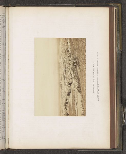
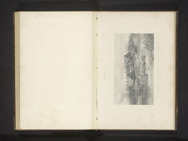
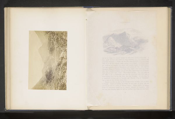
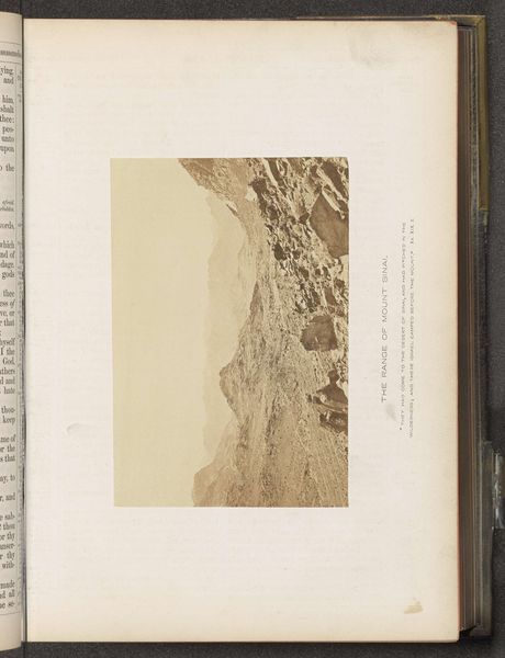
Curator: Editor: This is "Gezicht op Nazareth," a gelatin silver print by Francis Frith, dating from around 1850 to 1865, and it's held at the Rijksmuseum. It's surprisingly textured for a photograph; what details stand out to you? Curator: I observe a powerful manipulation of light and shadow. Notice how Frith uses chiaroscuro to define the topography, almost sculpting the land. The sharp contrast elongates the forms, thereby creating visual intrigue. Consider, too, the placement of the horizon line. Editor: The high horizon compresses the town below, which feels distant, yes. It creates a contrast between the vast, open sky and the somewhat cramped structures of Nazareth. Curator: Precisely. This positioning serves not merely as a documentary tool but also as an emotive one. By reducing Nazareth to a cluster of forms at the bottom, its relevance is questioned relative to the scale of the terrain and the composition. Editor: Are you suggesting it highlights the relative insignificance of human structures against the backdrop of nature and history? The image itself almost looks like an archaeological find embedded in the aged book. Curator: Precisely. This compositional strategy reflects, and subtly reinforces, thematic juxtapositions—history and the contemporary world, nature and the built environment, suggesting inherent relationships, even inherent tensions. Note also the tactile, grainy quality resulting from the printing process itself, contrasting with the almost ethereal quality of light. Editor: So it's more than just a landscape, then. The contrasting elements elevate its status. I see now it’s not *just* a place but a study of contrasting artistic tools to emphasize an intellectual claim. Thank you! Curator: Indeed. Examining such elements offers richer readings beyond representational value alone.
Comments
No comments
Be the first to comment and join the conversation on the ultimate creative platform.
More like this