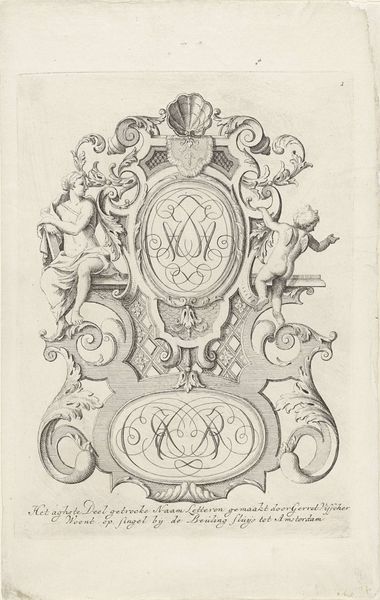
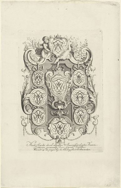
drawing, ink, engraving
#
portrait
#
drawing
#
baroque
#
pen drawing
#
figuration
#
ink
#
engraving
Dimensions: height 195 mm, width 137 mm
Copyright: Rijks Museum: Open Domain
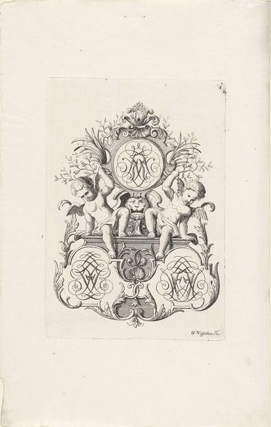
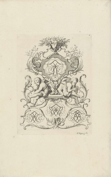
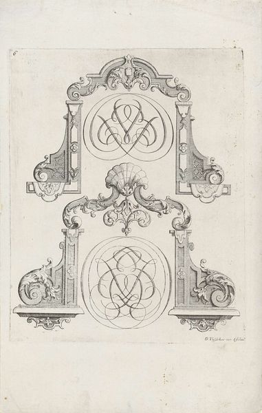
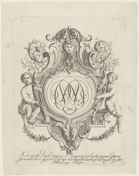
Editor: This ink and engraving work is titled "Drie monogrammen in ornamenteel kader geflankeerd door putti," created sometime between 1690 and 1710 by Gerrit Visscher. It’s striking how detailed the line work is, especially considering the small scale of the piece. What catches your eye? Curator: The organizational structure, the meticulous repetition of forms and counter-forms, strikes me. We have a clear hierarchy: crown, cartouche, putti, then the lower cartouche; all are enclosed in an ecosystem of baroque ornamentation. Tell me, what semiotic analysis would you apply to the central monograms? Editor: I suppose they denote the importance of individuals in society but perhaps also hint at the concept of trinity? What strikes me as odd is how repetitive the forms and counter-forms are in such small scale artwork. Curator: Precisely! Notice how the implied lines created by the curves lead your eye throughout the composition, a game of visual tennis that maintains the viewer’s gaze. Also, the contrasting balance and symmetry offer not just pleasure, but also order and purpose, the very hallmark of baroque art. But let's delve further into the lines: would you agree the fineness of the lines demonstrates Visscher's profound technical virtuosity? Editor: I absolutely agree. It's easy to get lost in the intricacies of the engraving. I hadn’t initially considered the level of technical skill required. Thank you! Curator: Indeed. It is through rigorous analysis of form and function that we may arrive at an objective and more profound understanding of the visual language of art.
Comments
No comments
Be the first to comment and join the conversation on the ultimate creative platform.
More like this