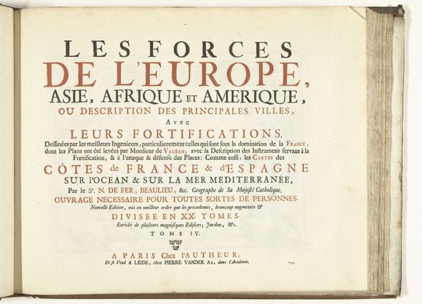
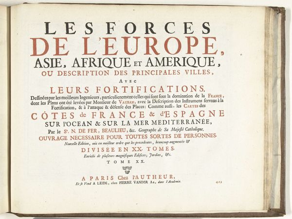
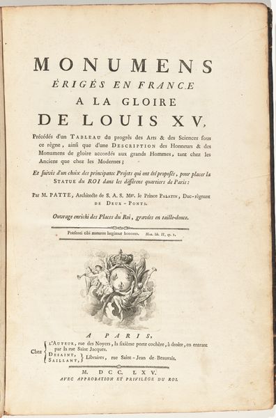
Titelpagina voor het prentwerk: Les Forces de l'Europe, Asie, Afrique et Amerique (...) Comme aussi les Cartes des Côtes de France et d'Espagne (deel XI), 1726 1726
0:00
0:00
pietervanderiaa
Rijksmuseum
print, typography, engraving
#
baroque
# print
#
typography
#
history-painting
#
engraving
Dimensions: height 300 mm, width 390 mm
Copyright: Rijks Museum: Open Domain
This is the title page from 1726 for “Les Forces de l'Europe, Asie, Afrique et Amerique,” created by Pieter van der Aa. Its dominant feature is the arrangement of text in various sizes and fonts, presented in two primary colors, black and red. The page offers a study in typographic hierarchy, where each line's size and color indicate its relative importance. Structurally, the page operates like a map, guiding the viewer through layers of information. The use of contrasting colors isn’t merely decorative; it serves a semiotic function. Red draws the eye to the most crucial elements, like ‘Europe,’ ‘Asie,’ ‘Afrique’ and ‘Amerique’ suggesting the geopolitical emphasis of the atlas. The organizational structure echoes the period's focus on categorizing and understanding the world. Consider how the page uses these formal elements to engage with broader themes of exploration and knowledge production, reflecting the Enlightenment’s ambition to map and classify the known world. This title page does more than introduce a book; it embodies the era's evolving understanding of global space and power.
Comments
No comments
Be the first to comment and join the conversation on the ultimate creative platform.
More like this