Copyright: Mark Rothko,Fair Use
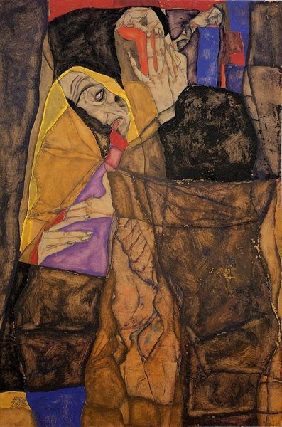
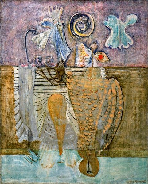
Mark Rothko’s ‘Gethsemane’ seems to play with familiar themes in unfamiliar ways, and it's hard to pin down a date. The muted palette, all tans, browns, and grays, sets a somber tone. It feels like he’s figuring things out as he goes, using color and form to wrestle with heavy ideas. Up close, you can see how the paint is layered, creating a rough, almost sandy texture. This adds a physical dimension to the work, as if the emotions are literally built up on the canvas. Look at the central figure, that striking red dot anchors the composition. It’s a tiny, almost defiant splash of color amidst all the earth tones. Rothko's later, more abstract works share this interest in color as a vehicle for emotion, but with less figurative representation. This piece reminds me of some of Guston's later figuration, and his use of symbol, although Rothko's shapes remain more allusive. Ultimately, it’s a testament to art’s capacity to embrace ambiguity and provoke endless interpretations.
Comments
No comments
Be the first to comment and join the conversation on the ultimate creative platform.
More like this