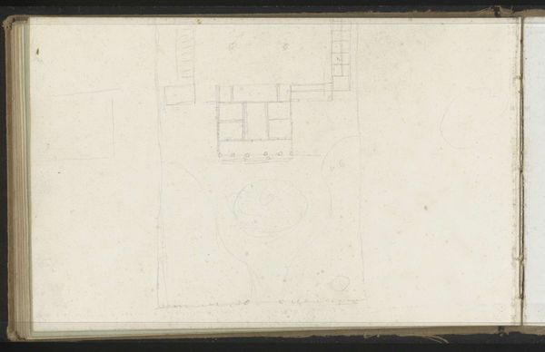
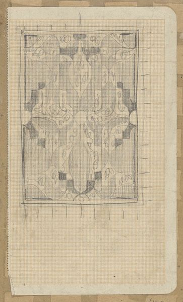
![Design for reflected ceiling plan.] [Partially colored drawing for ceiling plan by Winold Reiss](/_next/image?url=https%3A%2F%2Fd2w8kbdekdi1gv.cloudfront.net%2FeyJidWNrZXQiOiAiYXJ0ZXJhLWltYWdlcy1idWNrZXQiLCAia2V5IjogImFydHdvcmtzL2FkYmM4YmZjLThhODQtNDA0YS1iZDBkLThhNTA0MGYyOTllNi9hZGJjOGJmYy04YTg0LTQwNGEtYmQwZC04YTUwNDBmMjk5ZTZfZnVsbC5qcGciLCAiZWRpdHMiOiB7InJlc2l6ZSI6IHsid2lkdGgiOiAxOTIwLCAiaGVpZ2h0IjogMTkyMCwgImZpdCI6ICJpbnNpZGUifX19&w=1920&q=75)
Design for reflected ceiling plan.] [Partially colored drawing for ceiling plan 1910
0:00
0:00
drawing, architecture
#
architectural sketch
#
drawing
#
aged paper
#
quirky sketch
#
sketch book
#
personal sketchbook
#
idea generation sketch
#
sketchwork
#
geometric
#
sketchbook drawing
#
storyboard and sketchbook work
#
sketchbook art
#
architecture
Copyright: Public Domain: Artvee
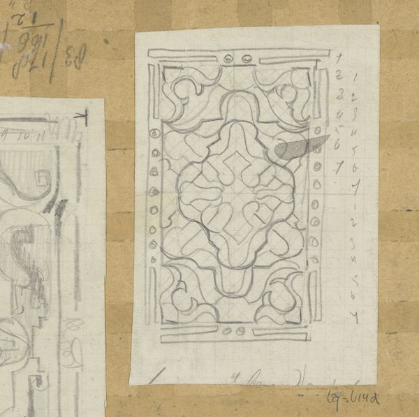
Curator: Immediately, I’m struck by the sketch-like quality of this ceiling design. It feels like we’re seeing the artist’s thought process right on the page. Editor: Exactly. What we have here is Winold Reiss's “Design for Reflected Ceiling Plan,” created around 1910. Considering Reiss's work in the context of the early 20th century and his commitment to representing diverse cultural identities, this plan might seem surprisingly... geometric. However, his interest in cross-cultural exchange influenced much of his design work. Curator: The interplay between the rigid squares and the softer circles within them does create a certain tension. The blue and gray sections are eye-catching but I am especially interested in the possible influences Reiss used for those motifs. Editor: Those motifs— particularly the floral one— certainly seem significant. This was commissioned for Louis W. Hill and the Great Northern Railway, and you can imagine how design played into projecting the image of a sophisticated transportation network at the time. Curator: Absolutely. So, while appearing almost abstract in its rendering, it points to a larger narrative concerning how railway expansion was visualized. Consider the power dynamics involved in such grand-scale infrastructure projects and how this translates to something as subtle as a ceiling design. Editor: I see it somewhat differently. It's precisely this subtle structure, the arrangement of form and color, that evokes its power. The limited color palette creates a calming effect. Reiss strategically contrasts detailed, ornate designs with blank squares to give our eyes places to rest, guiding the eye through the planned architecture of the space. Curator: I can agree that its geometric presentation creates a measured composition, but it also represents a carefully designed space that had cultural and historical contexts. Editor: Yes, and through its form, the image successfully provides order from chaos. The simplicity itself communicates a certain aesthetic. Curator: I think we've both come to understand this piece, each with an added dimension thanks to our differing approaches. Editor: Indeed. By looking at both the inherent qualities and its broader cultural place, we can both appreciate and extract new meaning from this wonderful, and deceptively simple design.
Comments
No comments
Be the first to comment and join the conversation on the ultimate creative platform.
More like this