print, engraving
#
portrait
# print
#
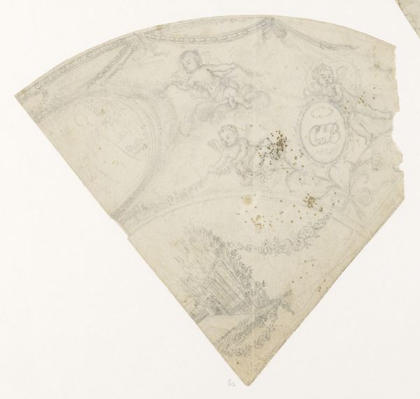
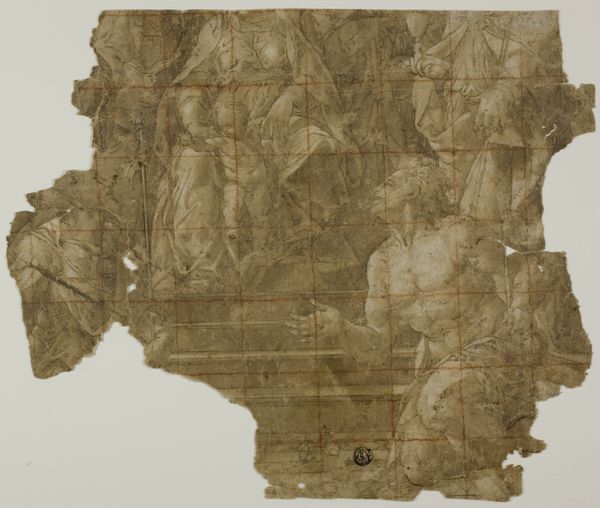
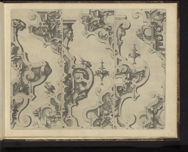
mannerism
#
11_renaissance
#
geometric
#
engraving
#
mixed media
Dimensions: height 8 cm, width 18.5 cm
Copyright: Rijks Museum: Open Domain
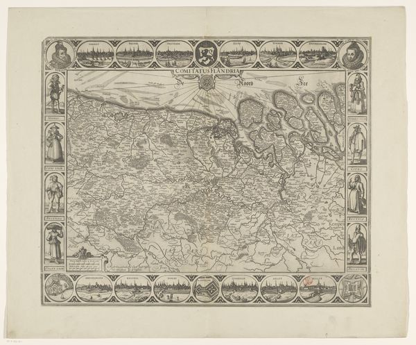
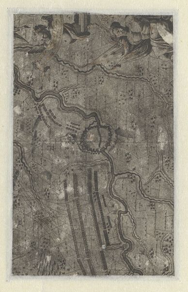
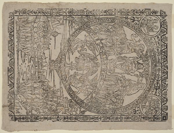
Editor: Here we have a fragment of an engraving, a map of England, Wales, and Ireland, created around 1590 by Jodocus Hondius. The detail is incredible, and even in its damaged state, it feels quite powerful. What strikes you about this piece? Curator: It’s fascinating how a seemingly straightforward map can reveal so much about the politics of representation in the late 16th century. Notice how the portrait of Queen Elizabeth I is central, literally framing the geographical space. This isn't just cartography; it's a deliberate construction of power. What does it say to you that the image of the Queen and inscribed text are prioritized over geographical accuracy? Editor: So, it's more than just a navigational tool? Curator: Exactly. Consider the engraving technique. Printmaking allowed for wide dissemination of this image, turning the Queen into a readily reproducible symbol of national identity. The intricate detail elevates her status, while simultaneously visually enforcing England’s claim over these territories. It prompts questions about who this map was for, and what kind of power it sought to legitimize. What narrative do you think it was trying to create about England’s place in the world? Editor: It feels like a very clear message of control and authority. I never considered how a map could be so deeply political. Curator: It's a reminder that even seemingly objective forms of knowledge, like maps, are always shaped by specific agendas. We must critically analyze the layers of meaning embedded within them. Editor: That gives me a lot to think about. I'll definitely look at maps differently from now on. Curator: And hopefully you’ll bring that critical lens to other forms of visual representation too.
Comments
No comments
Be the first to comment and join the conversation on the ultimate creative platform.
More like this