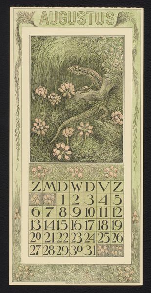
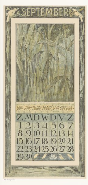
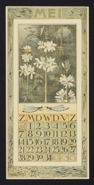
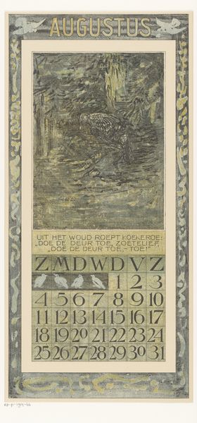
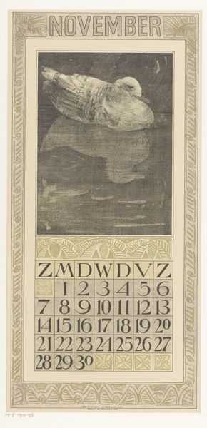
drawing, graphic-art, print, linocut, paper, woodblock-print
#
drawing
#
graphic-art
#
art-nouveau
# print
#
linocut
#
landscape
#
paper
#
linocut print
#
woodblock-print
Dimensions: height 440 mm, width 210 mm
Copyright: Rijks Museum: Open Domain
This is Theo van Hoytema's July Calendar lithograph, made sometime in the late 19th or early 20th century. I really get a sense of his process here, particularly in the soft, mottled fields of flowers and the quick, expressive strokes that bring the bird to life. The texture is something else; it's almost like a watercolor, with translucent layers that build up to create depth. The muted blues, yellows, and greens give it a dreamy, nostalgic feel. I'm drawn to the way the artist rendered the wings of the bird – so simple, but they capture the movement of flight. It's incredible how much information is conveyed with so little detail. The artist leaves space for the viewer to fill in the blanks. There’s something of Whistler’s tonalism in this piece, that same interest in atmosphere and mood over precise representation. But van Hoytema brings a unique sensibility, blending nature and design into one. It's like he's saying art is all about conversation, echoing and responding to what came before, while always adding something new.
Comments
No comments
Be the first to comment and join the conversation on the ultimate creative platform.
More like this