American Art Since 1960, The Art Museum, Princeton University, May 5 through May 27, 1970 1970
0:00
0:00
graphic-art, typography, poster
#
graphic-art
#
typography
#
geometric-abstraction
#
pop-art
#
poster
#
hard-edge-painting
Copyright: Modern Artists: Artvee
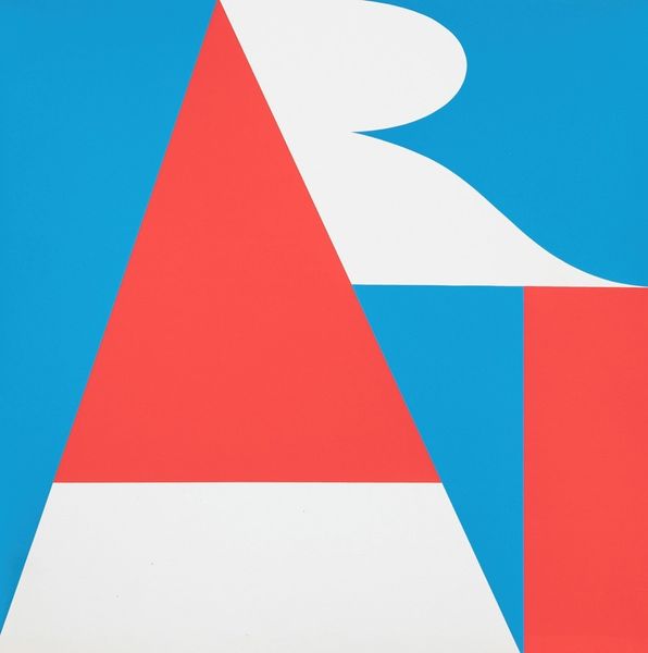
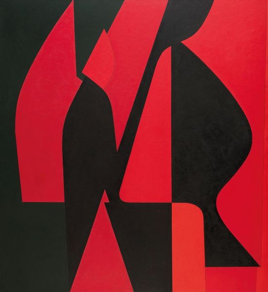
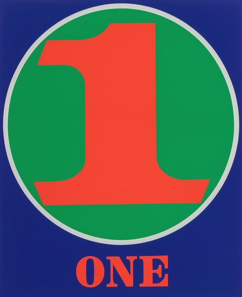
Editor: This vibrant poster by Robert Indiana announces "American Art Since 1960" at Princeton University, back in 1970. The red, white, and blue color palette really pops. The letters are stylized into hard-edged shapes. What do you notice about the visual language being used here? Curator: Notice the interplay of positive and negative space. The artist's deliberate placement of geometric forms—the sharp angles and curves—dictates our reading of the whole. How does the relationship between those primary colors affect the viewer’s gaze, moving our attention across the work? Editor: I see that the arrangement and color choices definitely create movement, guiding the eye upward, but do the textual elements themselves contribute beyond conveying information? Curator: Indeed, typography here moves beyond its semantic function. Note how font and size, their bold uniformity, support geometric abstraction. This formal structure reinforces an order, and the absence of nuanced tonality produces stark relationships between elements. It seems designed to deliver both aesthetic and literal information economically and unequivocally. Editor: So the formal elements serve a dual purpose, both visually engaging and functionally informative. The more I look at it, the more that clear sense of purpose emerges. Curator: Precisely, that is how the fusion of typography, color, and shape conveys meaning within this work's compositional frame. This exemplifies Indiana’s work within hard-edge painting, in service of public information. Editor: Thanks, understanding how those components work in concert really brings a clarity to my understanding.
Comments
No comments
Be the first to comment and join the conversation on the ultimate creative platform.
More like this