drawing, watercolor
#
drawing
#
water colours
#
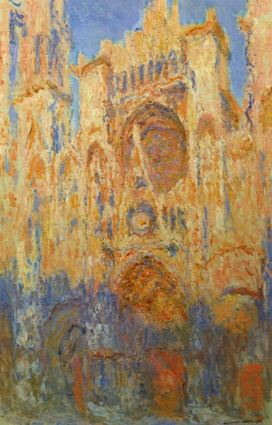
impressionism
#
landscape
#
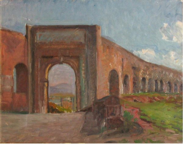
oil painting
#
watercolor
#
line
#
academic-art
#
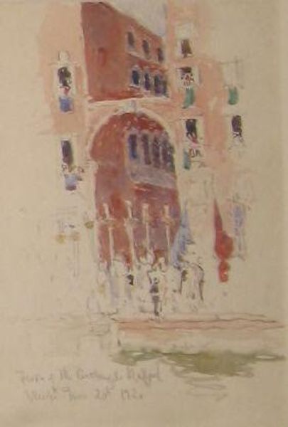
watercolor
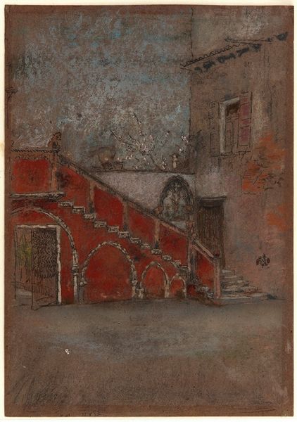
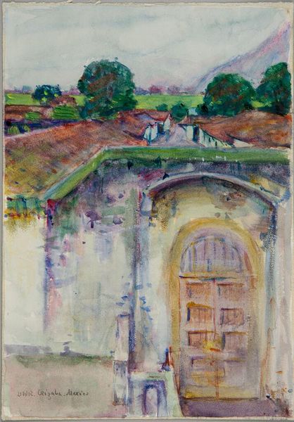
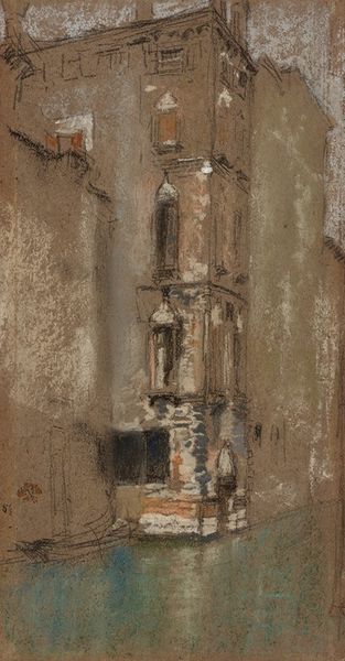
Dimensions: 20.3 x 29.6 cm
Copyright: Public domain
Curator: Looking at this watercolour drawing titled "The Staircase Note in Red" by James Abbott McNeill Whistler, created around 1880, the first thing that strikes me is the clear attention to materiality in its construction. The medium itself is central to its success. Editor: It feels…evanescent. The light seems to cling to the staircase in this really poignant, almost dreamlike way. It's as if you're recalling a place, a memory, more than seeing it objectively. I get a touch of melancholy, too. Curator: Absolutely. Watercolor lends itself beautifully to capturing those transient effects of light and atmosphere. But also, Whistler was very conscious of the social context of his art production, too. He insisted that art should primarily concern itself with formal relations like color and form and tone and line and pushed back at its subservience to narrative or representation. Editor: I completely understand. Whistler wants to free art from being beholden to outside things. Just let art do its own internal thing, its own music. But at the same time… those sharp angles against the more diffuse washes feel so deliberately constructed. Like a stage set, almost. I'm also sensing the urban transformation happening at this time, you know, buildings and spaces for living starting to multiply at pace... Curator: Interesting. Considering Whistler’s overall practice of resisting narrative, it makes sense to consider it more of an impression of Venice, rather than a rendering that would offer an exact resemblance of the buildings and layout of place. And that fits perfectly with his aims, he did what he had to in terms of selling picturesque landscape views for wealthy patrons...but you see the artistic drive coming through regardless. The composition and chromatic values are far removed from any specific localist documentation and far closer to musical harmony! Editor: Perhaps it’s about turning a piece of functional architecture into something emotionally evocative. It takes these really firm structural elements—the stairs, the walls—and imbues them with a fleeting sense of time and memory. You get a strong feeling for how we impose meaning upon simple shapes. Curator: And through the application of materials such as watercolour, we come closer to something akin to musicality or poetry. Whistler isn’t merely copying form but extracting its feeling in colour, composition, the use of open line. A beautiful example. Editor: It's really quite powerful, actually. This unassuming corner of a building speaks volumes. I think Whistler succeeded. I feel that I just went there on holidays.
Comments
No comments
Be the first to comment and join the conversation on the ultimate creative platform.
More like this