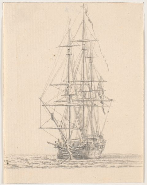
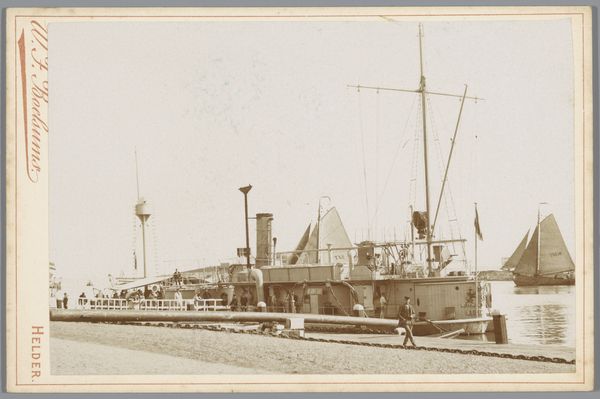
print, photography, gelatin-silver-print
# print
#
landscape
#
photography
#
gelatin-silver-print
#
genre-painting
#
realism
Dimensions: height 165 mm, width 108 mm
Copyright: Rijks Museum: Open Domain
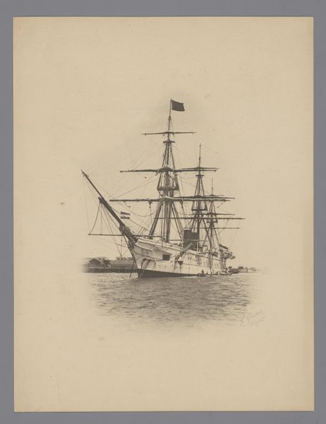
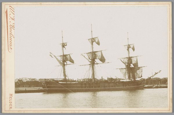
Editor: Here we have Willem Frederik Boelsums' "Wachtschip in de haven van Den Helder," a gelatin silver print dating from somewhere between 1890 and 1903. It feels very static to me, like a monument. What catches your eye in this photograph? Curator: The photograph's composition is immediately striking. Note the geometric precision – the rigorous verticals of the masts and rigging against the horizontality of the ship’s deck and the harbor structures. The subtle gradations in tone, particularly the way the light catches the complex web of lines above the deck, create a fascinating interplay of texture and form. How do you feel the use of the gelatin silver print enhances these qualities? Editor: I think it gives the photo this soft, almost dreamlike quality, but with really sharp details. Like, you can see every single rope. Is that something Boelsums was aiming for? Curator: Precisely. The technical mastery is evident. The gelatin silver process allowed for a high degree of tonal range and sharpness. It's less about an emotional or narrative message and more about exploring the inherent visual language of photography: light, shadow, texture, and line. Look at the contrast between the detailed ship and the hazier background. Editor: So it's about seeing what the medium can *do*? It’s interesting how a seemingly straightforward depiction can reveal so much about artistic choices. Curator: Exactly! Boelsums isn’t just documenting a ship; he's using the photographic medium to explore form and visual relationships. It’s a formal exercise presented as a scene, focusing on the inherent qualities of the image itself. Editor: I hadn’t thought about it that way at all. Now, looking at it again, the sharp focus and contrasting tones definitely speak to the artistry.
Comments
No comments
Be the first to comment and join the conversation on the ultimate creative platform.
More like this