textile, paper
#
type repetition
#
aged paper
#
page thumbnail
#
reduced colour palette
#
hand drawn type
#
textile
#
paper
#
fading type
#
stylized text
#
thick font
#
captioned image
#
columned text
#
calligraphy
Dimensions: height 274 mm, width 213 mm
Copyright: Rijks Museum: Open Domain
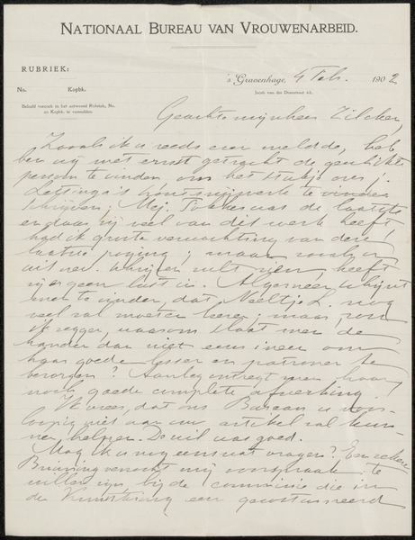
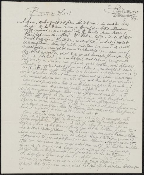
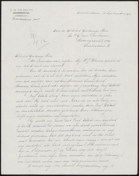
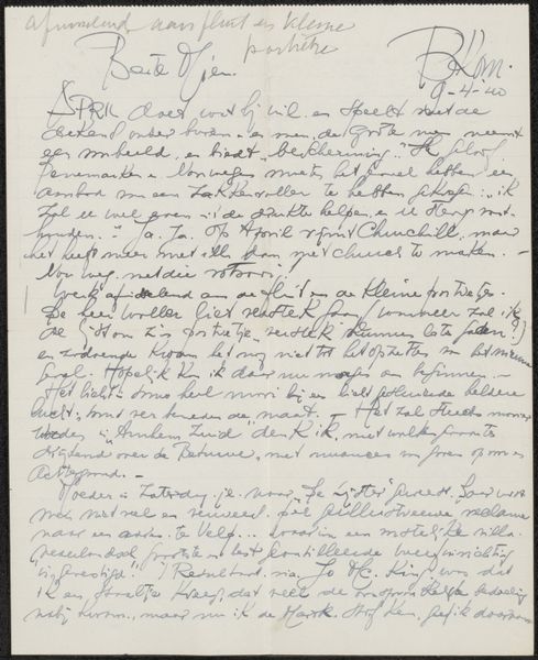
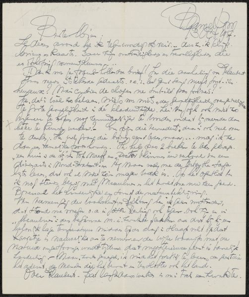
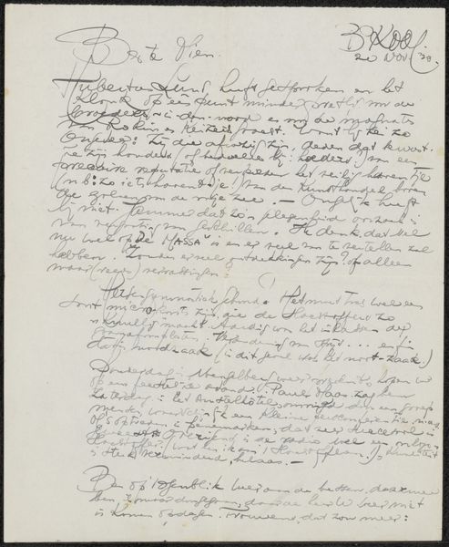
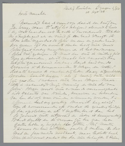
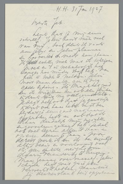
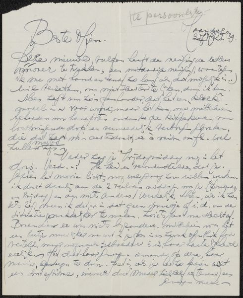
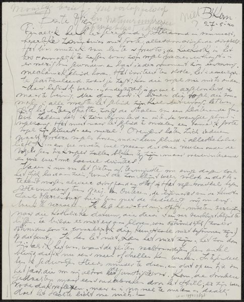
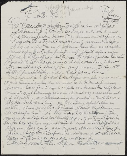
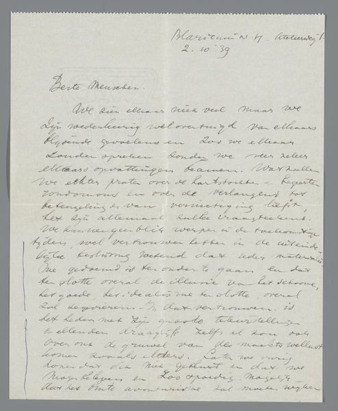
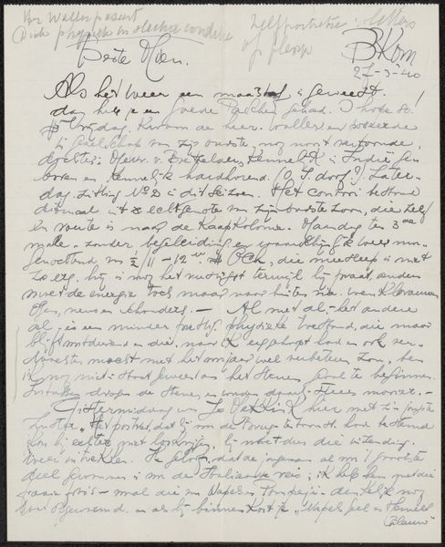
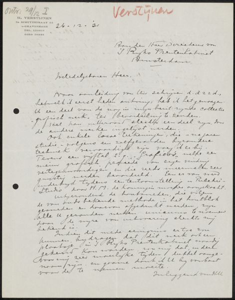
Curator: Welcome, everyone. We’re standing before "Brief aan R.W.P. de Vries Jr.," likely created around 1931 by weduwe Dr. J.F. Suyver. It’s fascinating; a textual piece primarily composed on paper. Editor: It strikes me as quite intimate. The handwritten quality and the aged paper evoke a sense of personal correspondence, something very immediate despite the passage of time. Curator: Indeed. The emphasis here really falls on the material. Paper, text, the very act of handwriting. Note the deliberate stylization. The thick font choices and varied sizing serve specific functions. It brings into play this really fascinating discussion about the boundary between document and artifact. Editor: I'm captivated by that element of stylized text you mention. Notice how the "hand drawn type," to use a modern term, is implemented with aged or deliberately faded areas, suggesting vulnerability, decay almost. This connects profoundly with its creation as an apothecarist’s stationary, as an exploration into materiality in service of brand and communication. Curator: I agree. And consider the labor embedded within. Every stroke is a deliberate act. It's a beautiful tension between mass communication – which printed material invariably attempts – and the individualized craft apparent on every aged line. Editor: It’s thought-provoking to analyze this work in an art historical context through repetition. This document invites considering all the often invisible human labor embedded within printed text: each letter, the careful layout... What thoughts went into its making? Curator: Exactly! It challenges us to redefine what’s ‘high art’ and to expand our perception of what art means to society, its value beyond sheer aesthetics. Editor: Analyzing "Brief aan R.W.P. de Vries Jr." is about unveiling layers of labor and intentional design, ultimately enriching our experience beyond the obvious text presented on the page. Curator: Agreed. It’s an important exploration of the relationship between design, craft, labor, and ultimately, the function of written communication.
Comments
No comments
Be the first to comment and join the conversation on the ultimate creative platform.
More like this