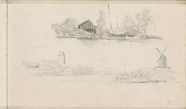
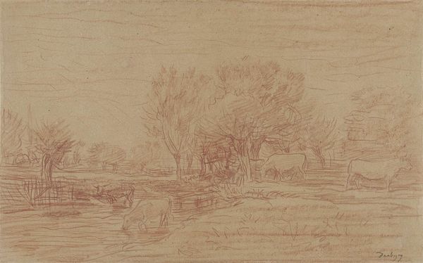
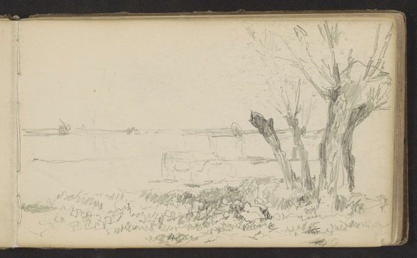
drawing, pencil
#
drawing
#
landscape
#
pencil
#
realism
Copyright: Rijks Museum: Open Domain
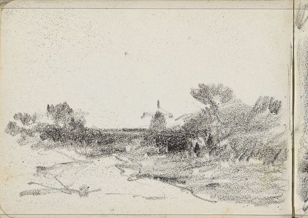
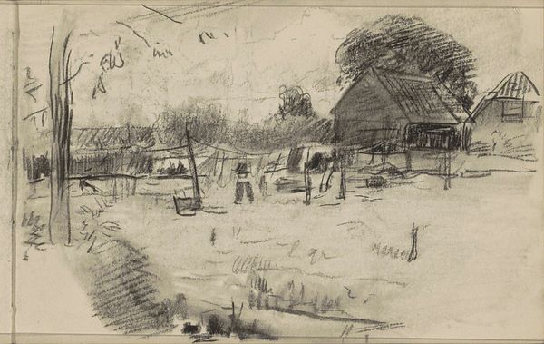
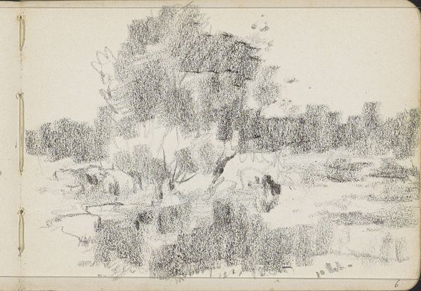
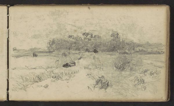
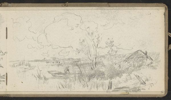
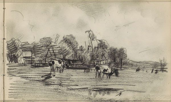
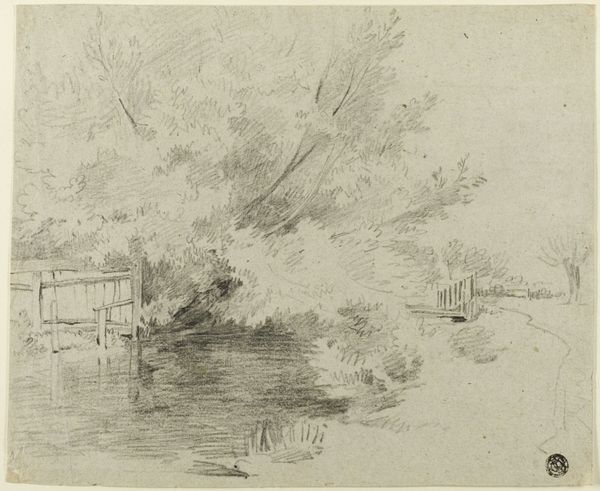
Editor: This is "Farm on a Waterfront" by Willem Cornelis Rip, dating from 1919 to 1921. It’s a pencil drawing, a fairly quick sketch of a rural scene. What jumps out to me is the interplay of light and shadow created by the dense pencil strokes. What do you see in this piece? Curator: Primarily, I observe the artist's skilled manipulation of line and tone. Notice how Rip uses varying densities of hatching to suggest form and depth. The clustered marks indicating foliage create a tactile surface, contrasting with the relatively smoother areas representing the water. Are you picking up on how the composition isn’t classically representational, yet uses gradients of darkness to depict an environment that recedes into the distance? Editor: I see what you mean! The darker foliage in the front versus the windmill barely visible in the distance... I was caught up in how ‘realistic’ it looked, but actually it's quite clever! Does the visible sketchbook page influence your perception? Curator: Certainly. The visible border of the page acts as a frame within a frame, drawing attention to the artifice of representation. It’s important to acknowledge the drawing as a self-contained object rather than a transparent window onto reality. The artist compels us to confront how we are creating a landscape image via our senses as guided by lines on a page. It calls attention to our interpretive relationship as the third element after the artist and nature itself. Editor: So, beyond the subject matter, you're suggesting that the artwork is really about the artist's technique and our process of viewing? Curator: Precisely. And our awareness of our role as interpreters of shapes and values. Editor: Thanks, I never thought to see it that way. I'll look closer from now on.
Comments
No comments
Be the first to comment and join the conversation on the ultimate creative platform.
More like this