Dimensions: 200 x 200 cm
Copyright: Paulo Tercio,Fair Use
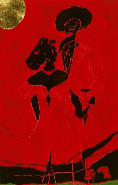
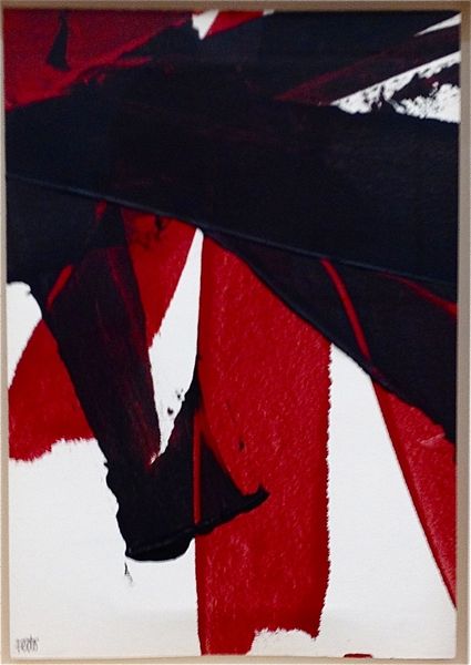
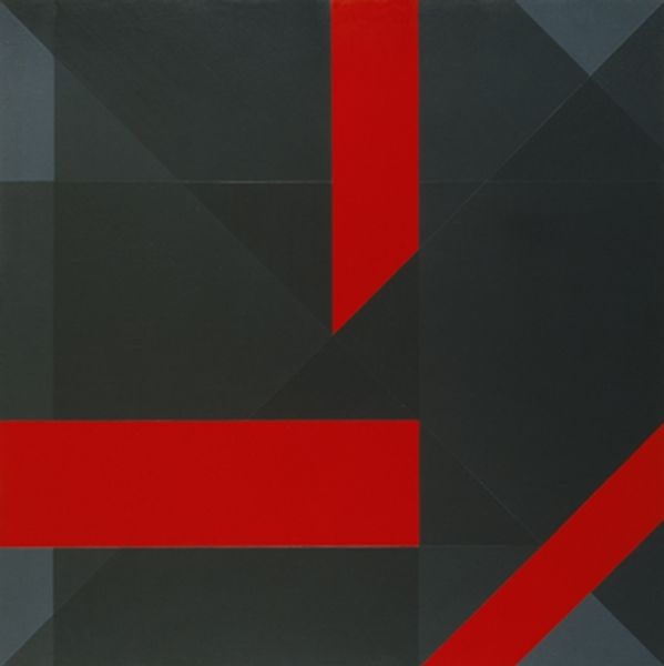
Editor: We're looking at Paulo Tercio's "Immaculate Conception" from 2014, made with acrylic paint. The stark contrast of red and black, the mirrored figures... it feels almost like a gothic altar piece. What are your thoughts on it? Curator: Immediately, the symbolism jumps out. The title itself, "Immaculate Conception," throws a sharp contrast against the stark, almost aggressively erotic imagery. Do you see the repeated crescent shapes? Think of the layers of meaning embedded within them. Editor: You mean the crescents that are also part of the figures’ torsos? The color creates an additional symbol in both locations... Curator: Exactly! Consider the crescent in its long association with femininity and the moon goddess Diana and its associations with ancient matriarchal systems. And that visceral red! Is it violence or passion? Or are these ultimately inseparable? Editor: That's fascinating. So the artist might be deliberately playing with this tension, challenging conventional religious iconography through... almost a primal lens? Curator: Precisely. Tercio might be digging into cultural memory, revealing how seemingly disparate symbols are inextricably linked. This artwork is both strikingly contemporary and rooted in millennia of symbolic thought. Notice, too, the fragmented, almost shattered forms – is this the deconstruction of a long-held myth? Editor: I hadn't considered the fragmented forms in that light. It feels much richer now. Curator: That’s what is incredible in Tercio's work; these icons stay potent, even as the structures around them fall apart. They remain to challenge viewers even when detached. Editor: This has really changed my perspective on the piece. The layers of symbolism are much more complex than I initially realized. Curator: And that is, perhaps, what makes a work truly worth contemplating, isn't it?
Comments
No comments
Be the first to comment and join the conversation on the ultimate creative platform.
More like this