#
toned paper
#
pen drawing
#
pen sketch
#
old engraving style
#
personal sketchbook
#
ink drawing experimentation
#
pen-ink sketch
#
pen work
#
sketchbook drawing
#
sketchbook art
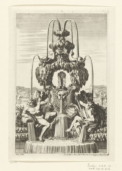
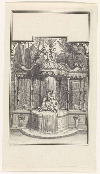
Dimensions: height 215 mm, width 148 mm
Copyright: Rijks Museum: Open Domain
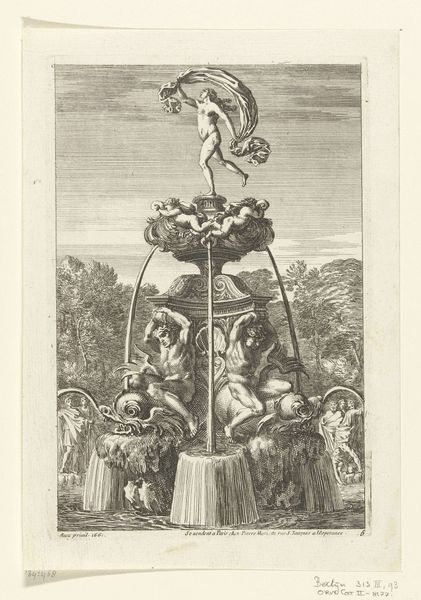
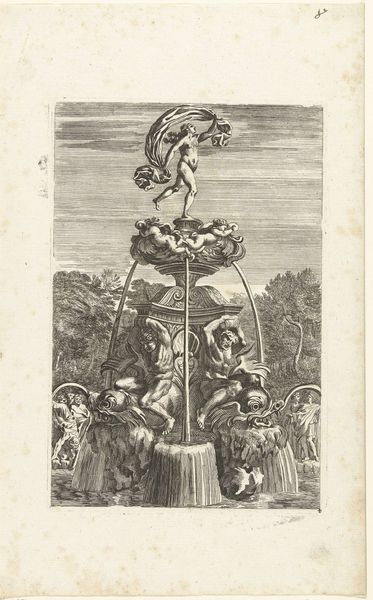
Curator: Before us is "Fontein met twee riviergoden," or "Fountain with two river gods," a work dating to before 1706. It's attributed to Jean Lepautre and held here at the Rijksmuseum. What's your initial take on it? Editor: Overwhelming, initially! There's so much crammed in. A slightly crazed feeling, like a baroque fever dream, especially with that odd central mask spouting water. It feels incredibly detailed and dynamic, almost vibrating off the toned paper. Curator: Precisely. The composition is relentlessly ornamental. Consider how Lepautre utilizes line and shadow. The intricate hatching defines form while generating depth and textural contrast. Notice how he juxtaposes curvilinear and rectilinear elements. It exemplifies the period's fascination with complex, layered imagery and use of allegorical forms. Editor: You're spot on about the allegory. Those river gods are giving off a distinctly louche vibe. The one lounging with the musical instrument almost looks bored! Do you think Lepautre was satirizing the decadence of the aristocracy a bit here, or am I reading too much into a fountain? Curator: Satire is plausible, though perhaps overstated. More compelling is to regard the drawing as an exploration of artistic possibility. Pen and ink afforded Lepautre a direct channel to envision and refine baroque designs. Observe the technical proficiency and confidence exhibited. He controls tonal gradations, and he conveys intricate architectural details in what may very well be a spontaneous drawing. Editor: Right, a fountain design flexing technical prowess... It does strike me as more than just a pretty fountain. There's an ambition to its detail, especially when it comes to texture—you feel like you could actually touch the rough stone. It also captures water’s dynamic form so well— both still and gushing! Almost alive. Curator: It certainly transcends functional representation. Its strength as a design concept lies in its expressive force. Editor: Thinking about that force—it has this tension, doesn’t it? It simultaneously invites and repels, much like water. Perhaps that contrast reveals the allure of beauty hiding an implicit instability or chaos? Curator: Intriguing concept. A rewarding perspective in closing. Thank you. Editor: Pleasure’s all mine! Thank you!
Comments
No comments
Be the first to comment and join the conversation on the ultimate creative platform.
More like this