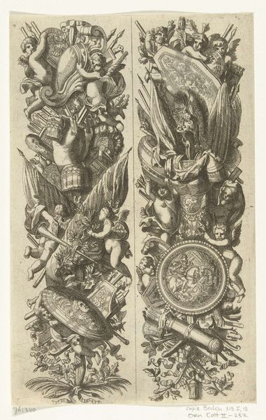
print, engraving
#
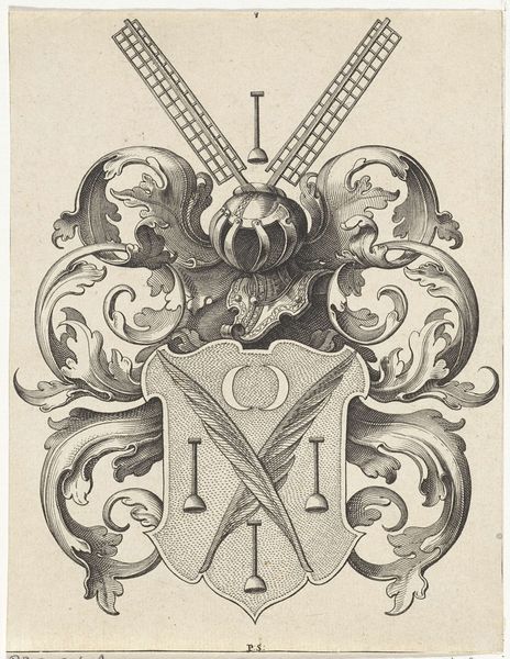
weapon
#
baroque
#
pen drawing
# print
#
pen illustration
#
history-painting
#
engraving
Dimensions: height 140 mm, width 95 mm
Copyright: Rijks Museum: Open Domain
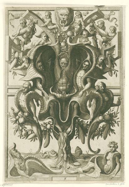
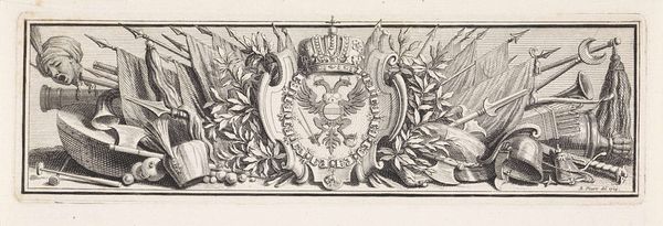
Editor: So, this is Pieter Yver's "Wapentrofee met wapenschild van Habsburg," created in 1741. It's currently housed here at the Rijksmuseum, rendered as a print or engraving. It feels very dense, almost like an explosion of weaponry frozen in time, a celebration of power, perhaps a tad intimidating! What stands out to you most when you look at this piece? Curator: Ah, yes! Intimidating is a great word for it. I’m immediately struck by the sheer *excess*. Look at the way those weapons are arranged, like trophies from some epic, never-ending battle. What I see is an exercise in Baroque maximalism, really hitting you over the head, don't you think? Does that reading come across to you? Editor: Absolutely! The excess is overwhelming, yet deliberate. Is there any cultural symbolism associated with Baroque art, especially given that this is a Habsburg emblem? Curator: Oh, for sure. Baroque was all about visual drama, meant to impress and inspire awe. This aesthetic fits the Habsburgs perfectly, because they wanted to convey their strength and legitimacy through imagery. It’s practically propaganda! That crowned double-headed eagle at the center – what do you think it signifies? Editor: The eagle is probably symbolic of imperial authority. And the weapons themselves... symbols of military strength, dominion and protection. But, beneath all this splendor and might, doesn't there seem to be this… hollowness, perhaps? All these symbols seem to scream, "Fear us!" Does it not mask something? Curator: Hollowness... I love that reading. All that show and bluster, trying to cover a void, a deeper insecurity perhaps? A fear of losing control? I guess art speaks to the spirit, doesn't it, beyond eras and ideologies. Editor: It’s amazing how one image can suggest such contrary emotions: pride and anxiety, pomp and doubt. I will never look at crests the same way!
Comments
No comments
Be the first to comment and join the conversation on the ultimate creative platform.
More like this