print, textile, paper, typography, poster
#
portrait
#
type repetition
#
aged paper
#
homemade paper
#
pale palette
#
reduced colour palette
#
narrative-art
#
paperlike
# print
#
textile
#
white palette
#
paper
#
typography
#
thick font
#
poster
#
historical font
#
columned text
#
calligraphy
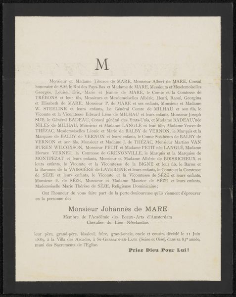
Copyright: Rijks Museum: Open Domain
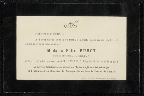
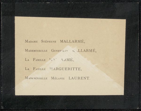
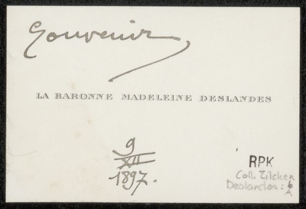
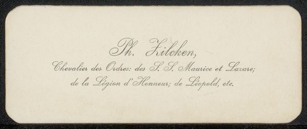
This death announcement for Philip Zilcken, printed sometime around 1906, is a fascinating study in how even the simplest of designs carry a heavy emotional weight. You know, it's just black ink on paper, but the way the words are spaced and weighted, gives them this profound sense of gravity. The texture of the paper itself, now aged and tinged with yellow, adds to the feeling of time passing. Look closely, and you'll see the subtle impressions left by the printing press, each letter a tiny physical marker of a moment in history. The formal announcement, delivered with such understated elegance, reminds me of Agnes Martin's prints: the bare minimum, but so much feeling. It’s also a reminder that art doesn't always have to shout to be heard. Sometimes, the quietest gestures speak the loudest. This piece is a dialogue with grief, loss, and memory and the enduring power of art to speak to the human condition.
Comments
No comments
Be the first to comment and join the conversation on the ultimate creative platform.
More like this