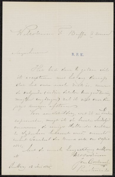
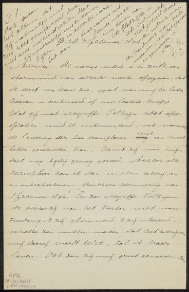
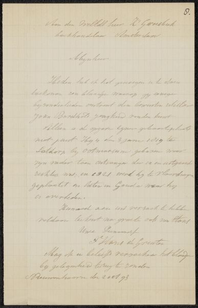
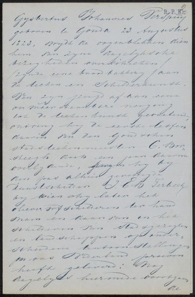
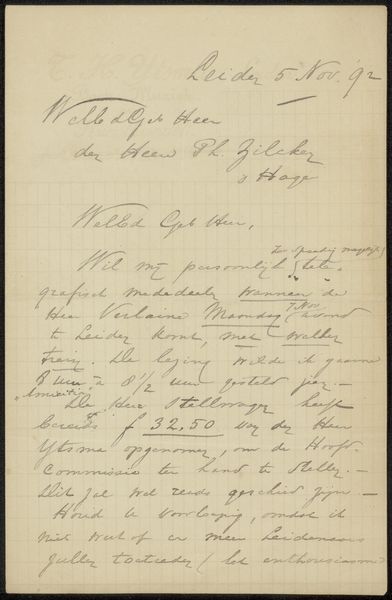
drawing, paper, ink
#
drawing
#
paper
#
ink
#
calligraphy
Copyright: Rijks Museum: Open Domain
Editor: Here we have Hendrik Albert van Trigt’s “Brief aan Frans Buffa en Zonen,” likely from 1873. It’s ink on paper and features beautiful calligraphy. I'm immediately drawn to the elegant curves of the script. How would you interpret the visual qualities of this work? Curator: Let us consider first the materiality of the piece. The inherent texture of the paper supports the delicate tracery of ink. Note the visual rhythm created by the varying thickness of the lines and the calculated arrangement of forms across the page. How does this linearity guide your eye? Editor: I see how the artist uses line weight to emphasize certain words. The darker, bolder strokes give a sense of importance, almost creating a visual hierarchy within the text itself. What else can we deduce from the purely formal elements? Curator: The restrained palette—the near-monochrome quality—certainly contributes to its impact. This tonal unity allows one to focus on the subtle gradations of light and shadow captured through the ink. Reflect on the composition. Does the asymmetry impact your perception? Editor: It does create a sense of dynamic energy, like the letter is leaning forward. Considering this is a letter, and judging purely from the aesthetic elements, I would assume this message holds a rather significant importance. I appreciate how the focus on purely formal aspects reveals new ways to interpret this piece. Curator: Precisely. By carefully observing its structural components, we can come to a richer and more nuanced interpretation, appreciating it as more than simply a mode of communication.
Comments
No comments
Be the first to comment and join the conversation on the ultimate creative platform.
More like this