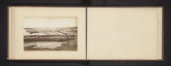
print, photography, albumen-print
aged paper
script typography
hand drawn type
landscape
photography
personal sketchbook
hand-drawn typeface
fading type
thick font
cityscape
handwritten font
italian-renaissance
albumen-print
historical font
columned text
Dimensions: height 102 mm, width 146 mm
Copyright: Rijks Museum: Open Domain
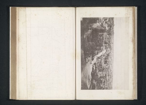
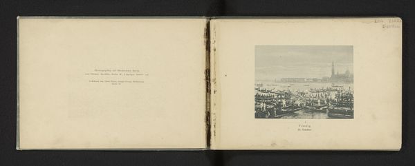
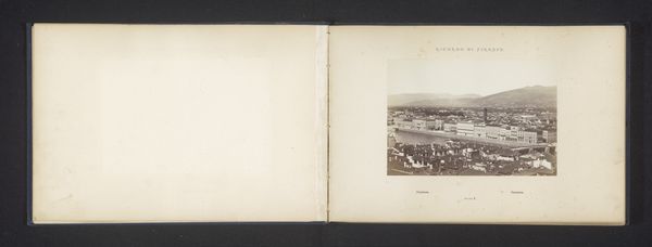
Curator: We're looking at Giacomo Brogi's "Gezicht op Florence," an albumen print created before 1871. Editor: The tonality strikes me first—it's that lovely sepia, which imparts such a nostalgic atmosphere to the scene. The composition is interesting, leading the eye along that curving road toward the cityscape in the distance. Curator: Absolutely, and the date places this image at a crucial time of Italian unification and urban transformation. Brogi, as a commercial photographer, catered to a growing interest in capturing and documenting this rapidly changing nation. Who were these images meant for, what message did Brogi try to tell? Editor: Observe how the road isn’t merely a road. The sharp angles of the road and landscape are meticulously constructed in this picture; the use of line creates a perspectival order, emphasizing structure of human creation as well as of urban landscape. Curator: Brogi capitalizes on the burgeoning tourism industry that simultaneously fetishizes and erases certain parts of Florence’s history. How does it affect women from this period, as women, still restricted in many spheres, use these kinds of landscapes to travel? Editor: True, the photograph objectifies Florence, transforming it into a picturesque vista, commodifying the aesthetic experience and sanitizing certain areas. Curator: The inclusion of handwritten, old-styled script, printed and framed in parallel to the print offers another fascinating dimension that situates Florence as something imagined but very specific in historical discourse. What’s outside this landscape as an actual location? What kind of access do people of different background have, or even have to this "panorama"? Editor: I appreciate that your line of thought focuses on what can’t be shown in an image; a landscape in and of itself presents a selective point of view. However, that very absence encourages critical discourse regarding access and narrative construction that we just talked about. The texture itself looks tactile. Curator: This image serves as a reminder of the power dynamics inherent in representation. Editor: Indeed. Through the study of structure and historical analysis, our discussion invites questions of beauty and the power that underlies it.
Comments
No comments
Be the first to comment and join the conversation on the ultimate creative platform.