Copyright: CC0 1.0
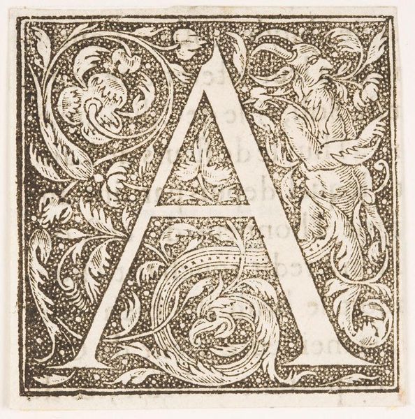
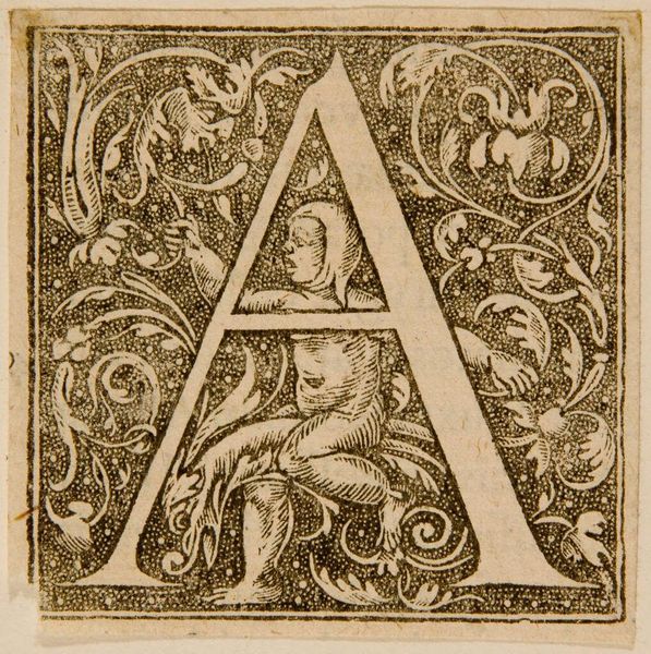
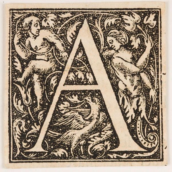
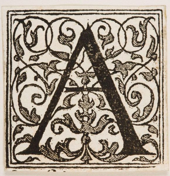
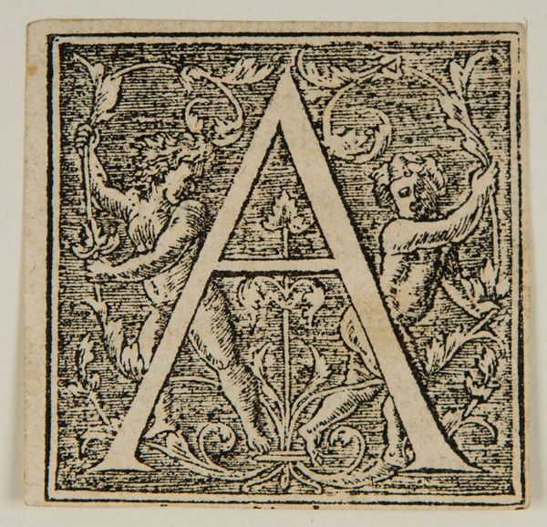
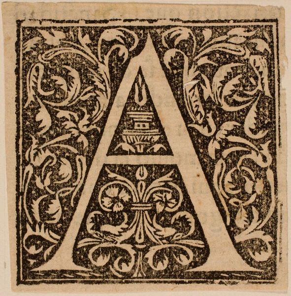
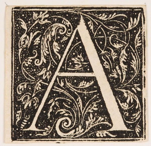
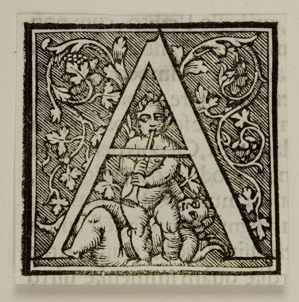
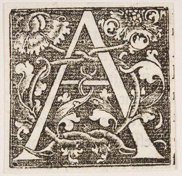
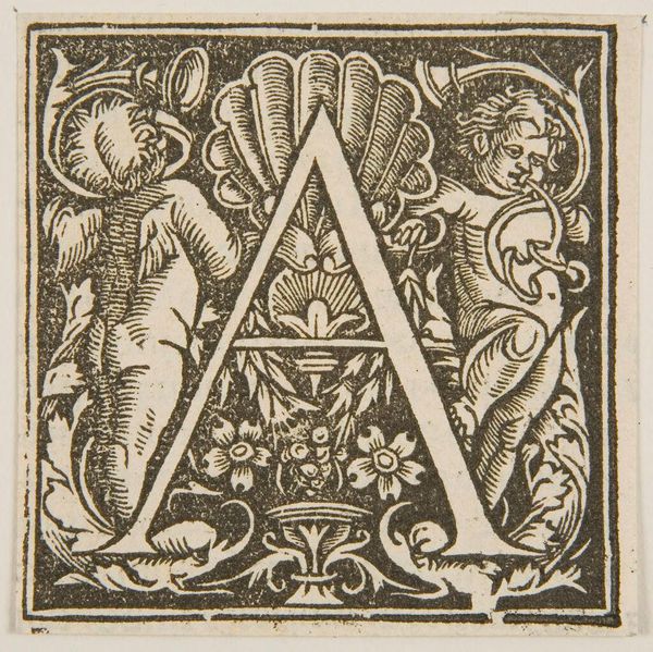
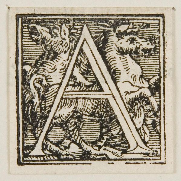
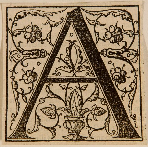
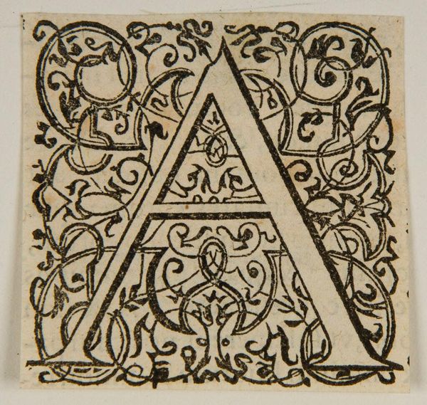
Editor: Here we have "Letter A" by an anonymous artist. It's a monochromatic image, and the letter is embellished with foliage and mythical creatures. How would you interpret its design? Curator: Observe the interplay of positive and negative space, the dense ornamentation surrounding the central form. The "A" itself becomes a void, framed by the intricate details. How does the contrast affect your perception? Editor: It makes the letter stand out. It’s an interesting dichotomy. Curator: Precisely. The anonymous artist employs texture to articulate form. The botanical and zoomorphic motifs, rendered with minute precision, serve to both decorate and deconstruct the legibility of the letter. Editor: So, the design itself is the primary subject? Curator: Indeed. The formal elements invite us to analyze the very essence of representation. The letter becomes secondary to the composition itself. Editor: That makes me see it differently. Thanks! Curator: My pleasure. Consider how form and function interact in art.
Comments
No comments
Be the first to comment and join the conversation on the ultimate creative platform.
More like this