graphic-art, print, paper, typography
#
graphic-art
#
dutch-golden-age
# print
#
paper
#
typography
Dimensions: height 387 mm, width 241 mm, height 565 mm, width 335 mm
Copyright: Rijks Museum: Open Domain
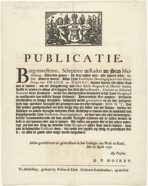
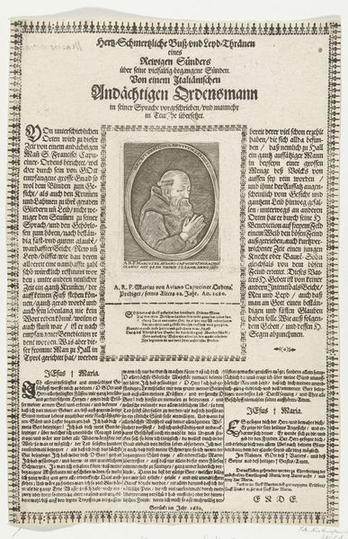
Curator: Looking at this intriguing print, dated 1661 and attributed to Dancker Danckerts, held at the Rijksmuseum... what are your first impressions? Editor: It feels…archaic. Dense typography dominates the page, a stark reminder of the manual labor involved in creating these documents. It looks incredibly labour-intensive to produce, doesn’t it? I wonder how accessible it was at the time. Curator: Indeed. This piece is titled "Beschrijving van het Stadhuis op de Dam"—a description of the Amsterdam City Hall. What’s particularly interesting is the convergence of graphic art, typography, and paper as material forms during the Dutch Golden Age. The description becomes almost as important as the building itself. Editor: Yes, it’s a portrait constructed of words, meticulously arranged. Note how the heavy block of text occupies nearly all the available space; the contrast between the black lettering and off-white paper generates a palpable sense of… solidity. There's a striking textual density. Curator: I'm drawn to thinking about its function within the societal context of the time. Who was consuming these printed descriptions, and what role did they play in shaping public perception of civic power and architecture? The availability of such prints says a lot about Amsterdam’s commercial environment. Editor: Good question. Consider also the texture of the paper; clearly not archival quality. The printing process—look closely; you can almost feel the pressure of the letterpress. Even the size suggests practical use over pure aesthetics; easily held, transported… functional, not solely decorative. Curator: Exactly. The value lies in the description's capacity to disseminate information and potentially solidify civic pride or shape political discourse. It makes you think of it as a tool to be actively put to work, in essence. Editor: A convergence of practical making, civic architecture, and nascent publicity! And its sheer physicality roots its significance in labor and purpose beyond simple visual appeal. I find my modern preconceptions dissolving before such purposeful simplicity.
Comments
No comments
Be the first to comment and join the conversation on the ultimate creative platform.
More like this