Dimensions: height 130 mm, width 170 mm
Copyright: Rijks Museum: Open Domain
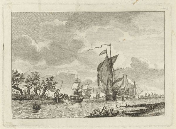
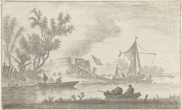
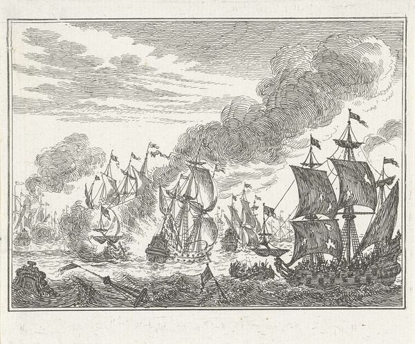
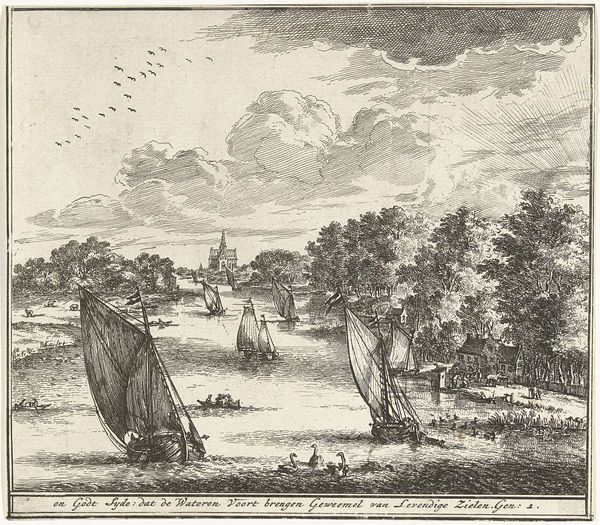
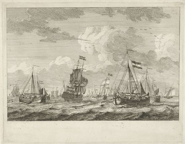
Curator: Look at this enchanting riverscape, "Riviergezicht," attributed to Gerrit Groenewegen, and created sometime between 1764 and 1826. The print, housed here at the Rijksmuseum, depicts a bustling scene along a Dutch river. Editor: It's incredibly detailed. The immediate impression I get is one of dynamic contrast, almost a tension, between the tranquil foreground with the figures in their small boat, and the naval warfare erupting in the distance. Curator: Indeed. The engraving really captures the dichotomy of 18th-century Dutch life. On one hand, we see the everyday movement of people and livestock by the river, rendered with detailed realism. Simultaneously, we’re given this striking glimpse into the naval conflicts that shaped the era’s geopolitical landscape and its colonial ambitions. Editor: The line work is so meticulous, almost obsessive, especially in rendering the clouds and water. I find the varying densities of line create atmospheric depth, a technique crucial to creating that contrast in spatial zones you described. It brings an otherwise muted palette to life with texture. It pulls me through the narrative, left to right, towards the escalating chaos of battle. Curator: That dynamic line work, it's worth noting how Groenewegen uses this to create a sense of immediacy and draws a distinction between the local and the global in terms of the economy. What seems idyllic and routine at the front, contrasts starkly against that violence playing out, representing global maritime trade's darker side. The ships themselves were symbols of commerce but also vehicles for asserting dominance. Editor: I'm curious about the visual weight – or lack thereof. Everything seems evenly distributed; no single element commands our attention. That absence of hierarchy flattens the image despite your interpretations of immediacy. Curator: I understand your formal reading, but perhaps that's precisely Groenewegen's point! By not emphasizing one element, he equates these realities – showing both the peace and chaos coexist. It speaks to the complex reality in shaping everyday experiences. Editor: Interesting thought! I still appreciate that the texture functions to unify the disparate elements; this unified structure creates harmony which enhances how this work operates visually, in an almost subversive commentary about empire. Curator: The beauty lies in these juxtapositions; this artwork provides a multi-layered lens through which we can examine Dutch society and politics of the era. Editor: A stunning reminder of how a formal element, like line, informs the historical narrative.
Comments
No comments
Be the first to comment and join the conversation on the ultimate creative platform.
More like this