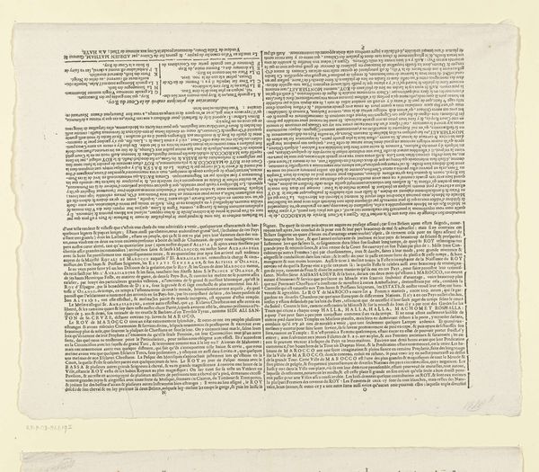
Tekstblad bij de prent van de twee zeeslagen op Schoonevelt, 7 en 14 juni 1673 1673
0:00
0:00
johannesjanssonius
Rijksmuseum
print, typography
#
informal type
#
dutch-golden-age
# print
#
small type
#
editorial typography
#
typographical layout
#
typography
#
newspaper layout
#
stylized text
#
thick font
#
handwritten font
#
classical type
#
small lettering
Dimensions: height 192 mm, width 510 mm
Copyright: Rijks Museum: Open Domain
Curator: So much text! It almost feels intimidating at first glance, like facing a wall of words. Editor: Indeed. What we’re looking at is "Tekstblad bij de prent van de twee zeeslagen op Schoonevelt, 7 en 14 juni 1673," essentially a textual broadside, created in 1673, likely by Johannes Janssonius. Curator: Right. A description accompanying a print of two naval battles during the Third Anglo-Dutch War. All that close Dutch type really gives it an authentic Golden Age feel. You can almost smell the ink and hear the printing press. Editor: Notice the typographical layout, though. See how the use of varied font sizes and weights create a visual hierarchy. The dense blocks of text are skillfully arranged to guide the reader through the narrative of the naval battles. A blend of form and function, if I may say so myself. Curator: Function definitely comes first for me here, and I immediately wonder who was eagerly devouring every line when this first came out? Editor: We can imagine 17th-century citizens, eager to learn of Dutch naval victories against England and France during a tumultuous period. This functions, really, as early modern news dissemination, relying on the power of typography to instill patriotic sentiment. The detail within each paragraph serves not only to inform, but also to ignite passion, perhaps, for the Dutch cause. Curator: And, considering this "news" came out in the midst of a major war, with life and death implications for just about everyone, you can see this "small lettering" becoming "bold text" in the people's imaginations. Even if the type size stays stubbornly small. I like the way that the formal classicism belies a certain propagandistic goal. Editor: A persuasive intention subtly encoded within the formal rigor of its layout and typography. And even if that persuasion is not completely effective on all parties, at least it allows the Dutch reading public to get insight into a complicated situation, from the home perspective. Curator: It just illustrates how information has always had to fight to be heard, and even now there is something quaint, almost courageous, about the singularity of purpose we see reflected back from this early textsheet. Editor: It is indeed a striking combination, capturing a key moment in both graphic design and Dutch history.
Comments
No comments
Be the first to comment and join the conversation on the ultimate creative platform.
More like this