drawing, ink
#
drawing
#
animal
#
dutch-golden-age
#
pen sketch
#
landscape
#
figuration
#
ink
#
ink drawing experimentation
#
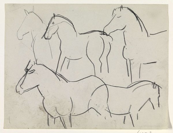
horse
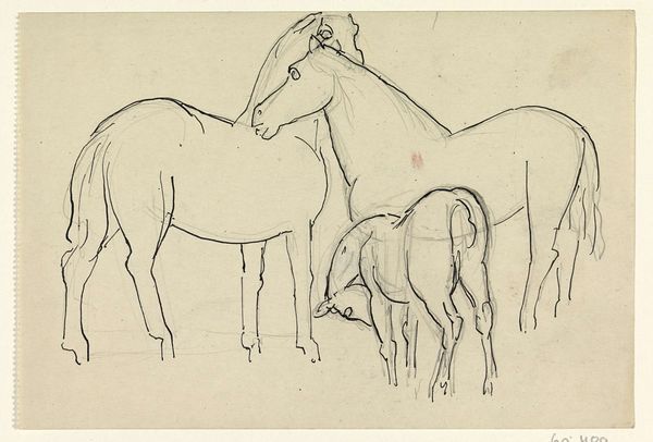
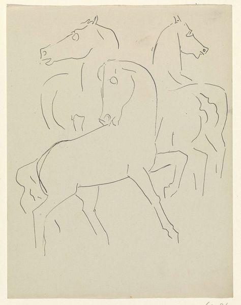
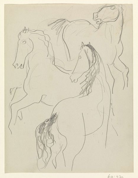
Dimensions: height 136 mm, width 202 mm
Copyright: Rijks Museum: Open Domain
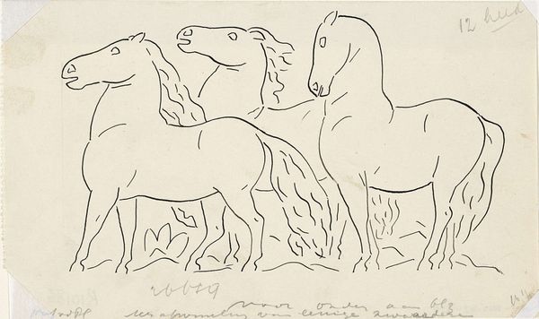
Editor: We're looking at "Twee paarden en een veulen," or "Two Horses and a Foal," a pen and ink drawing by Leo Gestel, created between 1926 and 1928. I’m immediately struck by how economical the line work is; he captures so much with so little. What elements of the composition stand out to you? Curator: It’s a remarkable study in form and reduction. Notice how the overlapping lines create a sense of depth, yet the figures remain almost abstract. Consider how the varying line weights – heavier in some areas, lighter in others – define volume and suggest light. Where does the interplay of positive and negative space lead your eye? Editor: I keep circling back to the foal, perhaps because it’s more fully rendered. But then the two larger horses feel more imposing, especially given the starkness of the medium. It's a dance between simplicity and definition, would you say? Curator: Precisely. Observe how Gestel avoids shading, relying instead on the density and direction of the lines to model the forms. Semiotically, what is communicated by this restraint? Is there a particular emotional affect suggested? Editor: Maybe a kind of peacefulness? It’s interesting to think about how such a sparse rendering can feel so complete, not really lacking anything. It makes you think about what is truly essential in art. Curator: Indeed. Through a formalist lens, this work highlights how essential elements – line, form, space – converge to create a cohesive and suggestive whole. Editor: I hadn’t really considered how much could be communicated through the bare minimum of lines. Thank you. Curator: And thank you. It’s always enriching to re-examine fundamental principles.
Comments
No comments
Be the first to comment and join the conversation on the ultimate creative platform.
More like this