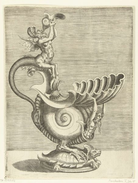
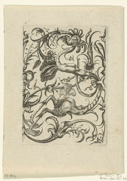
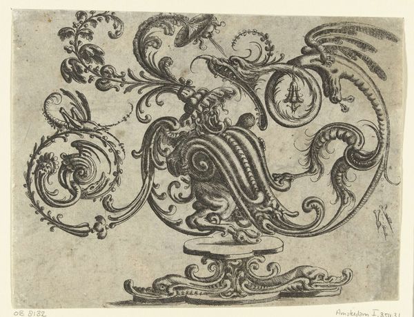
drawing, print, engraving
#
drawing
#
allegory
#
baroque
#
animal
# print
#
form
#
line
#
engraving
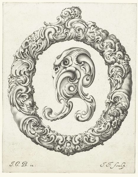
Dimensions: height 206 mm, width 156 mm
Copyright: Rijks Museum: Open Domain
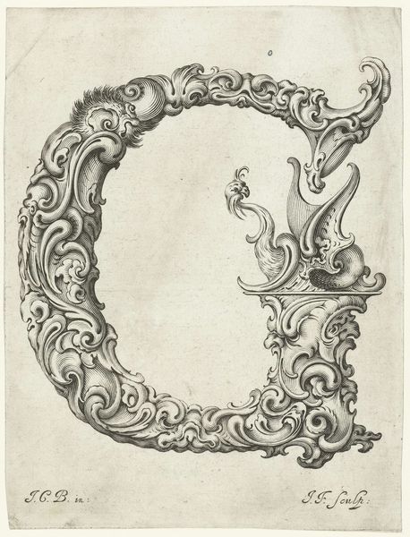
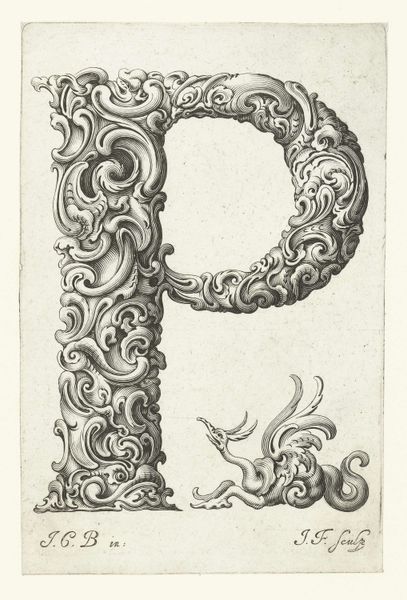
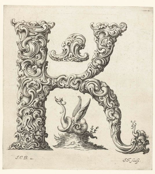
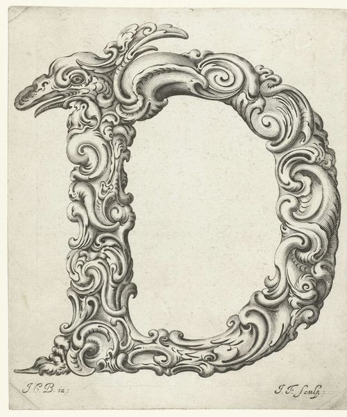
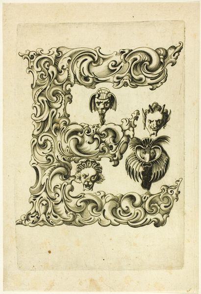
Curator: This engraving, “Letter C,” crafted circa 1645-1650 by Jeremias Falck, presents an intriguing combination of form and imagery. What strikes you first about this print? Editor: Its intricacy is undeniable. The swirling, almost baroque embellishments that form the letter “C” are quite captivating. However, there's an air of exclusivity that I find a bit off-putting at first glance. Curator: Interesting observation. Focusing on the formal elements, notice the lines - how Falck uses them to create a sense of depth and movement within the "C" itself. The baroque style is evident in the elaborate ornamentation. How do you see it connecting, if at all, to the creature it frames? Editor: Well, that creature... It looks like a fantastic griffin, an amalgamation of lion and eagle, which seems pointedly symbolic. Given the historical context, it’s difficult not to see the griffin representing power and dominance – specifically the aristocracy. The “C,” therefore, isn't merely decorative; it becomes a container of social messaging, class boundaries, and maybe the dominance of those whose names started with "C". Curator: A compelling interpretation! But is it possible we're overstating the intention of what appears to be simply an aesthetic object? We can surely acknowledge the griffin-motif adds layers of meaning through classical bestiaries, speaking to courage and nobility, irrespective of rigid social hierarchy. Editor: While I concede the inherent symbolism might be broader than class alone, such displays in that era often had a didactic purpose – reinforcing social stratifications. What do you make of its somewhat static nature and the otherwise lively detail of the etching? Curator: The engraver seems focused on balancing detail and legibility. This delicate rendering may, in fact, contribute to a kind of visual harmony; that of the letter as form meeting the implied values signified by the griffin. This interaction speaks, as does every Baroque work, to order in nature and society. Editor: I appreciate your reading of balance in that social structure but to leave it at order and harmony overlooks the deeply complex social realities of the 17th century. It leaves me uneasy, yet prompts crucial questions about art's function. Curator: Indeed, viewing it strictly as an element of visual culture forces one to consider how period values informed—and continue to inform—how we perceive artistic representation. Thank you for opening that avenue for consideration.
Comments
No comments
Be the first to comment and join the conversation on the ultimate creative platform.
More like this