![Designs for Indian Room, Chic-n-Coop Restaurant, Montreal, Canada.] [Placemat design with chicken character wearing crown by Winold Reiss](/_next/image?url=https%3A%2F%2Fd2w8kbdekdi1gv.cloudfront.net%2FeyJidWNrZXQiOiAiYXJ0ZXJhLWltYWdlcy1idWNrZXQiLCAia2V5IjogImFydHdvcmtzL2E3YjUzNGMxLWYwNjMtNDVmOC05OGQzLWI0M2FlY2ZmYzFiMy9hN2I1MzRjMS1mMDYzLTQ1ZjgtOThkMy1iNDNhZWNmZmMxYjNfZnVsbC5qcGciLCAiZWRpdHMiOiB7InJlc2l6ZSI6IHsid2lkdGgiOiAxOTIwLCAiaGVpZ2h0IjogMTkyMCwgImZpdCI6ICJpbnNpZGUifX19&w=3840&q=75)
Designs for Indian Room, Chic-n-Coop Restaurant, Montreal, Canada.] [Placemat design with chicken character wearing crown 1945
0:00
0:00
graphic-art, typography, poster
#
art-deco
#
graphic-art
#
typography
#
geometric
#
poster
Copyright: Public Domain: Artvee
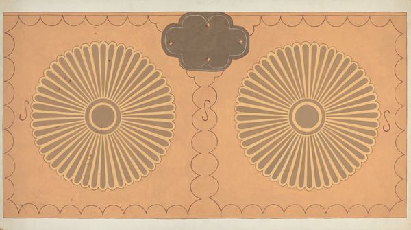
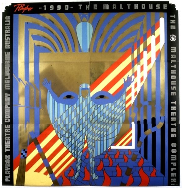
Curator: Right, so this playful graphic art piece, created in 1945 by Winold Reiss, presents itself as a placemat design for the Chic-n-Coop Restaurant in Montreal. It’s just bursting with...geometrics. Editor: Gosh, talk about capturing an era! It feels almost aggressively Art Deco, but with a weirdly charming, cartoonish twist. A crowned chicken – how wonderfully absurd! Curator: Absolutely. And if you think about it, the materials themselves speak volumes about accessibility in the restaurant industry during this period. Graphic art and typography meet restaurant promotion. Here, you have art becoming something practical, almost disposable, reflective of how it exists as just a restaurant, catering to a customer base who won't keep the placemat around forever. Editor: Exactly! And it’s got this odd contrast—I mean, juxtaposing an "Indian Room" with this utterly non-Indigenous aesthetic…it's clunky, almost ironically so, because how else would you present a restaurant's design scheme like that? And, y'know, "Where chicken is king"? So funny and ridiculous all at the same time, even down to how they created it in bold colors that stand out. Curator: Reiss really does make an interesting statement using color and design. It could also reference consumerist design, since typography in the era was essential to getting information across to a fast-moving populous, creating more business. It speaks a lot to what values we upheld back then, because it normalizes these ideals to such an extent in the restaurant industry that it is hardly thought of in a complex sense, rather just an advertising format. Editor: In many ways, the poster does the opposite in being inoffensive. And while it's light and almost campy at times, it also provides a real deep-dive look into the past that seems somewhat problematic at the same time, with allusions that reflect cultural sentiments from that era. Curator: Right, its almost blunt in a sense, which speaks volumes about the period. The Art Deco elements combined with what we understand as a poster with simple information gets diluted through allusions to other elements and concepts, that when combined feel incredibly potent. Editor: A powerful mix, no doubt. Who knew a chicken placemat could ruffle so many feathers?
Comments
No comments
Be the first to comment and join the conversation on the ultimate creative platform.
