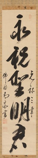
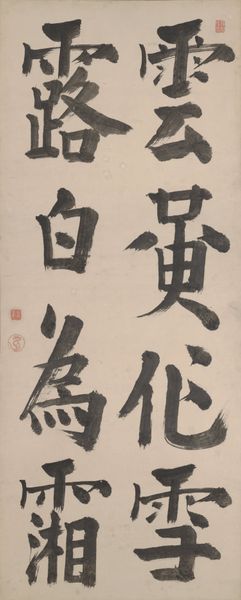
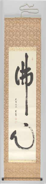
![Single-Line Calligraphy [left of a triptych of single-line calligraphies] by Gaoquan Xingdun](/_next/image?url=https%3A%2F%2Fd2w8kbdekdi1gv.cloudfront.net%2FeyJidWNrZXQiOiAiYXJ0ZXJhLWltYWdlcy1idWNrZXQiLCAia2V5IjogImFydHdvcmtzL2E3YTdkN2NhLTM3ZmMtNGIyNi04NGUwLWRmZGM1NDBjZWU0ZS9hN2E3ZDdjYS0zN2ZjLTRiMjYtODRlMC1kZmRjNTQwY2VlNGVfZnVsbC5qcGciLCAiZWRpdHMiOiB7InJlc2l6ZSI6IHsid2lkdGgiOiAxOTIwLCAiaGVpZ2h0IjogMTkyMCwgImZpdCI6ICJpbnNpZGUifX19&w=3840&q=75)
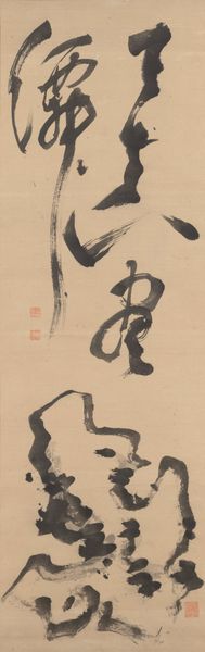
Single-Line Calligraphy [left of a triptych of single-line calligraphies] 1690
0:00
0:00


drawing, paper, ink-on-paper, ink
#
drawing
#
asian-art
#
paper
#
form
#
ink-on-paper
#
ink
#
line
#
calligraphy
Dimensions: 52 5/16 × 12 7/16 in. (132.87 × 31.59 cm) (image)87 1/2 × 16 3/4 in. (222.25 × 42.55 cm) (mount, without roller)
Copyright: Public Domain
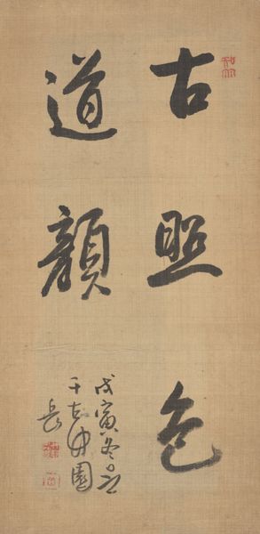
Editor: This artwork is titled "Single-Line Calligraphy," created around 1690 by Gaoquan Xingdun. It’s ink on paper and, standing here, I'm struck by its minimalist aesthetic. The stark black lines against the neutral background create a very arresting visual experience. What can you tell me about it? Curator: Indeed. Let's consider first the relationship between the marks and the field. The negative space is as crucial to the composition as the inked forms themselves. Note how the artist varies the ink density, moving from bold, saturated strokes to delicate, almost ethereal washes. This modulation creates a sense of depth and movement. How would you describe the rhythmic qualities of the brushstrokes? Editor: I'd say the brushstrokes have a confident, flowing rhythm, like a dance. The weight of the lines shifts, creating thick and thin contrasts, a visual energy on the paper. Do the composition or arrangement of the work offer particular insight? Curator: Precisely. The arrangement reveals the artist's command of spatial dynamics. It’s not just about the individual characters, but also the visual relationships between them and the silent intervals that punctuate the composition. Semiotically speaking, the artwork isn't about representing reality; it presents an internal construction according to aesthetic theory. Editor: That's fascinating. The contrast between the strong lines and delicate washes makes it both powerful and refined, while emphasizing form, line and texture in order to better express and emphasize what’s “really real.” Thanks, I have a lot to consider! Curator: A fruitful exchange. Thank you!
Comments

minneapolisinstituteofart over 2 years ago
⋮
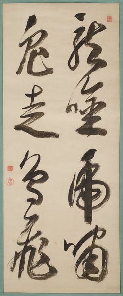
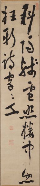
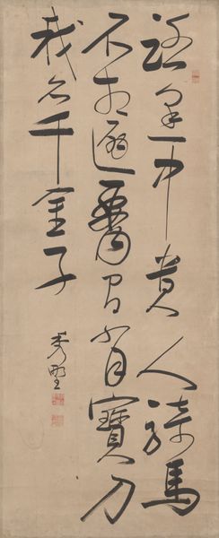
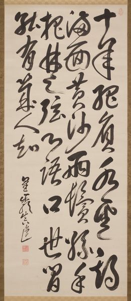
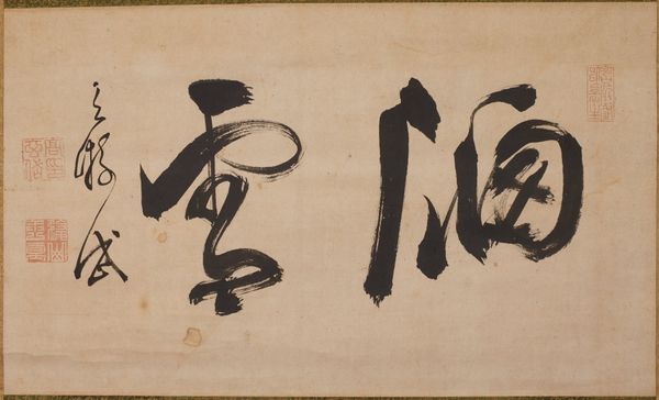
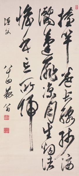
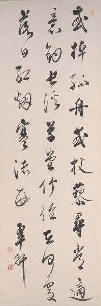
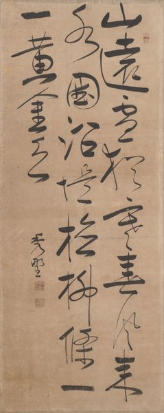
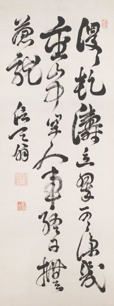
The written word is of utmost importance in Japanese Zen. Handwritten texts by Zen teachers—everything from lectures and certificates to poems and personal correspondence—are treasured as bokuseki, “ink traces” of the master, and displayed in monasteries for their didactic potential as well as for the beauty of the writing itself. This triptych of scrolls features the bold, semi-cursive calligraphy of Gaoquan Xingdun, a Chinese monk who immigrated to Japan in 1661 and became a central figure in the early development of the O_baku school, or sect, of Zen. Each scroll includes a single, five-character Zen maxim: “Eternal blessings on the wise ruler” on the important central scroll; “Religious spirit spreads across the four seas” at right; and “Beneficent graces permeate the world” at left.


Join the conversation
Join millions of artists and users on Artera today and experience the ultimate creative platform.
 Collect
More like this