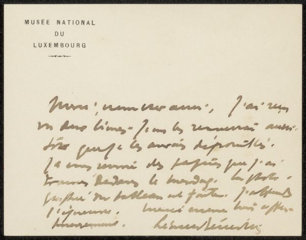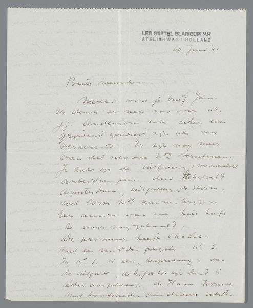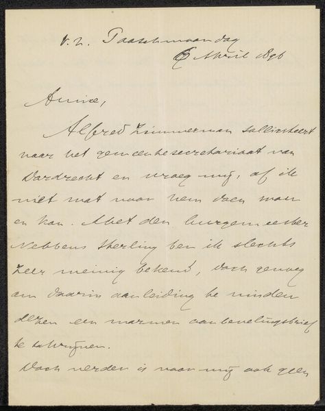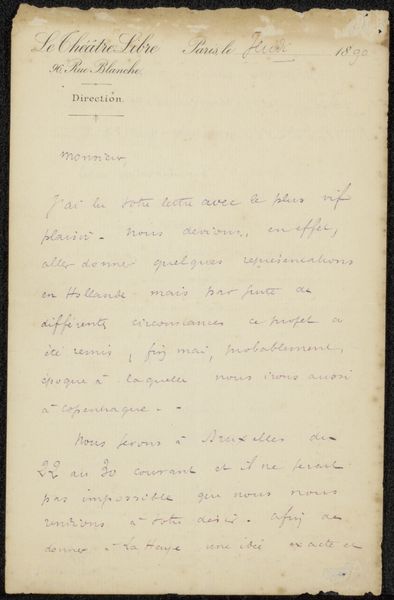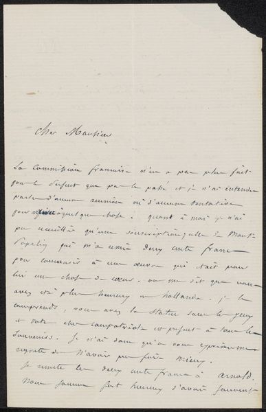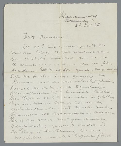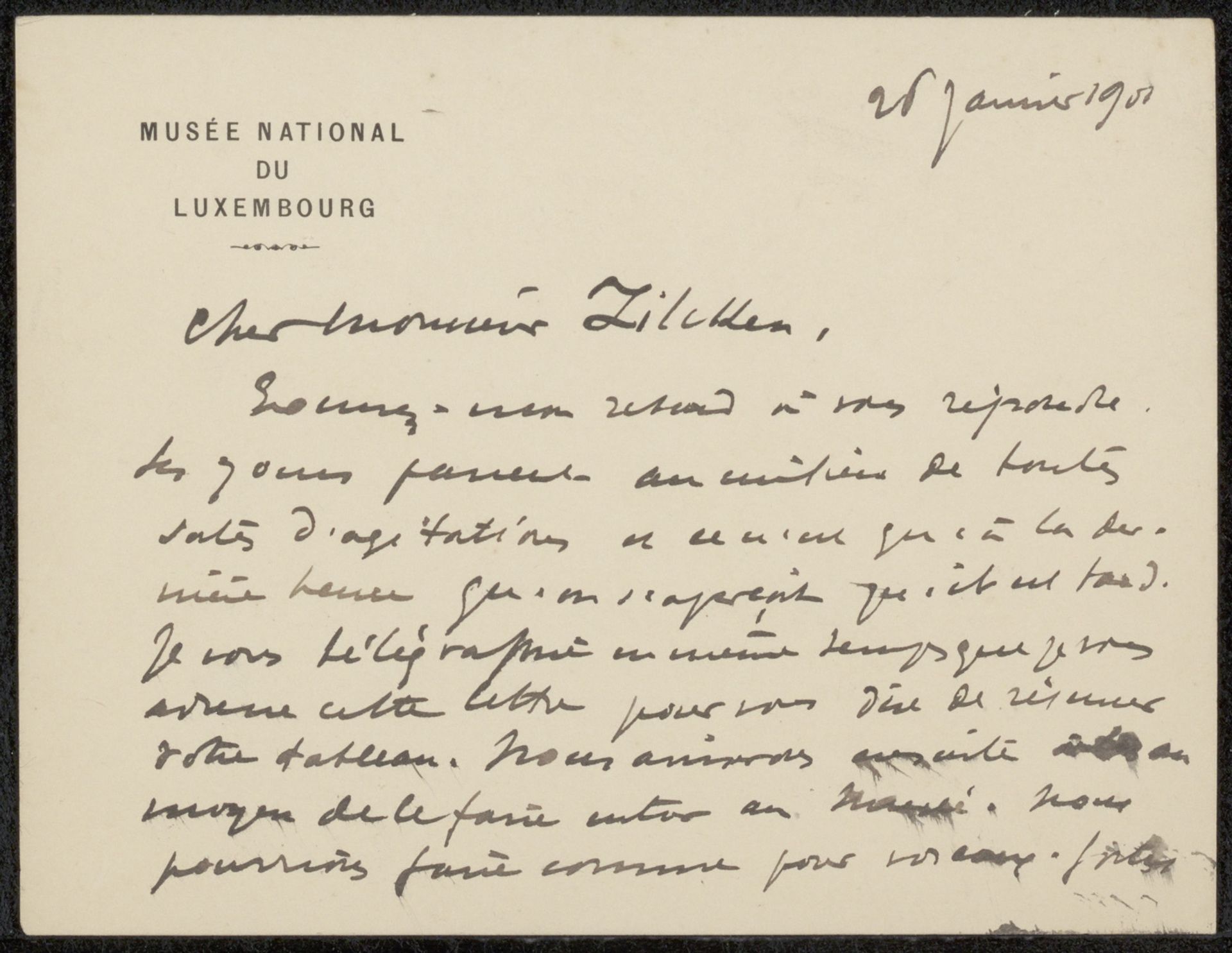
Possibly 1901
Brief aan Philip Zilcken
Listen to curator's interpretation
Curatorial notes
Curator: This drawing, "Brief aan Philip Zilcken," possibly from 1901, is rendered in ink on paper. Notice the texture created by the weave of the paper and the varying pressure of the artist’s hand. What stands out to you? Editor: It's the handwriting, I think. The loops and curves are so expressive, and the density varies across the page. What do you see in it formally? Curator: The density creates a field, doesn't it? The visual rhythm created by the rise and fall of the script's line. See how the upper part has that dark section where one word is written right after the other? The marks almost seem to take on a life of their own, quite separate from any textual content. Is there any balance created by those varied elements? Editor: Well, the lighter areas balance out those denser patches you mention, so I suppose that creates some distribution or symmetry? Curator: Precisely. The blank space around the perimeter becomes essential; it isolates the core, intensifying our focus on the interaction between positive and negative forms. Look at how the upper left and right, while having some visual markers, yield to that sense of negative space. It frames the overall gesture, would you agree? Editor: Definitely! The letter feels almost sculptural, because of the arrangement of dark versus light and how those combine with negative space. I see a dynamic tension between text and pure visual form. Curator: Yes, indeed. In ignoring its contextual meaning, the piece achieves its unique value, existing as shapes instead of information. We come to value materiality first and foremost! What have you gained from viewing it in that way? Editor: Seeing it that way…it lets me appreciate the hand of the artist. Separated from meaning, the material rendering creates all new areas for interpretation. Thank you!