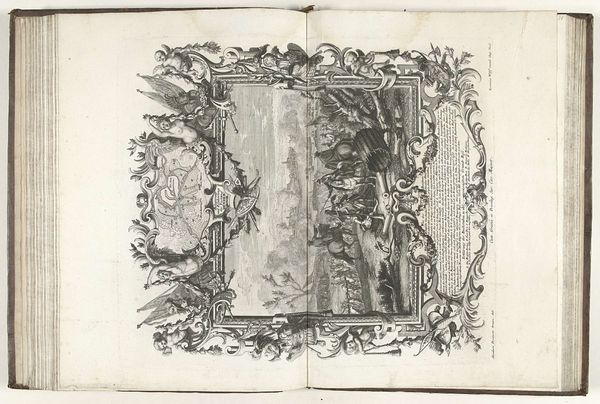
drawing, graphic-art, print, engraving
#
drawing
#
graphic-art
#
baroque
# print
#
pen sketch
#
history-painting
#
engraving
Dimensions: height 545 mm, width 420 mm
Copyright: Rijks Museum: Open Domain
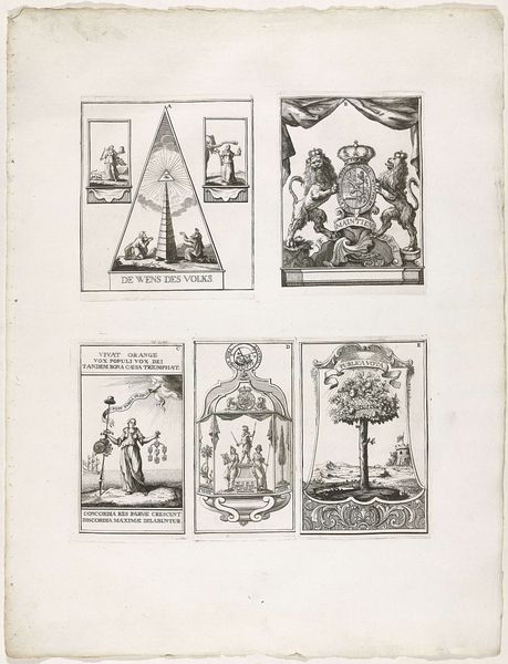
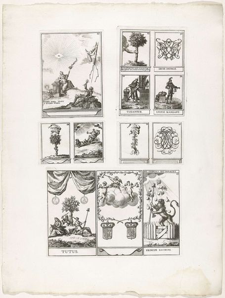
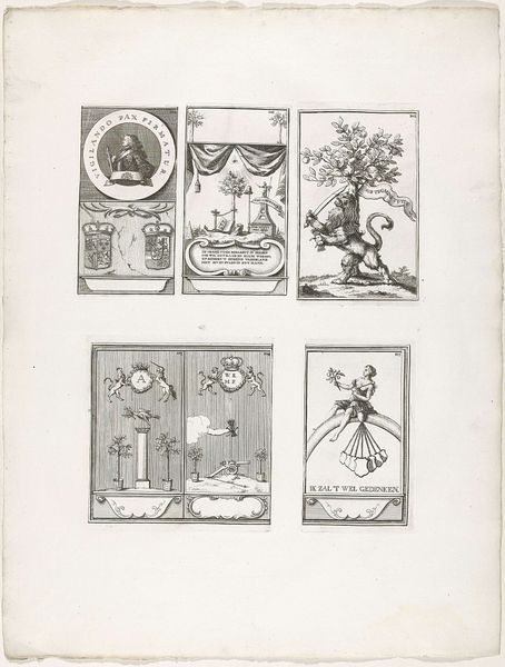
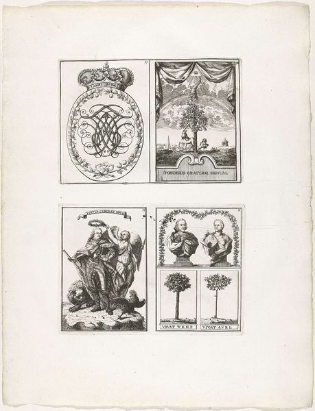
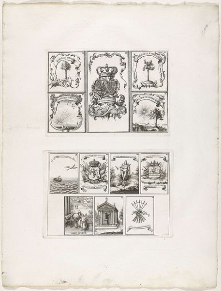
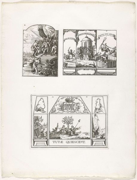
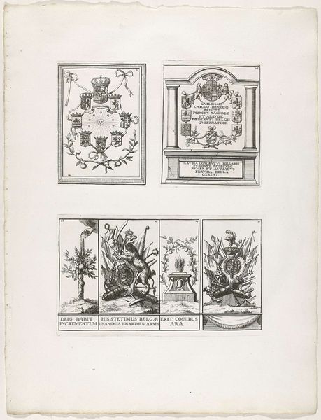
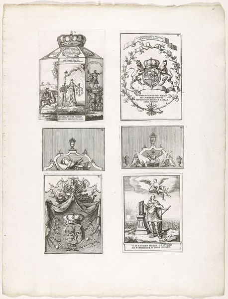
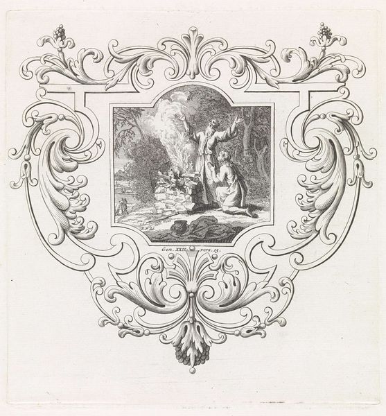
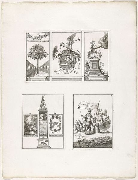
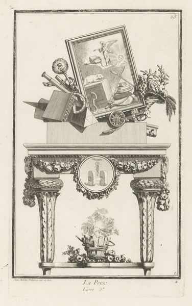
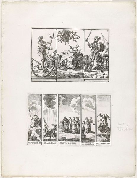
Curator: Here we have “Decoraties 84-87 te Den Haag, 1747,” a print made in 1751, now residing in the Rijksmuseum. What's your initial reaction? Editor: It feels like looking into someone’s meticulously crafted memory palace. There’s a deliberate order, but also a touch of the surreal in the iconography. And the line work…crisp, but somehow gives it a delicate feel. Curator: Precisely. These engravings, made using a burin to carve into a metal plate, exemplify Baroque artistry. Notice how each image, though separate, resonates with recurring visual themes: classical architecture, idealized figures, heraldic imagery. The compositions guide your eye through balanced arrangements, reinforcing the piece’s inherent sense of order. Editor: That order is compelling, especially considering the likely production. The artist had to physically cut into the metal to make these prints, backwards, a mirror image. It makes you wonder about the labor and intent. Were these mass-produced or specifically commissioned, do we know? The physical act itself lends a gravity to these designs; someone spent hours translating concepts to something tangible. Curator: Good questions. Such prints at the time were disseminated relatively widely, enabling accessible consumption of symbolic imagery linked to political and social ideals. The refined engraving technique translates those ideas with a sense of elevated, almost intellectual grandeur. It's the difference between reading a broadsheet and handling a carefully illuminated manuscript. Editor: Absolutely. The method impacts how its received, beyond the visual rhetoric. Knowing its origin gives further gravity. The materials themselves – the ink, paper, and the metal plate used in its making—become extensions of the imagery’s intended effect. It ties the abstract message to very physical circumstances. Curator: A compelling observation. By highlighting the interplay of process and presentation, we begin to understand not just what is represented, but how it was meant to be received by its contemporary audience, further informed by classical allusions within. Editor: Exactly. To delve into material and craft opens avenues towards interpreting these designs in relation to the practical world around it. It brings art history down from the clouds and roots it firmly within early modern studios and society. Curator: Indeed. These seemingly simple prints hold layers of visual complexity and artistic skill—something worth exploring. Editor: It makes you think of everyone involved in producing and dispersing such objects - labor as inherent.
Comments
No comments
Be the first to comment and join the conversation on the ultimate creative platform.
More like this