drawing, paper, ink
#
drawing
#
hand written
#
script typography
#
hand-lettering
#
hand drawn type
#
hand lettering
#
paper
#
ink
#
hand-written
#
hand-drawn typeface
#
thick font
#
genre-painting
#
handwritten font
#
academic-art
#
calligraphy
#
small lettering
Copyright: Rijks Museum: Open Domain
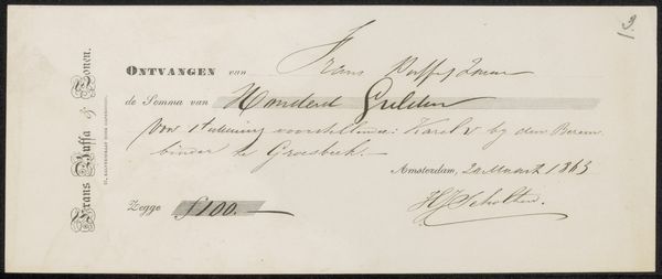
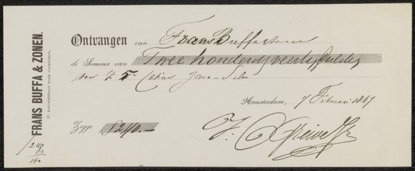
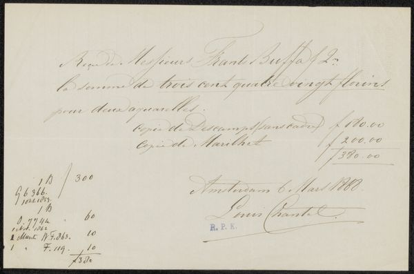
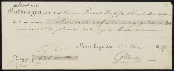
Editor: This is “Kwitantie voor Hendrik Hollander Cz.,” a drawing in ink on paper, possibly from 1863, attributed to Frans Buffa en Zonen. It seems simple, a receipt almost, but the line work and variation in thickness is very deliberate. What strikes you most about it? Curator: Indeed. What arrests me first is the overt presence of line itself. Consider the varying weights and calligraphic flourishes, completely divorced from any pretense of mere function. Do you observe how the confident strokes of ink sculpt the space, imbuing the mundane with a subtle sense of artistic flair? Editor: Yes, it’s definitely more than just handwriting! The lettering on the left, for example, almost forms an abstract design. How does this elevate a simple document? Curator: Precisely. The contrast between the rigid, almost mechanical, print on the left, "Frans Buffa & Zonen," and the free-flowing script highlights a tension between commerce and art. Ask yourself, does this tension create a third space, an invitation to reflect upon the aesthetic value embedded within the everyday transactions? Editor: I hadn’t thought of it that way, as a reflection on value itself! The artistry transforms a mere receipt into something worth examining. Curator: The beauty, as it often does, lies in the details of the construction, which reframes function to elevate aesthetic experience and contemplation. Editor: This really challenges my idea of what "art" can be. I’ll certainly look at handwriting differently from now on!
Comments
No comments
Be the first to comment and join the conversation on the ultimate creative platform.
More like this