Dimensions: support: 4242 x 2743 mm frame: 4525 x 2985 x 70 mm
Copyright: CC-BY-NC-ND 4.0 DEED, Photo: Tate
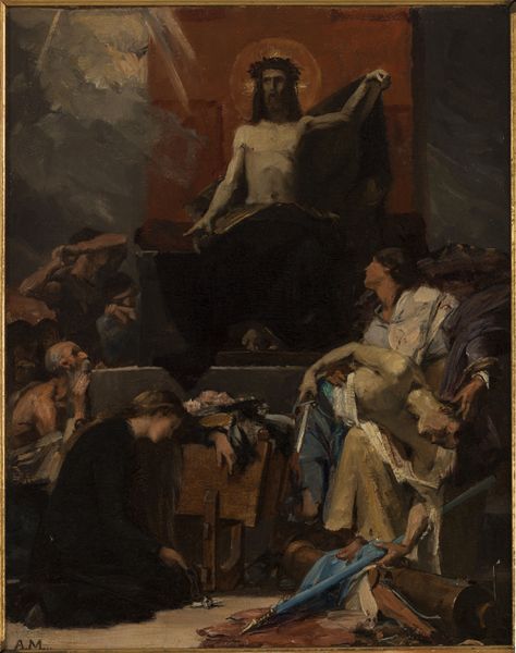
Editor: Watts’ *The Court of Death*—such a large painting, and the figures are arranged in a way that feels both classical and unsettling. What do you see in this work from a formal perspective? Curator: The composition, clearly divided into upper and lower registers, establishes a hierarchy. The upper section, dominated by the figure of Death, uses a muted palette, contrasting with the earthy tones below. Notice the stark verticals that frame the central figure; what effect do you think Watts intended? Editor: Perhaps to emphasize the figure's power and immovability? The verticals do create a sense of stability, even inevitability. Curator: Precisely. And consider the textures. The smooth, almost ethereal quality of the upper figures contrasts with the rough, more tactile rendering of the mortals below, reinforcing their earthly struggles. Editor: I hadn't considered the textural contrast so explicitly. It does seem crucial to the painting's overall impact. Curator: Indeed. These formal choices are not merely decorative; they are integral to the work's meaning.
Comments
tate 12 months ago
⋮
http://www.tate.org.uk/art/artworks/watts-the-court-of-death-n01894
Join the conversation
Join millions of artists and users on Artera today and experience the ultimate creative platform.
tate 12 months ago
⋮
This painting was intended for the chapel of a paupers’ cemetery. Death is shown as an enthroned angel, holding a baby which shows, according to Watts, that ‘even the germ of life is in the lap of Death’. Flanking Death are allegorical figures of Silence and Mystery, guarding what lies beyond the veil: sunrise and the star of hope. In the foreground a warrior surrenders his sword and a duke his coronet, showing that worldly status offers no protection. But Death also offers refuge: a man with crutches finds relief from pain, while a pale, sick woman rests her head. Gallery label, September 2004
More like this