About this artwork
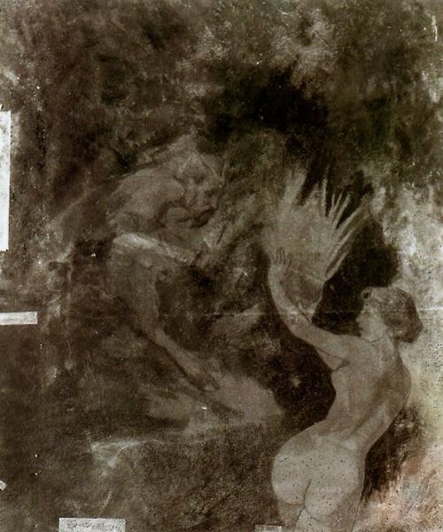
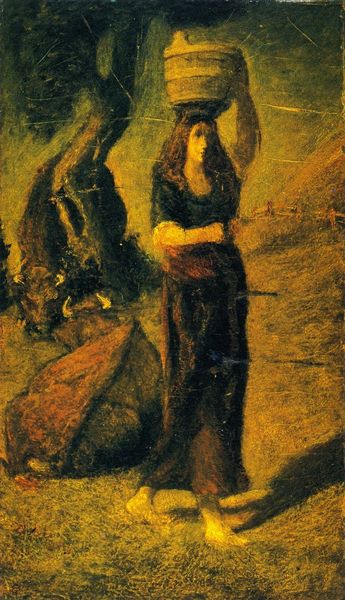
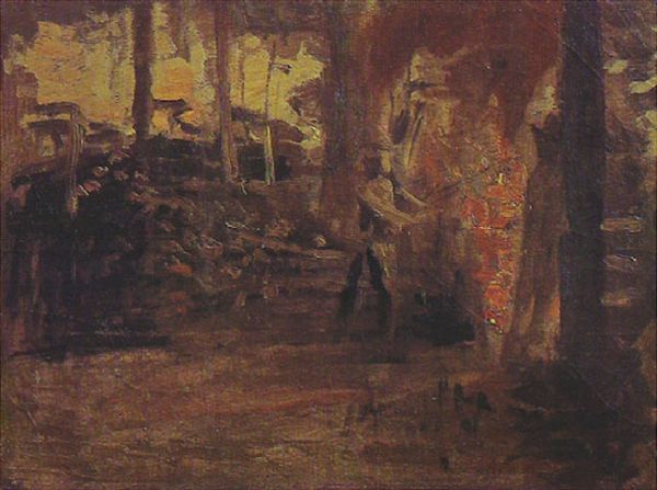
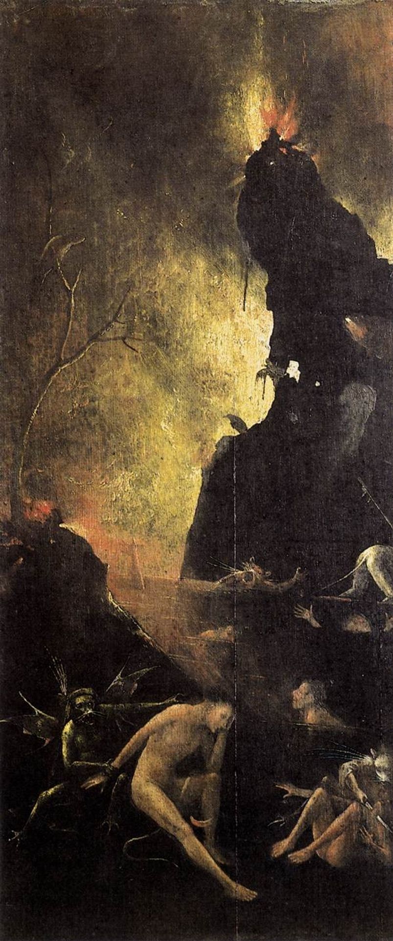
Editor: Here we have Hieronymus Bosch's "Hell," an oil on panel from 1504. It’s undeniably unsettling! The color palette is dominated by dark browns and blacks, making the sporadic fiery highlights all the more impactful. What catches your eye when you look at this piece? Curator: The compositional structure is quite striking. The eye is drawn upwards through a series of jagged forms. The stark contrast between the darkness in the lower registers and the flickers of light above create a palpable sense of unease. Note the artist's sophisticated handling of texture, particularly in the rendering of the rock formations. How does the application of paint contribute to the overall impact of the piece, in your view? Editor: I notice how thin and almost translucent the paint appears in certain areas, especially around the flames. This contrasts sharply with the thicker, more opaque application in the foreground figures, adding to the sense of depth. Curator: Precisely. And consider the overall form of the painting – its vertical orientation. How does this choice of format affect our interpretation of the subject matter? Editor: It emphasizes the descent, doesn't it? The eye falls downward, mirroring the theme of damnation and the plunge into hell. Curator: A keen observation. The artist manipulates form and color to reinforce the underlying concept. What have you gleaned from this analysis? Editor: I see how Bosch used darkness and light, thick and thin textures, to draw me in but keep me off balance, and how even the dimensions contribute to this disturbing effect. Thank you. Curator: Indeed, a focused analysis reveals the artistry beneath the grotesque.
Artwork details
- Dimensions
- 86.5 x 39.5 cm
- Copyright
- Public domain
Comments
Share your thoughts
About this artwork
Editor: Here we have Hieronymus Bosch's "Hell," an oil on panel from 1504. It’s undeniably unsettling! The color palette is dominated by dark browns and blacks, making the sporadic fiery highlights all the more impactful. What catches your eye when you look at this piece? Curator: The compositional structure is quite striking. The eye is drawn upwards through a series of jagged forms. The stark contrast between the darkness in the lower registers and the flickers of light above create a palpable sense of unease. Note the artist's sophisticated handling of texture, particularly in the rendering of the rock formations. How does the application of paint contribute to the overall impact of the piece, in your view? Editor: I notice how thin and almost translucent the paint appears in certain areas, especially around the flames. This contrasts sharply with the thicker, more opaque application in the foreground figures, adding to the sense of depth. Curator: Precisely. And consider the overall form of the painting – its vertical orientation. How does this choice of format affect our interpretation of the subject matter? Editor: It emphasizes the descent, doesn't it? The eye falls downward, mirroring the theme of damnation and the plunge into hell. Curator: A keen observation. The artist manipulates form and color to reinforce the underlying concept. What have you gleaned from this analysis? Editor: I see how Bosch used darkness and light, thick and thin textures, to draw me in but keep me off balance, and how even the dimensions contribute to this disturbing effect. Thank you. Curator: Indeed, a focused analysis reveals the artistry beneath the grotesque.
Comments
Share your thoughts