Copyright: Public Domain
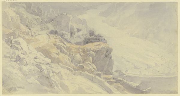
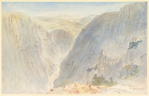
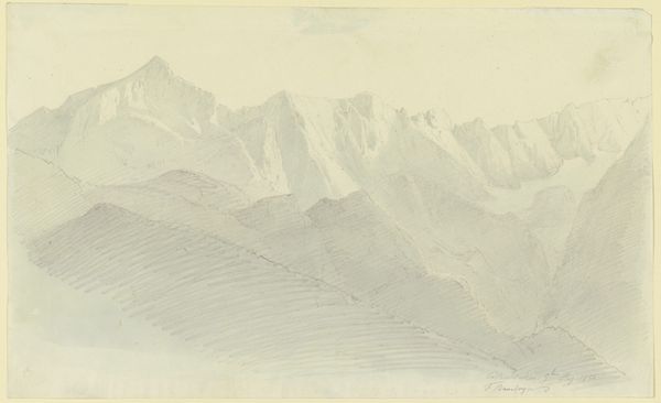
Editor: This is "Trento," a watercolor and pencil drawing by Fritz Bamberger, created around 1853. I find its misty blues and greens quite calming, almost ethereal. What's your take on this landscape? Curator: Observe how Bamberger constructs depth, not through linear perspective alone, but through tonal gradations. The foreground possesses a tangible warmth in its ochre hues, contrasted with the increasingly desaturated, cool blues of the distant peaks. Note also how he modulates the application of watercolor wash; thin veils in the distance versus slightly more concentrated areas closer in. What effect do you think this contrast has on the overall composition? Editor: I see what you mean; it definitely draws the eye forward. The change in color saturation and weight of the wash creates a visual journey into the landscape. Curator: Precisely. And consider the materiality itself. The delicate pencil underdrawing peeks through in areas, a ghost of structure beneath the color. The artist allows us to see the artifice of its construction. What is Bamberger suggesting by not fully obscuring his process? Editor: Perhaps it is not meant to be a realistic depiction, but instead highlights the subjective experience of viewing a landscape, layers of seeing, and feeling. Curator: Indeed. A powerful demonstration of affect through form. The composition leads us not to a destination, but deeper into the act of perception itself. Editor: This has helped me see that this artwork uses color and form to communicate about the human encounter with the natural world. I appreciate the subtleties in Bamberger's approach. Curator: And I appreciate your astute observations.
Comments
No comments
Be the first to comment and join the conversation on the ultimate creative platform.
More like this