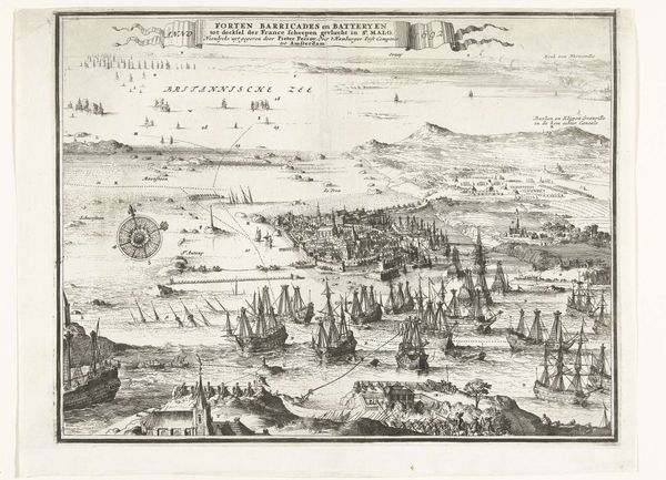
print, engraving
#
baroque
#
dutch-golden-age
# print
#
pen sketch
#
landscape
#
pen-ink sketch
#
pen work
#
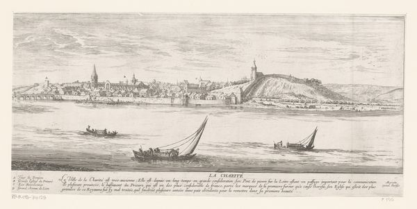
cityscape
#
engraving
Dimensions: height 427 mm, width 473 mm
Copyright: Rijks Museum: Open Domain
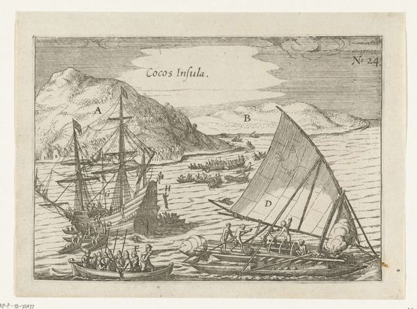
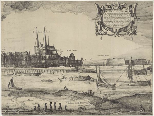
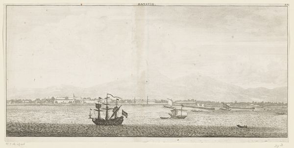
Curator: I find myself drawn into the placid and serene scene presented in this Dutch Golden Age print. It’s quiet somehow. Editor: You're picking up on something interesting. This engraving, known as "Gezicht op Batavia (rechter blad)," likely created sometime between 1619 and 1680, offers more than just aesthetic calm. The artist gives us the cityscape of Batavia, now Jakarta, during a pivotal moment in Dutch colonial history. Curator: Right. You know, seeing those ships, it's like they're gliding right out of the Age of Exploration. I feel a bit like a stowaway just peering through the rigging. Editor: They're imposing, aren't they? Think about their broader historical presence, not as adventurous vessels, but as instruments of trade, power and, let's be frank, oppression in Southeast Asia. Batavia was the capital of the Dutch East Indies and center of the spice trade. This idyllic portrayal smooths over complex issues of labor, extraction, and resistance. Curator: True. The whole scene feels... curated, perhaps intentionally avoiding visual conflicts. The city walls appear so uniform and the ships sailing ever-so-orderly, almost staged. But I’m so drawn to the rendering of the light on the water! Editor: Yes! And notice how the coat-of-arms in the upper right floats almost as a heavenly seal of approval, legitimizing the entire colonial enterprise below. The trident symbolizes maritime power, the ship representing trade, and the figures... well, a subtle form of colonial personification. The print becomes a propaganda piece, doesn't it? Curator: I can see it. It almost feels like an advertisement for the East Indies, something aimed at investors and colonists, more than an authentic "view." Knowing what this represented I'm now noticing the subtle erasure and visual promotion here. Fascinating. Editor: Exactly. That interplay is crucial to understanding the piece, the tension between the alluring image and the fraught historical context. It makes me consider the artist's role and intent...what are they trying to portray and who is the envisioned viewer of such a print. Curator: Absolutely. So, it began as an escapist nautical scene but it’s more like a portrait of colonial ambition masked by apparent serenity. Editor: I agree completely. It is indeed more about control than any honest rendering. I’m not sure if I feel so drawn to it anymore!
Comments
No comments
Be the first to comment and join the conversation on the ultimate creative platform.
More like this