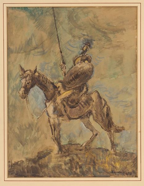
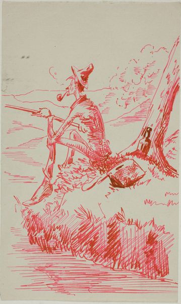
drawing, coloured-pencil, ink
#
drawing
#
coloured-pencil
#
ink
#
coloured pencil
#
naive art
Dimensions: height 14 cm, width 9 cm
Copyright: Rijks Museum: Open Domain
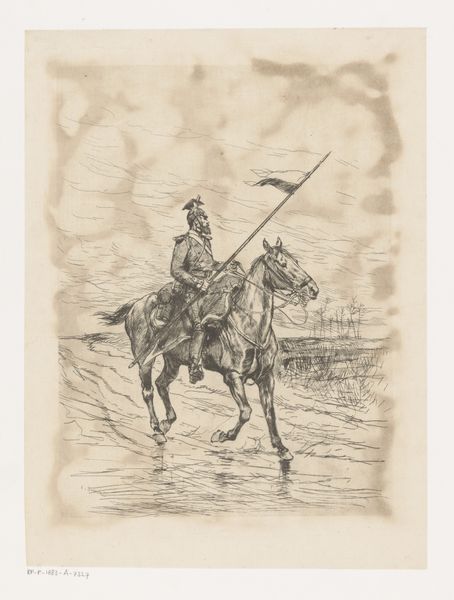
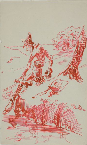
Curator: Let's analyze this intriguing piece, titled "Briefkaart" by P. Bergmann, created possibly between 1900 and 1912 using ink and colored pencil. What are your initial impressions? Editor: I'm immediately drawn to the slightly off-kilter, almost naive quality of the drawing style. There's a strange mix of precision and looseness, especially in the rendering of the figure and the landscape. What do you see as the key compositional elements? Curator: Precisely. The tension lies in this paradoxical execution. Note how the artist employs a rather flat picture plane, despite attempting perspectival representation. Consider also the use of line. Do you observe a hierarchy in the linework itself? Editor: I do. The lines defining the figure seem more deliberate, while the background elements fade into a more sketched quality. Does this relate to how we should 'read' the piece? Curator: Precisely. Focus on how the artist’s intentional manipulation directs our attention. Consider the flag, a somewhat unresolved and unclear element, vis-a-vis the meticulously rendered rifle. One gains precedence. Do you see it? Editor: Now that you point it out, definitely the rifle. What strikes me is how foregrounded this object becomes within this otherwise relatively busy composition. The way Bergmann manipulates our reading almost mimics propaganda. Curator: Yes! Notice how these design choices reflect prevailing attitudes. What seems accidental likely functions as an element for creating the ideological program of this work. Editor: I see now that even seemingly unskilled choices play an integral role in the overall meaning. The dialogue between precision and naivete provides a compelling, yet slightly unsettling, viewing experience.
Comments
No comments
Be the first to comment and join the conversation on the ultimate creative platform.
More like this