#
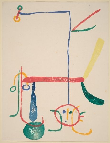
childish illustration
#
cartoon like
#
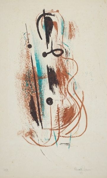
cartoon based
#
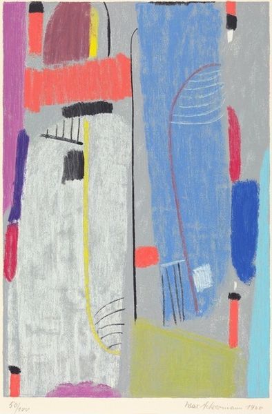
pastel soft colours
#
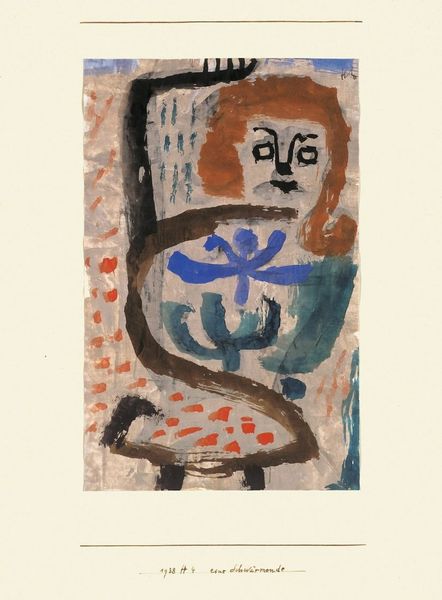
egg art
# print
#
pastel colours
#
bubble style
#
watercolour illustration
#
cartoon style
#
cartoon theme
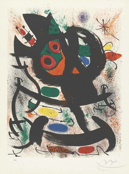
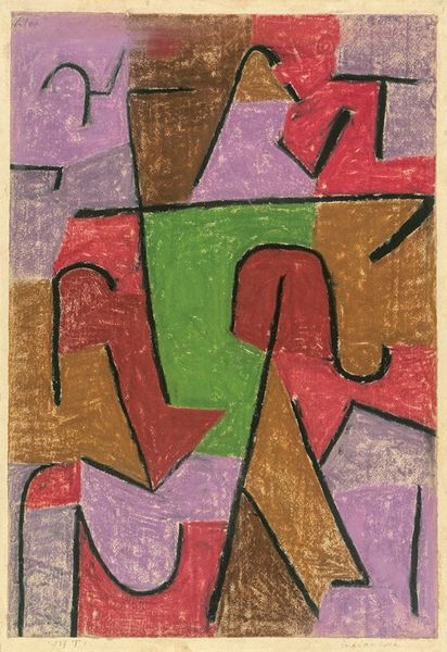
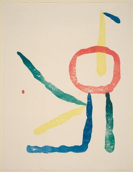
Dimensions: plate: 47.6 x 24 cm (18 3/4 x 9 7/16 in.) sheet: 70 x 50.2 cm (27 9/16 x 19 3/4 in.)
Copyright: National Gallery of Art: CC0 1.0
Editor: This is Max Ackermann's "Capriccio" from 1953, a print. I find the whimsical composition really striking, it's like a playful dance of shapes and colours. How would you interpret this work? Curator: Let’s consider the materiality of this print. The accessibility of printmaking in the mid-20th century allowed for wider dissemination of art. How do you think this affects the value or the meaning of a work like "Capriccio?" Editor: That’s interesting! It does feel less precious knowing it could be reproduced. Does the medium somehow take away from Ackermann’s intention? Curator: Not at all. Consider the context. Post-war Germany saw artists exploring new forms of expression, often rejecting traditional constraints. The materials at their disposal—affordable printing techniques—allowed them to reach a wider audience and perhaps even challenge the traditional art market. Do the soft, pastel colors resonate with the context? Editor: I guess the softness contrasts pretty starkly with the harsh realities of the post-war era. Maybe a sort of escapism through playful colors? Curator: Precisely. And notice the childish or cartoon-like elements. Think about the labor involved. A printmaker reproduces someone’s labor using possibly industrial processes, unlike the singular touch of an oil painter. In Ackermann’s case, however, his mark feels closer to freehand because he is deliberately cultivating an immediate, naive visual idiom that’s meant to suggest a lightness or ease that belies the more industrial print process itself. Editor: That makes the cartoon-like or bubble style elements much more compelling when thinking about materiality and production, the freehand expression versus an industrial feel. It completely alters my understanding of Ackermann’s artistic choices. Curator: Right! It reveals a subtle commentary on the changing landscape of art production and consumption at the time. Editor: I'll definitely be thinking more about materials and processes from now on! Thanks for shedding a different light on it!
Comments
No comments
Be the first to comment and join the conversation on the ultimate creative platform.
More like this