drawing, paper, ink
#
drawing
#
hand written
#
hand-lettering
#
hand drawn type
#
hand lettering
#
paper
#
personal sketchbook
#
ink
#
hand-drawn typeface
#
fading type
#
sketchbook drawing
#
sketchbook art
#
small lettering
Copyright: Rijks Museum: Open Domain
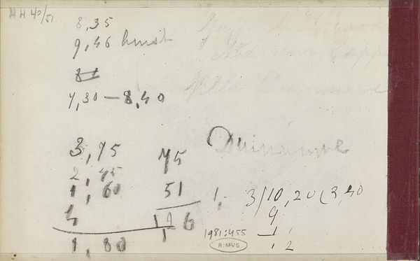
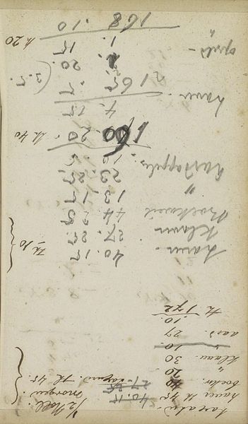
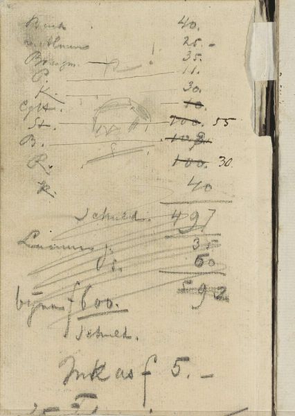
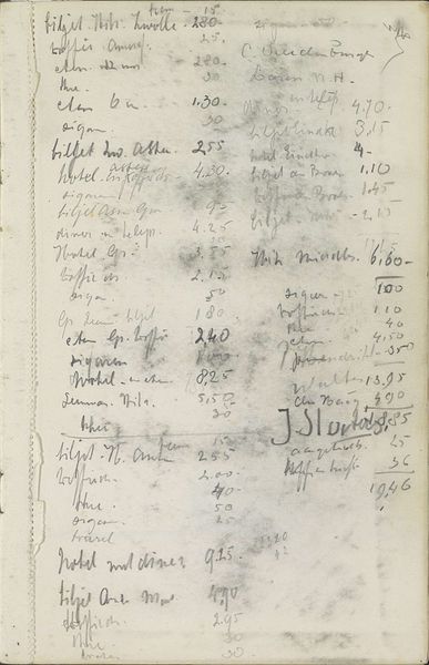
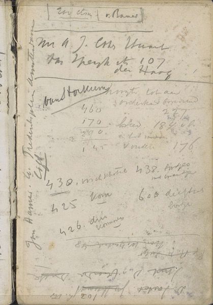
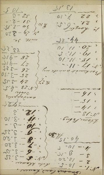
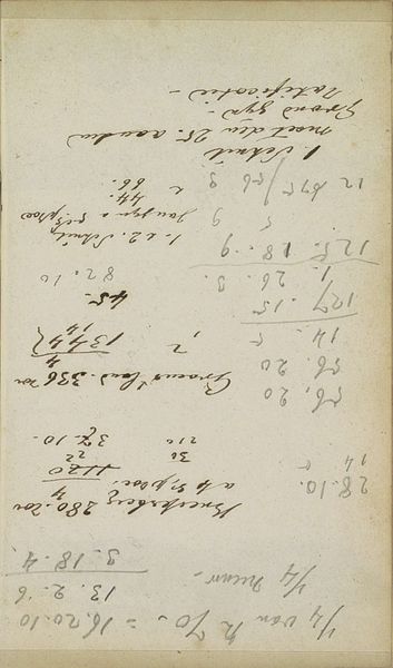
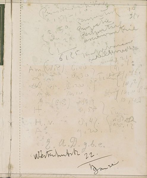
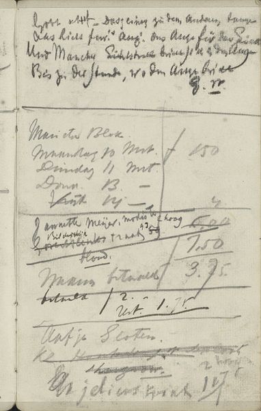
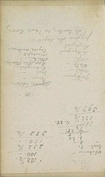
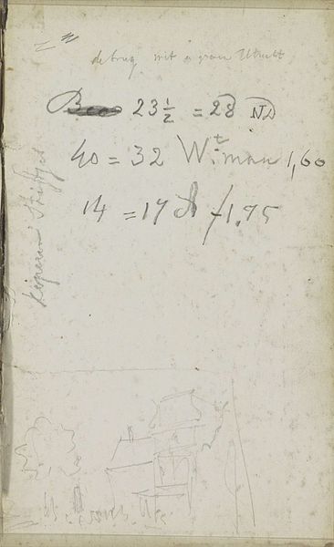
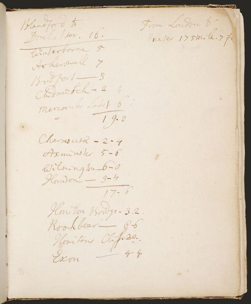
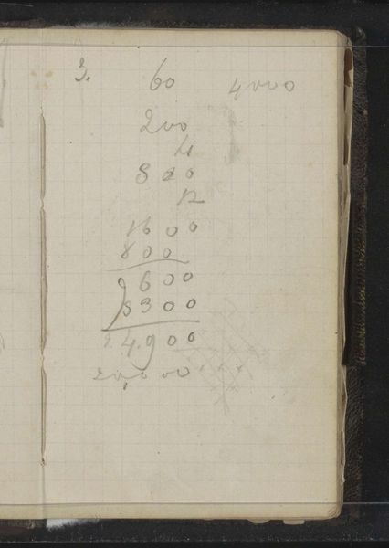
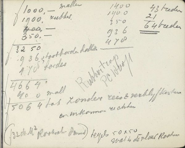
Editor: This is "Notities," or "Notes," by Cornelis Vreedenburgh, dating from between 1890 and 1946. It's an ink drawing on paper, and it looks like a page torn from a personal sketchbook. The faded script creates an overall impression of transience, like a fleeting thought captured in ink. What do you see in this piece? Curator: Intriguing. Let us begin with its formal structure. Notice the linear quality. The composition is entirely text-based; it shuns traditional pictorial elements, foregrounding linguistic signs instead. The pale tonality further flattens the image, drawing our attention to the varying weights and directions of the handwritten lines. This distribution creates its own internal rhythm, would you agree? Editor: Yes, the way the script varies in size and pressure does create a sort of visual rhythm, almost like musical notation. Is it merely the formal elements at play, though, or can we consider content, too? Curator: Content becomes another layer of form here. It is precisely what the marks signify – fleeting observations, perhaps shopping lists, or expense records. These snippets of everyday life are what ultimately build up its affect. Can we isolate where the formal components create new meaning with what’s written, though? Editor: Perhaps in the fading quality of the ink, then? Some elements of text are clearly legible, others fade, almost like memory itself. So that visual dynamic contributes something powerful about the passage of time? Curator: Precisely. We can then explore its texture, opacity and tone – qualities that transform a simple sketch into an eloquent reflection on memory and presence, or absence. Editor: I see, it’s like the content becomes a part of the form, enhancing the overall impression through visual elements, not just linguistic information. Thank you, I learned so much!
Comments
No comments
Be the first to comment and join the conversation on the ultimate creative platform.
More like this