drawing, paper, pen
drawing
script typography
hand-lettering
playful lettering
old engraving style
hand drawn type
hand lettering
paper
word art
hand-drawn typeface
pen work
pen
coloring book page
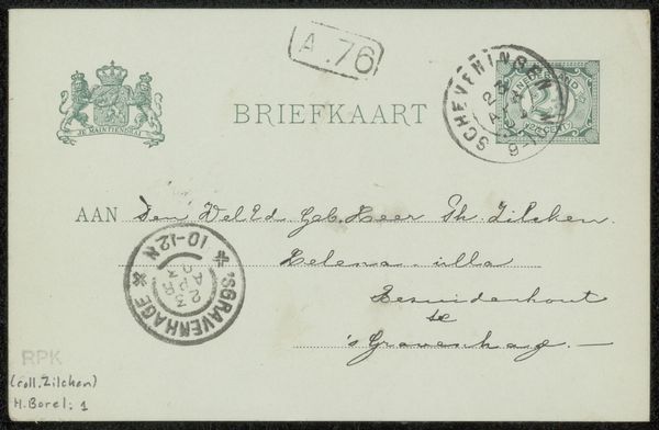
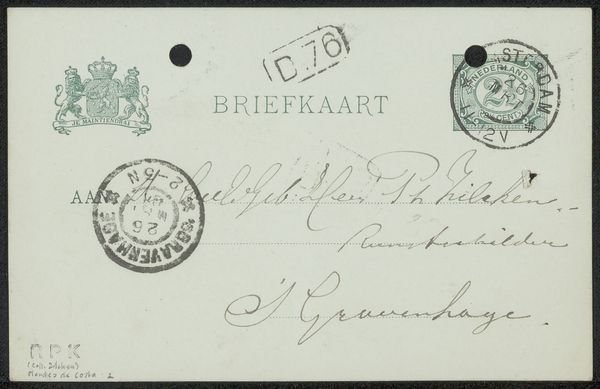
Copyright: Rijks Museum: Open Domain
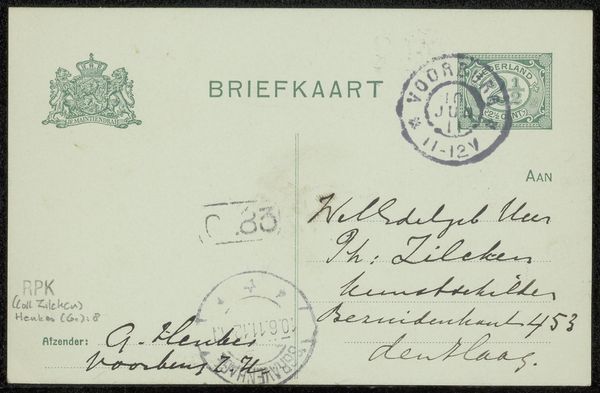
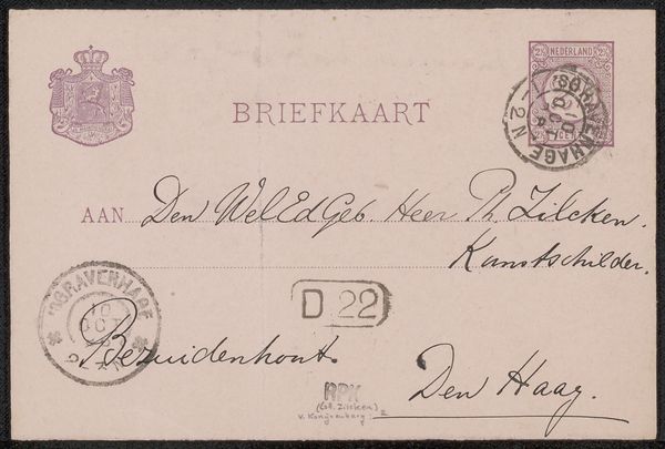
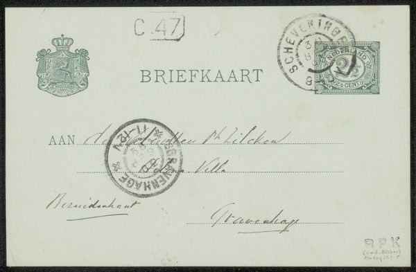
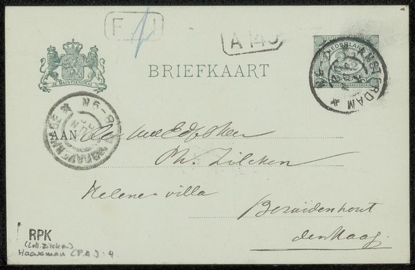
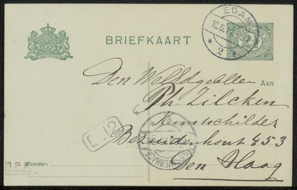
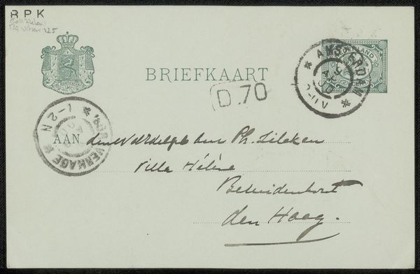
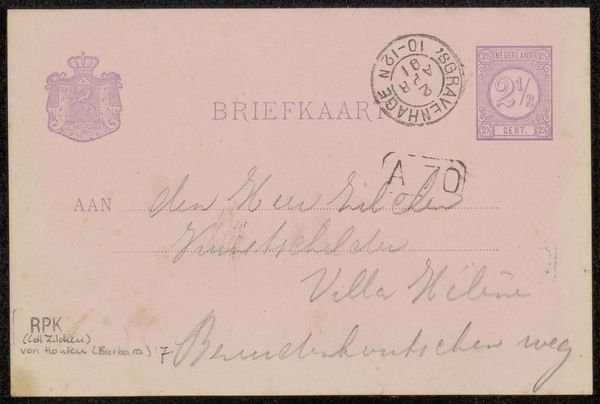
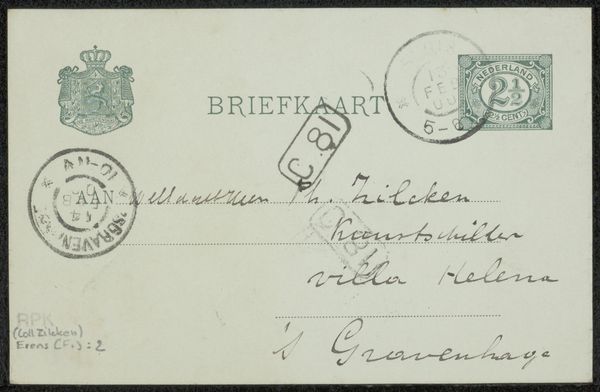
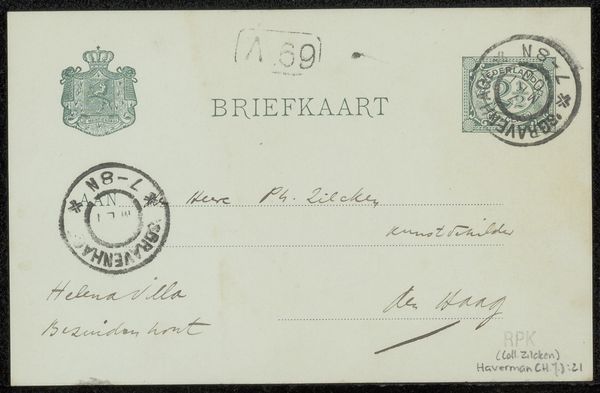
Curator: Here we have Wijnand Otto Jan Nieuwenkamp's "Briefkaart aan Philip Zilcken," believed to be from around 1911. It’s a drawing on paper, executed in pen. Editor: My immediate impression is one of meticulous artistry, a beautiful artifact of handwritten communication. I notice the controlled flourishes, the variations in line weight - the hand is very present. Curator: Absolutely. The hand is quite evident, speaking to the directness and labor inherent in manual inscription. Considering it's a postcard, think about the materials themselves. Paper—its texture, its weight—and the ink, their availability and cost at the time of production. Even the act of writing versus, say, printing reveals choices influenced by resources and skills. Editor: Indeed. Let's also examine the semiotics in the flourishes and particular letterforms. Notice how certain strokes elongate into almost decorative motifs. There’s a system in play here; the very deliberate rhythm dictates the visual interest. The words, however, act as function, no? Curator: Of course. There is also the function of mailing which ties back to materials: What kind of pen creates that precise line quality, that evenness of ink distribution, the particularities that mark the image's age? Are we dealing with a simple nib or something more specialized? Consider the craft tradition feeding into everyday correspondence. The stamp. It shows a whole system of state control to support private needs. Editor: Precisely, a fusion of utility and embellishment! Even the smudges become part of the piece’s overall appeal. We could easily engage a formal analysis, parsing out geometric repetitions. Notice, for instance, how circular elements from the stamps offset angular structures of the typography itself, crafting a harmonious interplay between function and artistry. Curator: Considering the postal system as the mechanism that puts such an item into circulation underscores how communication is supported materially through social infrastructure. The availability of such infrastructures affects the production, distribution, and reception of the piece. It allows someone with the resources to take advantage of tools in a global environment. Editor: That's a perfect summary: material conditions shape aesthetic and communicative expression and the reciprocal relationships underscore all the layers of intention. It would have been a wonderful gift to receive.
Comments
No comments
Be the first to comment and join the conversation on the ultimate creative platform.