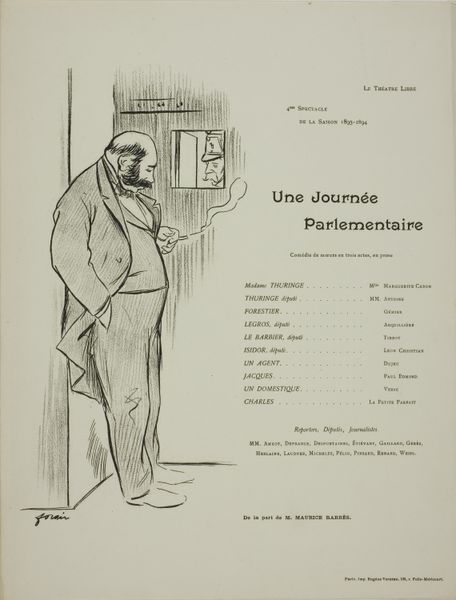
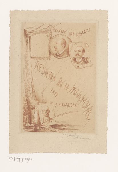
Uitnodiging voor een tentoonstelling met schilderijen van Louis Anquetin before 1897
0:00
0:00
#
aged paper
#
toned paper
#
old engraving style
#
personal sketchbook
#
ink colored
#
sketchbook drawing
#
watercolour illustration
#
sketchbook art
#
historical font
#
columned text
Dimensions: height 190 mm, width 300 mm
Copyright: Rijks Museum: Open Domain
Curator: This intriguing invitation announces an exhibition of paintings by Louis Anquetin, likely dating from before 1897, now residing in the Rijksmuseum collection. Editor: It strikes me as oddly melancholy. The figure hunched in the doorway, the aging paper...there’s a sense of weariness that feels quite palpable. Curator: Absolutely. Consider Anquetin's position within the artistic milieu of the late 19th century. He was a pivotal figure, contributing significantly to the evolution of Post-Impressionism. His collaborations with artists like Toulouse-Lautrec and Émile Bernard, challenged the norms of academic art. Editor: That’s interesting. But why this choice for an invitation? The imagery feels so…unconventional for a promotional piece. It feels more like a commentary than a marketing ploy, almost defying the expectations of bourgeois patronage. It shows this unidealized man at his doorstep on Rue de...what does it say here?... Rue de Clauzel, he is smoking something from his pipe in the shape of a lightbulb while a little cat appears at the door. The 'peintre' at the doorstep of cubat and then on Champs Élysées makes this scene an invitation for what seems like an artistic gathering. Curator: The figure’s posture might also reflect a broader societal anxiety during that era. This card reminds me a bit of Walter Benjamin´s work, to show that in critical and historical thinking, "the thoughts appear no longer as in the order of sequence, but as in the order of constellation". He sought to show history not as "it really was" but show an allegory with contemporary problems through cultural fragments. Anquetin was probably criticizing this societal behavior, too. Editor: And the deliberate use of aged-looking paper further underscores that sense of decline. It almost foreshadows a certain fin-de-siècle malaise and, at the same time, inviting to an exclusive group to gather and experiment. The old meets the modern. Curator: Yes, that's right. The "historical font", as is mentioned, alongside other attributes of an older kind, could very well echo his commitment to explore outside the classic canon, but also his interest in the art of printing. He seemed very interested in fonts, typography, in some way to bring together the content and visuality to make a statement. Editor: Fascinating how a simple invitation can reveal so much about the artist, his era, and his position within it. It transcends the mere function of advertisement. Curator: Indeed. It highlights how every element in an artwork contributes to a narrative, even a piece seemingly as utilitarian as this one.
Comments
No comments
Be the first to comment and join the conversation on the ultimate creative platform.
More like this