drawing, ink, pen, architecture
#
drawing
#
dutch-golden-age
#
ink
#
pen
#
architecture
#
calligraphy
Copyright: Rijks Museum: Open Domain
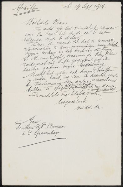
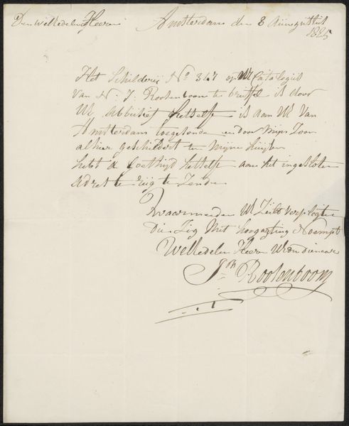
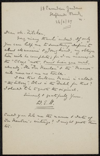
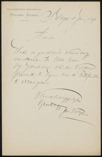
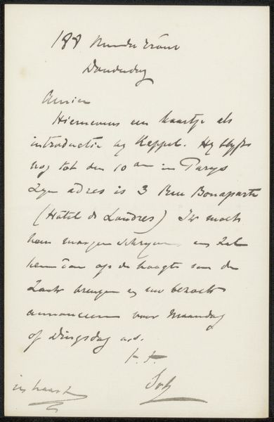
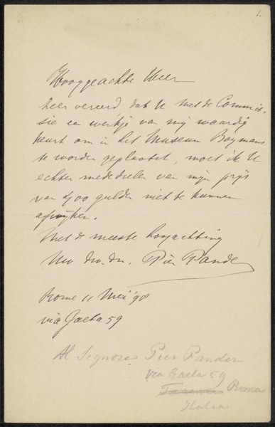
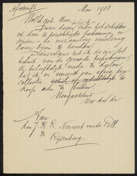
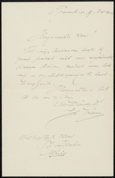
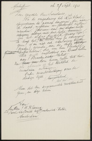
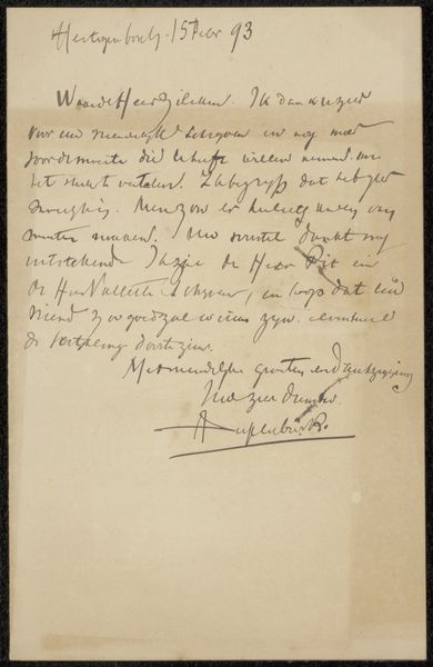
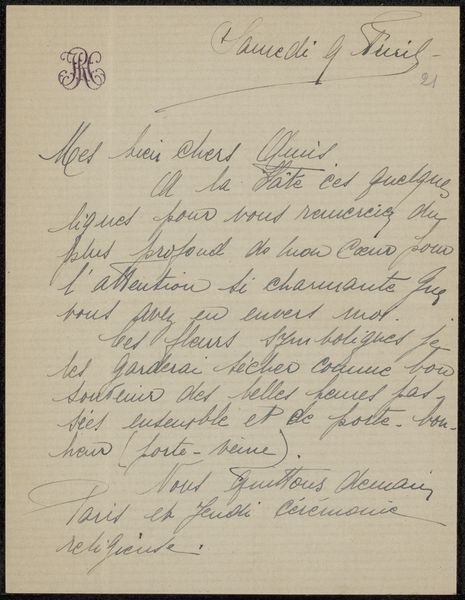
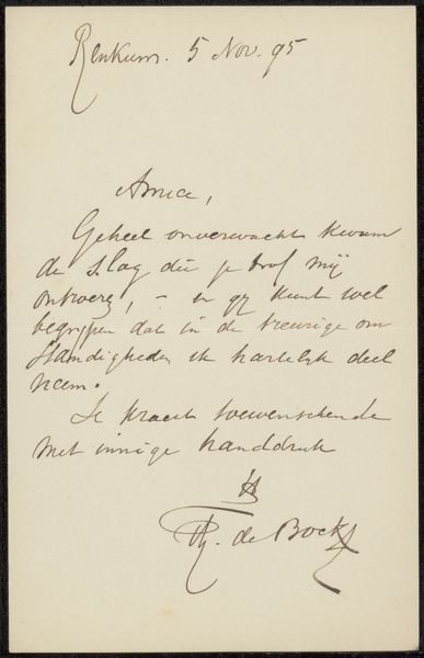
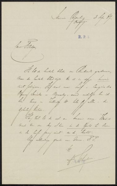
Editor: Here we have Pierre Cuypers' 1907 pen and ink drawing, a letter titled "Brief aan Cornelis Smith," currently held at the Rijksmuseum. What strikes me is the elegant but hurried quality of the script. It feels very personal. What stands out to you? Curator: The interplay of positive and negative space certainly directs our eye. Note how the artist masterfully distributes the textual mass across the page. It isn't simply information conveyance; observe the carefully considered layout and weighting of strokes. How does the curvature in 'Amsterdam Juni 1907' contrast with the straight signature lines, for example? Editor: I see that now; the upper script seems almost airy, while the signature has a more grounded feel. It's more than just handwriting, isn't it? Curator: Precisely! The *medium* itself – pen and ink on paper – reinforces the historical context. However, we are less interested in the explicit content of the letter and instead focus on the intrinsic formal components such as line quality, the density of mark-making, and its relationship to the surrounding void. We may ponder why Cuypers chose such a particular script to signify its form. How is this illustrative of late 19th/early 20th century concepts of art and calligraphy? Editor: That's fascinating. I hadn't considered calligraphy as a consciously constructed pictorial space. Curator: Indeed. And we learn how Cuypers treats writing as artistic expression itself. The work, considered through its visual arrangement, achieves an aesthetic presence. Editor: Thank you. That provides a completely new way to appreciate something as simple as a handwritten letter.
Comments
No comments
Be the first to comment and join the conversation on the ultimate creative platform.
More like this