About this artwork
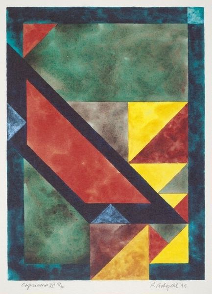
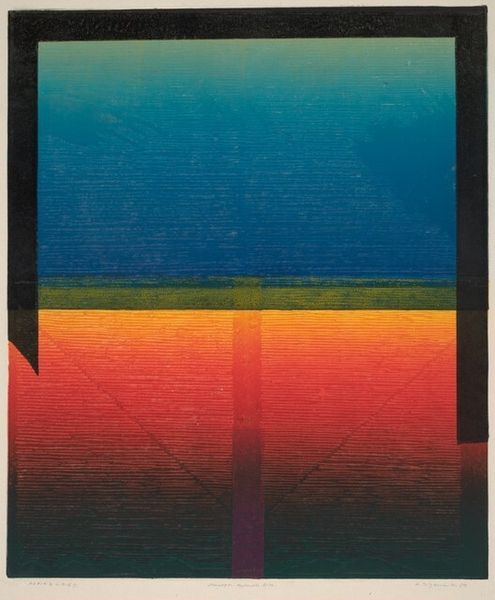
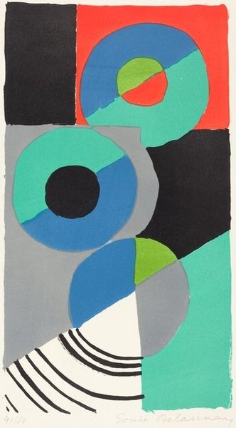
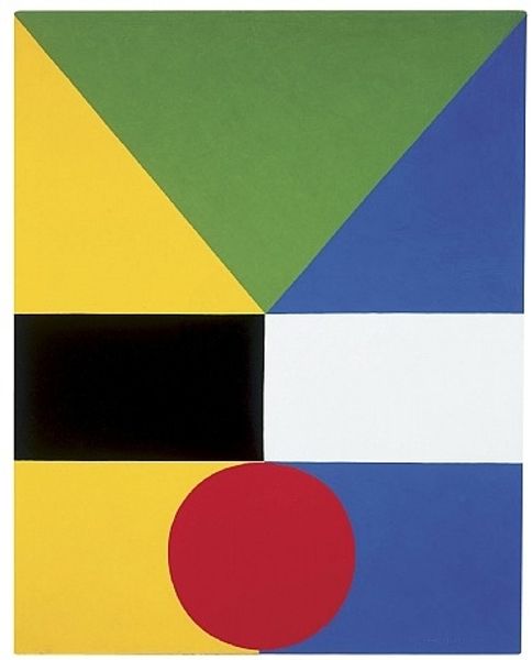
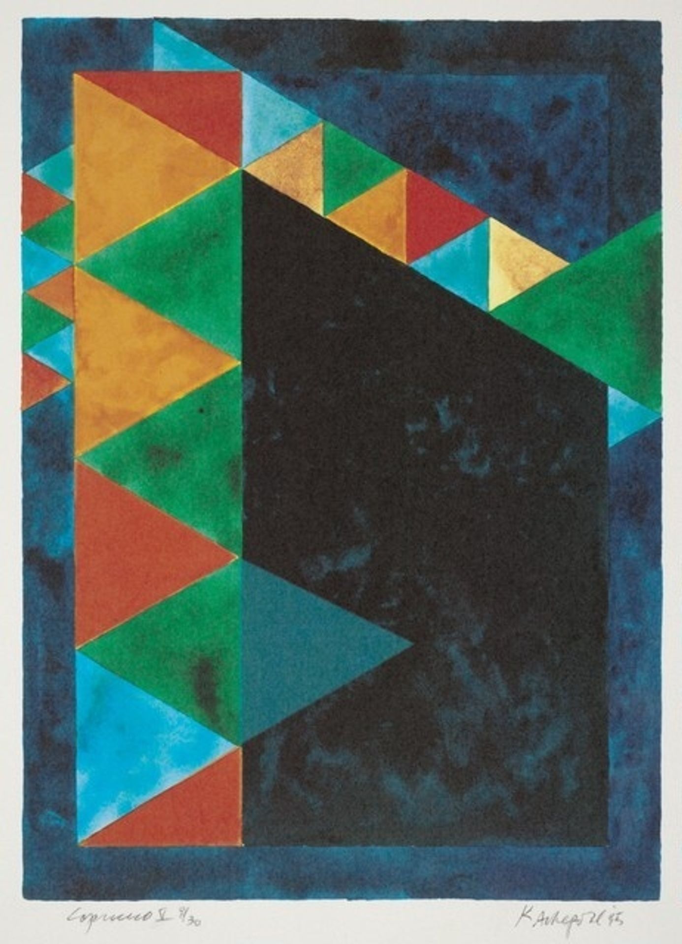
Editor: Here we have Keith Achepohl’s “Capriccio V” from 1995, seemingly an acrylic print. The contrast between the deep, moody blues and blacks against the playful geometric shapes creates a fascinating tension. It feels very balanced in a strange way. How would you interpret this work based on your perspective? Curator: The formal qualities are immediately striking. Consider the interplay between the solid black field and the tessellated triangles. Do you notice how the arrangement defies a clear figure-ground relationship, preventing any singular element from dominating? The semiotic reading here would investigate how such visual syntax informs meaning through relational elements alone, eschewing representative imagery for an inherent language. Editor: That's interesting! So it’s about the relationship between shapes rather than what the shapes might represent? The lack of recognizable imagery almost forces that reading, doesn’t it? Curator: Precisely. It's less about "what" and more about "how." We can see this as a deliberate effort to liberate the canvas from narrative constraints. Achepohl appears interested in pure compositional strategies. The color choices contribute further – are they harmonious, dissonant, or both? Note also how the texture influences depth, particularly in relation to planar structure. Editor: The colours, in the interplay of depth and shape, have a language of their own, as you said. And it encourages me to spend time exploring those tensions, I think. It changes the piece, as I look at it, especially regarding foreground and background as the colors merge at the periphery of shapes, adding both emphasis and complexity. Curator: You highlight a critical aspect: the artwork's power lies precisely in this constant recalibration of perception. Its non-objectivity invites us into pure seeing—into engaging with compositional architecture on its own terms. And in doing so, a whole lexicon of abstract expression and dynamic interpretation may open up. Editor: Thanks, seeing it through this lens helps me appreciate the focus on visual elements. I now see a far richer, engaging purpose for that choice than merely the composition, itself. Curator: My pleasure! May the shapes now reveal stories.
Artwork details
- Dimensions
- image: 37.5 x 29.5 cm (14 3/4 x 11 5/8 in.) sheet: 44.5 x 34 cm (17 1/2 x 13 3/8 in.)
- Copyright
- National Gallery of Art: CC0 1.0
Comments
Share your thoughts
About this artwork
Editor: Here we have Keith Achepohl’s “Capriccio V” from 1995, seemingly an acrylic print. The contrast between the deep, moody blues and blacks against the playful geometric shapes creates a fascinating tension. It feels very balanced in a strange way. How would you interpret this work based on your perspective? Curator: The formal qualities are immediately striking. Consider the interplay between the solid black field and the tessellated triangles. Do you notice how the arrangement defies a clear figure-ground relationship, preventing any singular element from dominating? The semiotic reading here would investigate how such visual syntax informs meaning through relational elements alone, eschewing representative imagery for an inherent language. Editor: That's interesting! So it’s about the relationship between shapes rather than what the shapes might represent? The lack of recognizable imagery almost forces that reading, doesn’t it? Curator: Precisely. It's less about "what" and more about "how." We can see this as a deliberate effort to liberate the canvas from narrative constraints. Achepohl appears interested in pure compositional strategies. The color choices contribute further – are they harmonious, dissonant, or both? Note also how the texture influences depth, particularly in relation to planar structure. Editor: The colours, in the interplay of depth and shape, have a language of their own, as you said. And it encourages me to spend time exploring those tensions, I think. It changes the piece, as I look at it, especially regarding foreground and background as the colors merge at the periphery of shapes, adding both emphasis and complexity. Curator: You highlight a critical aspect: the artwork's power lies precisely in this constant recalibration of perception. Its non-objectivity invites us into pure seeing—into engaging with compositional architecture on its own terms. And in doing so, a whole lexicon of abstract expression and dynamic interpretation may open up. Editor: Thanks, seeing it through this lens helps me appreciate the focus on visual elements. I now see a far richer, engaging purpose for that choice than merely the composition, itself. Curator: My pleasure! May the shapes now reveal stories.
Comments
Share your thoughts