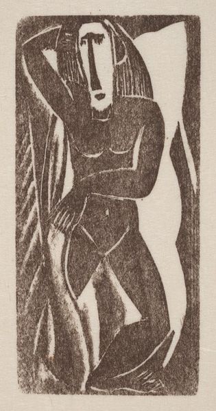
drawing, lithograph, print
#
drawing
#
art-nouveau
#
lithograph
# print
#
abstract
#
geometric
#
expressionism
Copyright: Public Domain: Artvee
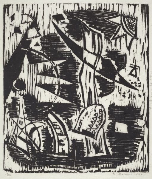
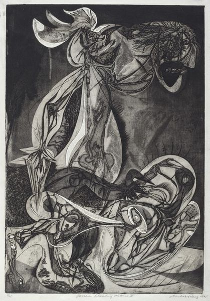
Rudolf Bauer made this lithograph with black ink on paper, it’s titled Lithograph No. 14. The beauty of lithography, for me, is its directness - the way marks made on a stone, then transferred, become a new reality. Bauer's lines, thick and thin, create a dynamic push and pull. Look at how the hatched marks create tonal variation, the way they give weight to the forms. There’s a visual depth, created by the layers of marks. A lot of the composition is achieved through hatching, cross-hatching, or short, rhythmic strokes. It makes you wonder how much was planned, how much discovered in the process. The composition has cubist elements but is also reminiscent of German Expressionism in the way it uses abstraction to convey emotion. It reminds me a little of Lyonel Feininger’s architectural prints, the same angular forms, yet Bauer has his own unique syntax. Like all good art, it's a conversation, an ongoing exploration of form, line, and feeling.
Comments
No comments
Be the first to comment and join the conversation on the ultimate creative platform.
More like this