print, engraving
#
portrait
#
baroque
#
pen drawing
#
dutch-golden-age
# print
#
figuration
#
line
#
history-painting
#
engraving
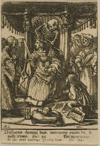
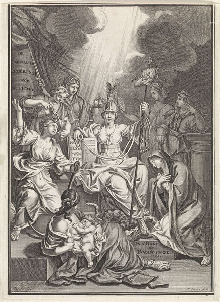
Dimensions: height 145 mm, width 94 mm
Copyright: Rijks Museum: Open Domain
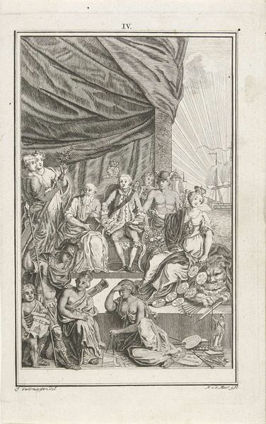
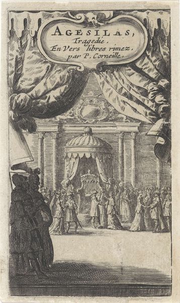
Curator: This engraving by Jan Punt, dated 1733, is titled "Vorst in zijn troonzaal" which translates to "Prince in his throne room." It's currently held in the Rijksmuseum. What are your immediate impressions? Editor: The visual field is certainly busy! There's a dramatic composition unfolding; my eyes dart between the theatrically posed figures, the ornate throne, and those almost comically muscular figures holding up the drapery at the top. The use of line to create texture and shadow is striking. Curator: Absolutely. The piece depicts a pivotal scene, very likely derived from historical dramas which explore themes of betrayal and power dynamics. Consider the fallen figure in the foreground—suggesting treachery and violent overthrow. The posture of the Prince himself radiates a rather complex mixture of power and vulnerability. Editor: He's almost effeminate in the stance; more posed than powerful. I am quite arrested by the sharp contrast created using linear precision across a spectrum of detail—for example, look how lightly he renders the curtains in comparison to the characters themselves. What of that duality in treatment, then? A political device to enhance meaning? Curator: Perhaps. There’s a stark difference in agency between the women clinging to him and the guards on the other side of the frame. The women’s powerlessness highlights the social imbalances of the period—especially the limited roles afforded to women in political dramas. Editor: So the semiotics are clear; the Prince as center of power with symbols abounding around his state of being, with these active figures on the margins pushing or pulling his hand. Is it any different to works on the same stage 100 years hence? Curator: Not particularly; we find a continuation of similar tropes. I appreciate Jan Punt’s commentary here. Editor: An intriguing interplay of contrasts which certainly stimulates broader discussions and a very well rendered use of etching that underscores tension by contrasting light and dark.
Comments
No comments
Be the first to comment and join the conversation on the ultimate creative platform.
More like this