drawing, ink
#
drawing
#
landscape
#
nature
#
ink
#
romanticism
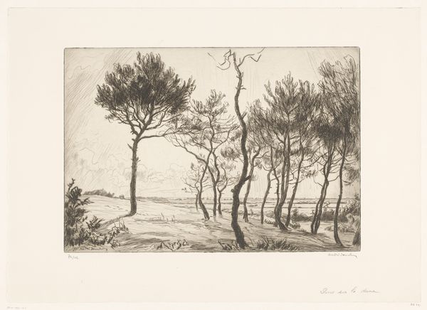
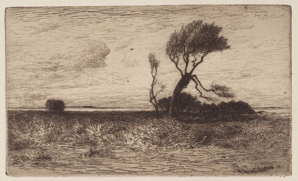
Dimensions: 270 mm (height) x 532 mm (width) (bladmaal)
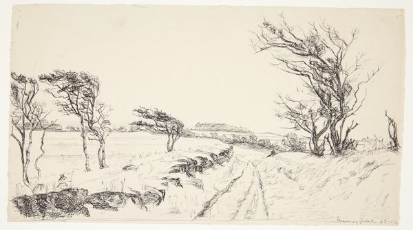
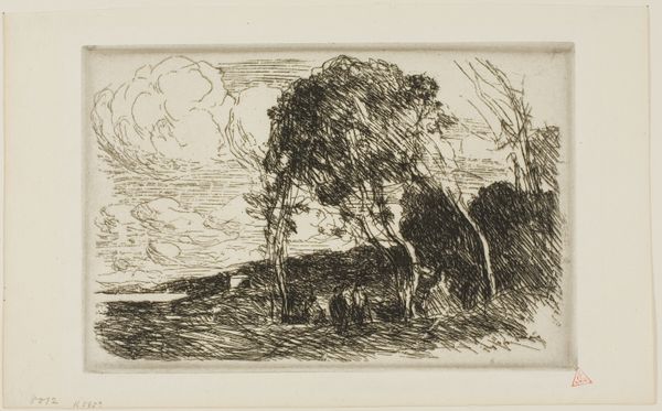
Editor: Here we have Johan Thomas Lundbye’s “Forblæste træer. Vejrhøj,” created in 1844 using ink. The sketch captures the silhouette of wind-beaten trees. The stark black ink against the muted sky creates a dramatic tension. What strikes you about its composition? Curator: It is indeed compelling how the artist manipulates ink wash to create a study in contrasts. Observe the delicate linework of the foreground grasses against the bold, almost calligraphic rendering of the trees. This deliberate juxtaposition invites contemplation on the nature of representation itself. Is the artist attempting to depict a specific locale, or is this a more symbolic exploration of nature’s forces? Editor: That’s interesting. I hadn't thought about the level of abstraction. It does make me wonder if Lundbye was more concerned with capturing a feeling rather than creating a photorealistic image. Curator: Precisely. The effectiveness of this drawing rests not on its mimetic fidelity, but rather on its sophisticated interplay of light and shadow. The graded tonality achieved with ink wash produces a scene both palpable and ethereal. Notice how the artist avoids stark outlines, favoring instead nuanced modulations of tone to define form and create spatial depth. This invites a deeper reading into what constitutes visual expression. Do you agree? Editor: Absolutely. I can see how the varying ink densities add depth and imply the wind’s movement, which carries across the landscape. I initially focused on the mood and subject but overlooked his conscious choices in mark-making. Thank you for pointing it out. Curator: Indeed. Close study reveals that the subject is inextricably tied to its execution. It’s in this synthesis that the meaning is to be discovered.
Comments
No comments
Be the first to comment and join the conversation on the ultimate creative platform.
More like this